Markets
Map: Economic Might by U.S. Metro Area
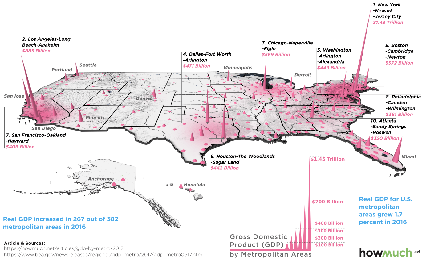
Map: Economic Might by U.S. Metro Area
The U.S. economy is massive on a global scale, and much of the country’s economic capabilities can be traced back to the innovation, knowledge, and productivity that tends to be clustered in urban areas.
The fact is that 80% of Americans live in cities – and the 10 largest metro areas alone combine for a whopping 34% of the country’s total GDP.
The 10 Largest Metro Areas by GDP
Today’s map comes to us from HowMuch.net, and it highlights recent data from the U.S. Bureau of Economic Analysis that estimates the GDP for each U.S. metro area in 2016:
| Rank | Metropolitan Area | 2016 GDP (Est.) | Population |
|---|---|---|---|
| #1 | New York-Newark-Jersey City, NY-NJ-PA | $1.43 trillion | 20.1 million |
| #2 | Los Angeles-Long Beach-Anaheim, CA | $885 billion | 13.3 million |
| #3 | Chicago-Naperville-Elgin, IL-IN-WI | $569 billion | 9.5 million |
| #4 | Dallas-Fort Worth-Arlington, TX | $471 billion | 7.2 million |
| #5 | Washington-Arlington-Alexandria, DC-VA-MD-WV | $449 billion | 6.1 million |
| #6 | Houston-The Woodlands-Sugar Land, TX | $442 billion | 6.7 million |
| #7 | San Francisco-Oakland-Hayward, CA | $406 billion | 4.7 million |
| #8 | Philadelphia-Camden-Wilmington, PA-NJ-DE-MD | $381 billion | 6.1 million |
| #9 | Boston-Cambridge-Newton, MA-NH | $371 billion | 4.8 million |
| #10 | Atlanta-Sandy Springs-Roswell, GA | $320 billion | 5.8 million |
| Top 10 Metropolitan Areas | $5.7 trillion | 84.3 million |
Note: figures in chained 2009 dollars
Not surprisingly, New York City and its surrounding area is the breadwinner here with an annual economic output of $1.43 trillion – the largest for any city in the United States. Impressively, the GDP of the NYC metro area is even higher than those of most of the world’s countries, including Australia, Mexico, and Spain.
It’s also interesting that some metro areas punch above their weight in relation to their population figures. San Francisco is #7 on the list with a GDP of $406 billion, despite having the lowest population total of all of the top 10. Boston and D.C. can be classified similarly, each with a high economic output per capita.
Trending Up, Trending Down
While they can’t quite compete with cities like New York and Chicago in terms of GDP or population, there are actually 300+ other metro areas in the country.
Here’s a recent snapshot from the BEA of which cities are growing – and which are shrinking in terms of GDP:
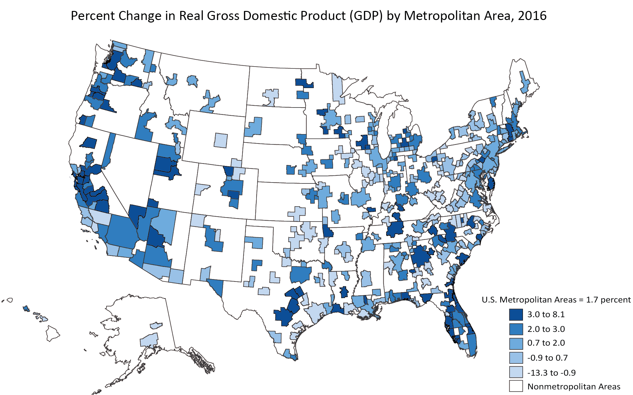
The BEA noted that real gross domestic product (GDP) increased in 267 out of 382 metropolitan areas in 2016.
The biggest increase was a tie between Lake Charles, LA and Bend-Redmond, OR, each which had GDP climb by 8.1% from the last year. The city that saw the biggest drop was Odessa, TX, which fell -13.3%.


Markets
U.S. Debt Interest Payments Reach $1 Trillion
U.S. debt interest payments have surged past the $1 trillion dollar mark, amid high interest rates and an ever-expanding debt burden.


U.S. Debt Interest Payments Reach $1 Trillion
This was originally posted on our Voronoi app. Download the app for free on iOS or Android and discover incredible data-driven charts from a variety of trusted sources.
The cost of paying for America’s national debt crossed the $1 trillion dollar mark in 2023, driven by high interest rates and a record $34 trillion mountain of debt.
Over the last decade, U.S. debt interest payments have more than doubled amid vast government spending during the pandemic crisis. As debt payments continue to soar, the Congressional Budget Office (CBO) reported that debt servicing costs surpassed defense spending for the first time ever this year.
This graphic shows the sharp rise in U.S. debt payments, based on data from the Federal Reserve.
A $1 Trillion Interest Bill, and Growing
Below, we show how U.S. debt interest payments have risen at a faster pace than at another time in modern history:
| Date | Interest Payments | U.S. National Debt |
|---|---|---|
| 2023 | $1.0T | $34.0T |
| 2022 | $830B | $31.4T |
| 2021 | $612B | $29.6T |
| 2020 | $518B | $27.7T |
| 2019 | $564B | $23.2T |
| 2018 | $571B | $22.0T |
| 2017 | $493B | $20.5T |
| 2016 | $460B | $20.0T |
| 2015 | $435B | $18.9T |
| 2014 | $442B | $18.1T |
| 2013 | $425B | $17.2T |
| 2012 | $417B | $16.4T |
| 2011 | $433B | $15.2T |
| 2010 | $400B | $14.0T |
| 2009 | $354B | $12.3T |
| 2008 | $380B | $10.7T |
| 2007 | $414B | $9.2T |
| 2006 | $387B | $8.7T |
| 2005 | $355B | $8.2T |
| 2004 | $318B | $7.6T |
| 2003 | $294B | $7.0T |
| 2002 | $298B | $6.4T |
| 2001 | $318B | $5.9T |
| 2000 | $353B | $5.7T |
| 1999 | $353B | $5.8T |
| 1998 | $360B | $5.6T |
| 1997 | $368B | $5.5T |
| 1996 | $362B | $5.3T |
| 1995 | $357B | $5.0T |
| 1994 | $334B | $4.8T |
| 1993 | $311B | $4.5T |
| 1992 | $306B | $4.2T |
| 1991 | $308B | $3.8T |
| 1990 | $298B | $3.4T |
| 1989 | $275B | $3.0T |
| 1988 | $254B | $2.7T |
| 1987 | $240B | $2.4T |
| 1986 | $225B | $2.2T |
| 1985 | $219B | $1.9T |
| 1984 | $205B | $1.7T |
| 1983 | $176B | $1.4T |
| 1982 | $157B | $1.2T |
| 1981 | $142B | $1.0T |
| 1980 | $113B | $930.2B |
| 1979 | $96B | $845.1B |
| 1978 | $84B | $789.2B |
| 1977 | $69B | $718.9B |
| 1976 | $61B | $653.5B |
| 1975 | $55B | $576.6B |
| 1974 | $50B | $492.7B |
| 1973 | $45B | $469.1B |
| 1972 | $39B | $448.5B |
| 1971 | $36B | $424.1B |
| 1970 | $35B | $389.2B |
| 1969 | $30B | $368.2B |
| 1968 | $25B | $358.0B |
| 1967 | $23B | $344.7B |
| 1966 | $21B | $329.3B |
Interest payments represent seasonally adjusted annual rate at the end of Q4.
At current rates, the U.S. national debt is growing by a remarkable $1 trillion about every 100 days, equal to roughly $3.6 trillion per year.
As the national debt has ballooned, debt payments even exceeded Medicaid outlays in 2023—one of the government’s largest expenditures. On average, the U.S. spent more than $2 billion per day on interest costs last year. Going further, the U.S. government is projected to spend a historic $12.4 trillion on interest payments over the next decade, averaging about $37,100 per American.
Exacerbating matters is that the U.S. is running a steep deficit, which stood at $1.1 trillion for the first six months of fiscal 2024. This has accelerated due to the 43% increase in debt servicing costs along with a $31 billion dollar increase in defense spending from a year earlier. Additionally, a $30 billion increase in funding for the Federal Deposit Insurance Corporation in light of the regional banking crisis last year was a major contributor to the deficit increase.
Overall, the CBO forecasts that roughly 75% of the federal deficit’s increase will be due to interest costs by 2034.

-

 Real Estate2 weeks ago
Visualizing America’s Shortage of Affordable Homes
-

 Technology1 week ago
Ranked: Semiconductor Companies by Industry Revenue Share
-

 Money1 week ago
Which States Have the Highest Minimum Wage in America?
-

 Real Estate1 week ago
Ranked: The Most Valuable Housing Markets in America
-

 Business2 weeks ago
Charted: Big Four Market Share by S&P 500 Audits
-

 AI2 weeks ago
The Stock Performance of U.S. Chipmakers So Far in 2024
-

 Misc2 weeks ago
Almost Every EV Stock is Down After Q1 2024
-

 Money2 weeks ago
Where Does One U.S. Tax Dollar Go?