Markets
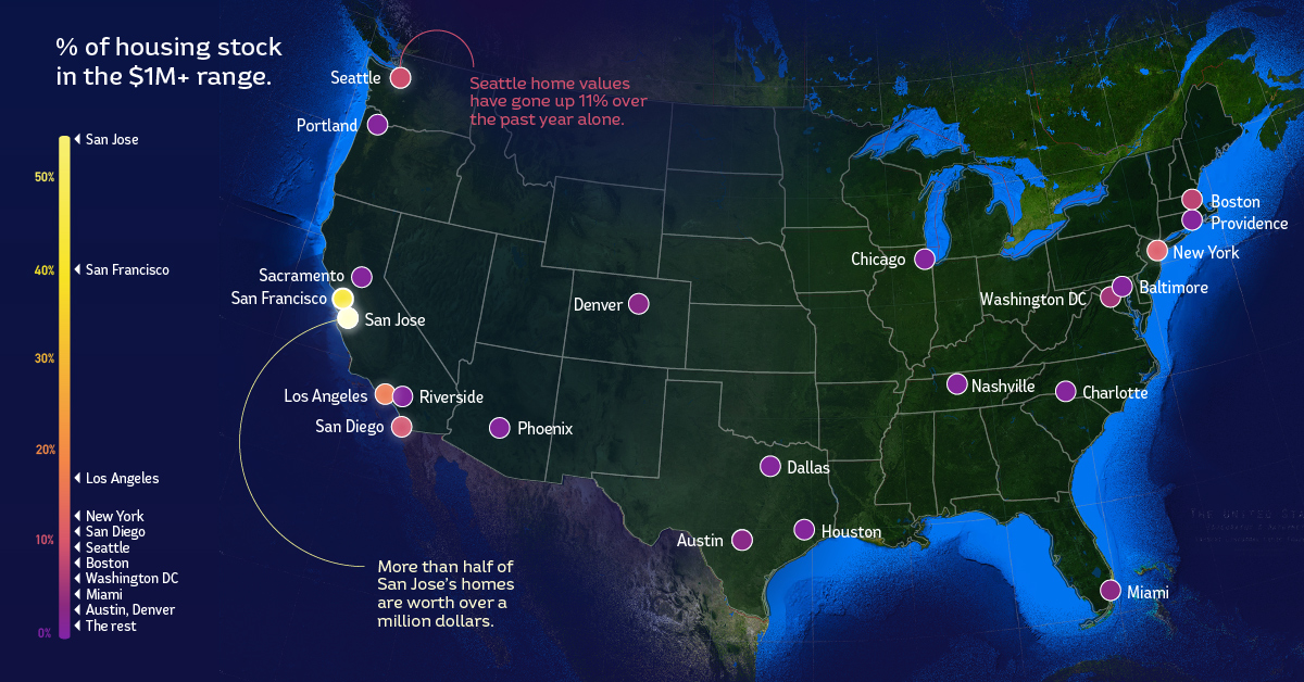
Mapped: The 22 Cities With the Most $1 Million Homes in the U.S.
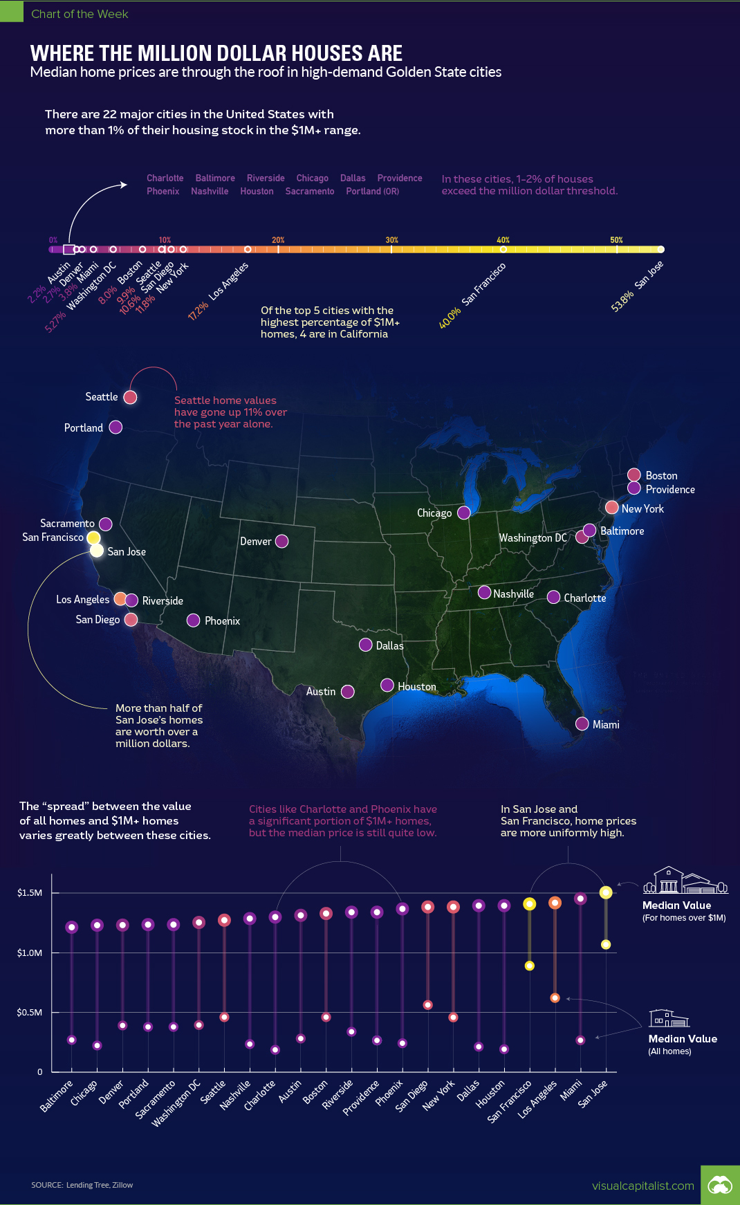
Map: The 22 Cities With the Most $1 Million Homes
Throughout most of America, owning a $1 million home gives you definite bragging rights – it means you may have six bedrooms, 5,000 square feet, an infinity pool, and at least a few acres of property.
But along the coasts – and particularly in California – the two comma club has lost most of its novelty. That’s because in some places, like San Jose, CA, the majority (53.8%) of homes are already soaring past the $1 million mark, despite most of them looking nothing more than ordinary.
$1 Million Homes by City
Today’s chart uses data from a study by LendingTree, which ranks the largest 50 U.S. cities by the percentage of million dollar homes in each metro area. The data from the study was pulled out of a database of 155 million property prices throughout the country.
Here are the 22 U.S. cities that have at least 1% of their housing stock exceeding the $1 million value mark:
| Rank | City | % of $1mm homes | Median home price |
|---|---|---|---|
| #1 | San Jose, CA | 53.81% | $1,069,000 |
| #2 | San Francisco, CA | 40.03% | $891,000 |
| #3 | Los Angeles, CA | 17.23% | $622,000 |
| #4 | New York, NY | 11.81% | $454,000 |
| #5 | San Diego, CA | 10.55% | $563,000 |
| #6 | Seattle, WA | 9.90% | $461,000 |
| #7 | Boston, MA | 7.95% | $459,000 |
| #8 | Washington, DC | 5.27% | $395,000 |
| #9 | Miami, FL | 3.79% | $267,000 |
| #10 | Denver, CO | 2.65% | $391,000 |
| #11 | Austin, TX | 2.16% | $282,000 |
| #12 | Portland, OR | 1.95% | $378,000 |
| #13 | Sacramento, CA | 1.72% | $378,000 |
| #15 | Nashville, TN | 1.52% | $235,000 |
| #14 | Houston, TX | 1.52% | $192,000 |
| #16 | Phoenix, AZ | 1.51% | $242,000 |
| #17 | Providence, RI | 1.32% | $266,000 |
| #18 | Dallas, TX | 1.31% | $213,000 |
| #19 | Chicago, IL | 1.30% | $223,000 |
| #20 | Riverside, CA | 1.12% | $332,000 |
| #21 | Baltimore, MD | 1.07% | $270,000 |
| #22 | Charlotte, NC | 1.02% | $187,000 |
The data looks pretty telling, with four of the top five cities being located in California. In each of those cities, more than 10% of all homes have surpassed the $1 million mark.
In the Bay Area specifically, prices are amplified even further: San Francisco (40.0%) and San Jose (53.8%) have by far more $1 million homes than other major cities in the country. It’s also worth noting that in San Jose, the median price of all homes is a whopping $1,069,000.
You can just imagine what houses might cost in some of the Silicon Valley towns like Mountain View or Palo Alto, or just over the Golden Gate Bridge in Marin County.
The Bottom of the List
While the above chart shows the 22 U.S. cities with the most $1 million homes, LendingTree also listed the major cities in the country with the fewest.
Buffalo, located in upstate New York, takes this title, with only 0.10% of homes passing the mark and an overall median home price of just $141,000. So, to buy the average home in San Jose, you’d need to sell off about eight average houses in Buffalo.
The other cities with the smallest concentrations of million dollar homes are also located in the Great Lakes and Midwest regions: Pittsburgh (0.17%), Hartford (0.18%), Cleveland (0.19%), and Indianapolis (0.27%).


Markets
U.S. Debt Interest Payments Reach $1 Trillion
U.S. debt interest payments have surged past the $1 trillion dollar mark, amid high interest rates and an ever-expanding debt burden.


U.S. Debt Interest Payments Reach $1 Trillion
This was originally posted on our Voronoi app. Download the app for free on iOS or Android and discover incredible data-driven charts from a variety of trusted sources.
The cost of paying for America’s national debt crossed the $1 trillion dollar mark in 2023, driven by high interest rates and a record $34 trillion mountain of debt.
Over the last decade, U.S. debt interest payments have more than doubled amid vast government spending during the pandemic crisis. As debt payments continue to soar, the Congressional Budget Office (CBO) reported that debt servicing costs surpassed defense spending for the first time ever this year.
This graphic shows the sharp rise in U.S. debt payments, based on data from the Federal Reserve.
A $1 Trillion Interest Bill, and Growing
Below, we show how U.S. debt interest payments have risen at a faster pace than at another time in modern history:
| Date | Interest Payments | U.S. National Debt |
|---|---|---|
| 2023 | $1.0T | $34.0T |
| 2022 | $830B | $31.4T |
| 2021 | $612B | $29.6T |
| 2020 | $518B | $27.7T |
| 2019 | $564B | $23.2T |
| 2018 | $571B | $22.0T |
| 2017 | $493B | $20.5T |
| 2016 | $460B | $20.0T |
| 2015 | $435B | $18.9T |
| 2014 | $442B | $18.1T |
| 2013 | $425B | $17.2T |
| 2012 | $417B | $16.4T |
| 2011 | $433B | $15.2T |
| 2010 | $400B | $14.0T |
| 2009 | $354B | $12.3T |
| 2008 | $380B | $10.7T |
| 2007 | $414B | $9.2T |
| 2006 | $387B | $8.7T |
| 2005 | $355B | $8.2T |
| 2004 | $318B | $7.6T |
| 2003 | $294B | $7.0T |
| 2002 | $298B | $6.4T |
| 2001 | $318B | $5.9T |
| 2000 | $353B | $5.7T |
| 1999 | $353B | $5.8T |
| 1998 | $360B | $5.6T |
| 1997 | $368B | $5.5T |
| 1996 | $362B | $5.3T |
| 1995 | $357B | $5.0T |
| 1994 | $334B | $4.8T |
| 1993 | $311B | $4.5T |
| 1992 | $306B | $4.2T |
| 1991 | $308B | $3.8T |
| 1990 | $298B | $3.4T |
| 1989 | $275B | $3.0T |
| 1988 | $254B | $2.7T |
| 1987 | $240B | $2.4T |
| 1986 | $225B | $2.2T |
| 1985 | $219B | $1.9T |
| 1984 | $205B | $1.7T |
| 1983 | $176B | $1.4T |
| 1982 | $157B | $1.2T |
| 1981 | $142B | $1.0T |
| 1980 | $113B | $930.2B |
| 1979 | $96B | $845.1B |
| 1978 | $84B | $789.2B |
| 1977 | $69B | $718.9B |
| 1976 | $61B | $653.5B |
| 1975 | $55B | $576.6B |
| 1974 | $50B | $492.7B |
| 1973 | $45B | $469.1B |
| 1972 | $39B | $448.5B |
| 1971 | $36B | $424.1B |
| 1970 | $35B | $389.2B |
| 1969 | $30B | $368.2B |
| 1968 | $25B | $358.0B |
| 1967 | $23B | $344.7B |
| 1966 | $21B | $329.3B |
Interest payments represent seasonally adjusted annual rate at the end of Q4.
At current rates, the U.S. national debt is growing by a remarkable $1 trillion about every 100 days, equal to roughly $3.6 trillion per year.
As the national debt has ballooned, debt payments even exceeded Medicaid outlays in 2023—one of the government’s largest expenditures. On average, the U.S. spent more than $2 billion per day on interest costs last year. Going further, the U.S. government is projected to spend a historic $12.4 trillion on interest payments over the next decade, averaging about $37,100 per American.
Exacerbating matters is that the U.S. is running a steep deficit, which stood at $1.1 trillion for the first six months of fiscal 2024. This has accelerated due to the 43% increase in debt servicing costs along with a $31 billion dollar increase in defense spending from a year earlier. Additionally, a $30 billion increase in funding for the Federal Deposit Insurance Corporation in light of the regional banking crisis last year was a major contributor to the deficit increase.
Overall, the CBO forecasts that roughly 75% of the federal deficit’s increase will be due to interest costs by 2034.

-

 Real Estate2 weeks ago
Visualizing America’s Shortage of Affordable Homes
-

 Technology1 week ago
Ranked: Semiconductor Companies by Industry Revenue Share
-

 Money2 weeks ago
Which States Have the Highest Minimum Wage in America?
-

 Real Estate2 weeks ago
Ranked: The Most Valuable Housing Markets in America
-

 Markets2 weeks ago
Charted: Big Four Market Share by S&P 500 Audits
-

 AI2 weeks ago
The Stock Performance of U.S. Chipmakers So Far in 2024
-

 Automotive2 weeks ago
Almost Every EV Stock is Down After Q1 2024
-

 Money2 weeks ago
Where Does One U.S. Tax Dollar Go?