Money
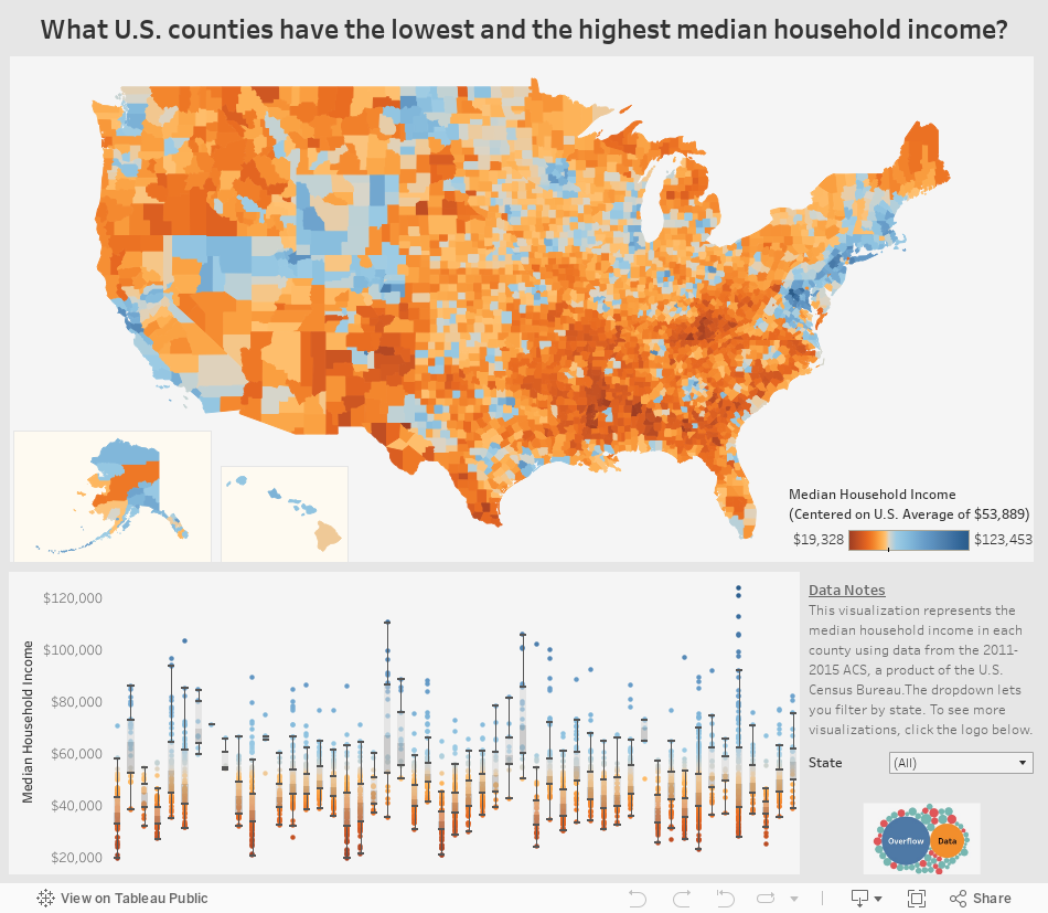
Interactive: Visualizing Median Income For All 3,000+ U.S. Counties
var divElement = document.getElementById(‘viz1503420628886’); var vizElement = divElement.getElementsByTagName(‘object’)[0]; if ( divElement.offsetWidth > 800 ) { vizElement.style.width=’954px’;vizElement.style.height=’869px’;} else if ( divElement.offsetWidth > 500 ) { vizElement.style.width=’954px’;vizElement.style.height=’869px’;} else { vizElement.style.width=’100%’;vizElement.style.height=’1136px’;} var scriptElement = document.createElement(‘script’); scriptElement.src = ‘https://public.tableau.com/javascripts/api/viz_v1.js’; vizElement.parentNode.insertBefore(scriptElement, vizElement);
Interactive: Visualizing Median Income for All 3,000+ U.S. Counties
When thinking about the United States and its economy, we often think in terms of maps.
That’s why we have previously visualized the country’s $18 trillion economy by comparing specific regions to similarly sized countries. It’s also why we have shown the extreme variance in population distribution across counties, or highlighted the average income of the “Top 1%” throughout the country.
But there is perhaps nothing more telling or interesting to explore than the “granddaddy” of all economic maps: an interactive visualization of median household income.
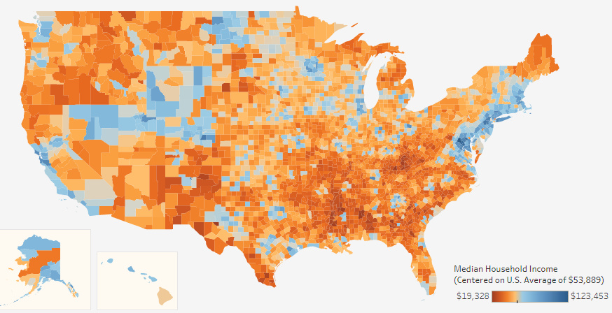
That’s why today’s fantastic interactive map from Overflow Data is such a treat. It covers all 3,007 U.S. counties using color coding to show the richest and poorest counties based on median income, and it also allows users to drill down to the stats on counties at the state level.
Coasts, Mountains, and Oil
While the areas around coastal cities like San Francisco, Los Angeles, New York City, Boston, or Washington, D.C. are often thought of as the wealthier parts of the country, this map helps reveal two other “belts” in the country with median incomes well above the national average of $53,889.
The first is in the mountains through states like Utah, Colorado, Wyoming and even parts of Nevada – where there is a cluster of more than 40 counties with median incomes of $60,000 or above. Aside from upscale ski areas in places like Summit County, UT or Jackson, WY, the counties in this belt also feature cities like Boulder, CO, or Salt Lake City, UT.
Areas that are rich in natural resources, such as parts of Alaska, Texas, and North Dakota, also tend to have more counties with above average median incomes. For example, Williams County, ND, is in the middle of the Bakken oilfield – and the median household income there is $88,013.
In Alaska, the northernmost county of North Slope Borough has less than 8,000 residents, but they boast a median household income of $72,576.
Tougher Times
On this map, the less wealthy areas are also very evident – and they tend to be most concentrated in the Southeast region of the country.
Many states, including ones like Kentucky, Alabama, Mississippi, Montana, Louisiana, Missouri, New Mexico, Arkansas, Texas, West Virginia, North Carolina, South Carolina, and South Dakota, all have some counties that are at the very low end of median income spectrum.
More specifically, there are only two counties in the country that have income levels below $20,000: Sumter County, AL, and McCreary County, KY.


Money
Charted: Who Has Savings in This Economy?
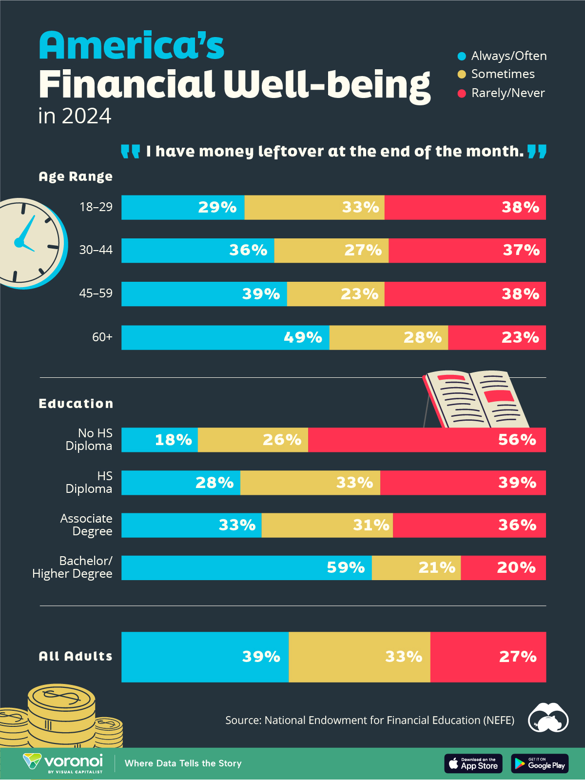
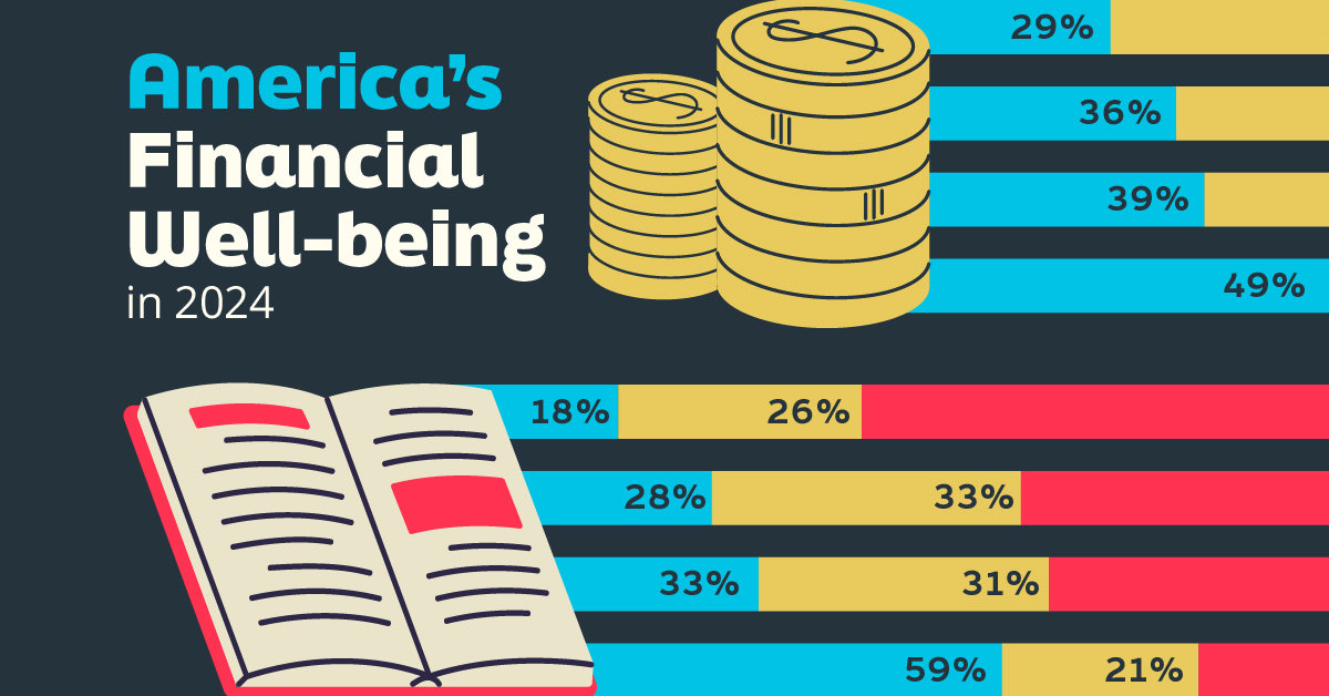
Older, better-educated adults are winning the savings game, reveals a January survey by the National Opinion Research Center at the University of Chicago.
Who Has Savings in This Economy?
This was originally posted on our Voronoi app. Download the app for free on iOS or Android and discover incredible data-driven charts from a variety of trusted sources.
Two full years of inflation have taken their toll on American households. In 2023, the country’s collective credit card debt crossed $1 trillion for the first time. So who is managing to save money in the current economic environment?
We visualize the percentage of respondents to the statement “I have money leftover at the end of the month” categorized by age and education qualifications. Data is sourced from a National Endowment for Financial Education (NEFE) report, published last month.
The survey for NEFE was conducted from January 12-14, 2024, by the National Opinion Research Center at the University of Chicago. It involved 1,222 adults aged 18+ and aimed to be representative of the U.S. population.
Older Americans Save More Than Their Younger Counterparts
General trends from this dataset indicate that as respondents get older, a higher percentage of them are able to save.
| Age | Always/Often | Sometimes | Rarely/Never |
|---|---|---|---|
| 18–29 | 29% | 33% | 38% |
| 30–44 | 36% | 27% | 37% |
| 45–59 | 39% | 23% | 38% |
| Above 60 | 49% | 28% | 23% |
| All Adults | 39% | 33% | 27% |
Note: Percentages are rounded and may not sum to 100.
Perhaps not surprisingly, those aged 60+ are the age group with the highest percentage saying they have leftover money at the end of the month. This age group spent the most time making peak earnings in their careers, are more likely to have investments, and are more likely to have paid off major expenses like a mortgage or raising a family.
The Impact of Higher Education on Earnings and Savings
Based on this survey, higher education dramatically improves one’s ability to save. Shown in the table below, those with a bachelor’s degree or higher are three times more likely to have leftover money than those without a high school diploma.
| Education | Always/Often | Sometimes | Rarely/Never |
|---|---|---|---|
| No HS Diploma | 18% | 26% | 56% |
| HS Diploma | 28% | 33% | 39% |
| Associate Degree | 33% | 31% | 36% |
| Bachelor/Higher Degree | 59% | 21% | 20% |
| All Adults | 39% | 33% | 27% |
Note: Percentages are rounded and may not sum to 100.
As the Bureau of Labor Statistics notes, earnings improve with every level of education completed.
For example, those with a high school diploma made 25% more than those without in 2022. And as the qualifications increase, the effects keep stacking.
Meanwhile, a Federal Reserve study also found that those with more education tended to make financial decisions that contributed to building wealth, of which the first step is to save.

-

 Green1 week ago
Ranked: The Countries With the Most Air Pollution in 2023
-

 Automotive2 weeks ago
Almost Every EV Stock is Down After Q1 2024
-

 AI2 weeks ago
The Stock Performance of U.S. Chipmakers So Far in 2024
-

 Markets2 weeks ago
Charted: Big Four Market Share by S&P 500 Audits
-

 Real Estate2 weeks ago
Ranked: The Most Valuable Housing Markets in America
-

 Money2 weeks ago
Which States Have the Highest Minimum Wage in America?
-

 AI2 weeks ago
Ranked: Semiconductor Companies by Industry Revenue Share
-

 Travel2 weeks ago
Ranked: The World’s Top Flight Routes, by Revenue