Inequality
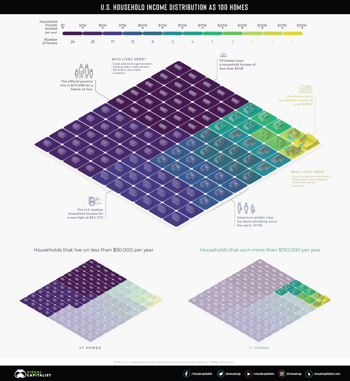
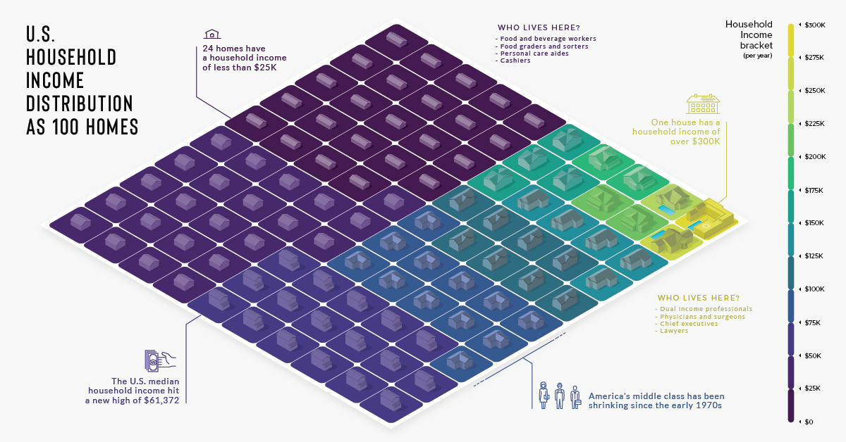
Household Income Distribution in the U.S. Visualized as 100 Homes
View a high resolution version of this graphic.
Household Income in the U.S. Visualized as 100 Homes
View the high resolution version of today’s graphic by clicking here.
Inequality in America has become a major talking point in recent years. For many people though, the concept of inequality – the idea that wealth is spread very thinly at the lower end of the socioeconomic ladder – is still an abstract concept.
There are over 125 million households in the United States, each with their own unique structure and financial situation, so understanding such a complex issue requires reducing it to proportions we can understand.
American Households as a Neighborhood
In the visualization above, American households are distilled down into 100 homes, then color-coded into $25,000 income increments.
One house is allocated for those making $300,000 and more per year. On the other end of the scale, we can see that 24 of the households earn $25,000 per year or less, and nearly half of the households have an annual income lower than $50,000.
Here is a more granular breakdown of numbers, this time from a slightly different data source (U.S. Census Bureau’s 2017 Household Income Survey):
| Income Bracket | Households (Millions) | Share of Total |
|---|---|---|
| Less than $15,000 | 14.1 | 11.2% |
| $15,000 - $24,999 | 12.1 | 9.6% |
| $25,000 - $34,999 | 11.9 | 9.4% |
| $35,000 - $49,999 | 16.3 | 12.9% |
| $50,000 - $74,999 | 21.5 | 17.0% |
| $75,000 - $99,999 | 15.5 | 12.3% |
| $100,000 - $149,999 | 17.8 | 14.1% |
| $150,000 - $199,999 | 8.3 | 6.6% |
| $200,000 and up | 8.8 | 7.0% |
Households between $35,000 and $100,000 are generally considered middle class. That said, the geographical location of where a household is located also makes a big difference.
The Power of Place
Not surprisingly, cost of living strongly influences your household’s place on the income spectrum.
In El Paso, Texas, a $50,000 income places a household of four people in the middle class. However, in a more expensive metro area, like San Diego, that same income lands your household in a lower income tier. Here’s a closer look at the cost of typical expenses in the two metros:
| Expense | El Paso, TX | San Diego, CA | Cost difference |
|---|---|---|---|
| Home price | $239,285.67 | $755,273.67 | ⬆︎ 216% |
| Apartment rent | $945.92 | $1,961.55 | ⬆︎ 107% |
| Energy cost | $133.53 | $213.96 | ⬆︎ 60% |
| Dentist visit | $89.08 | $104.25 | ⬆︎ 17% |
| Coffee | $4.47 | $5.39 | ⬆︎ 20% |
| Hamburger | $3.56 | $4.35 | ⬆︎ 22% |
| Gasoline | $2.31 | $3.31 | ⬆︎ 44% |
Mixed Messages
The median household income in the U.S. continues setting new monthly records, and we’ve just seen this decade’s largest year-over-year increase in individual wages.
One side effect of this economic growth is that households in the top wage bracket – the well-appointed yellow square in our visualization – have a tendency to reap outsized rewards. So, for now, as America’s economy trends upward, so does its Gini Coefficient.


Money
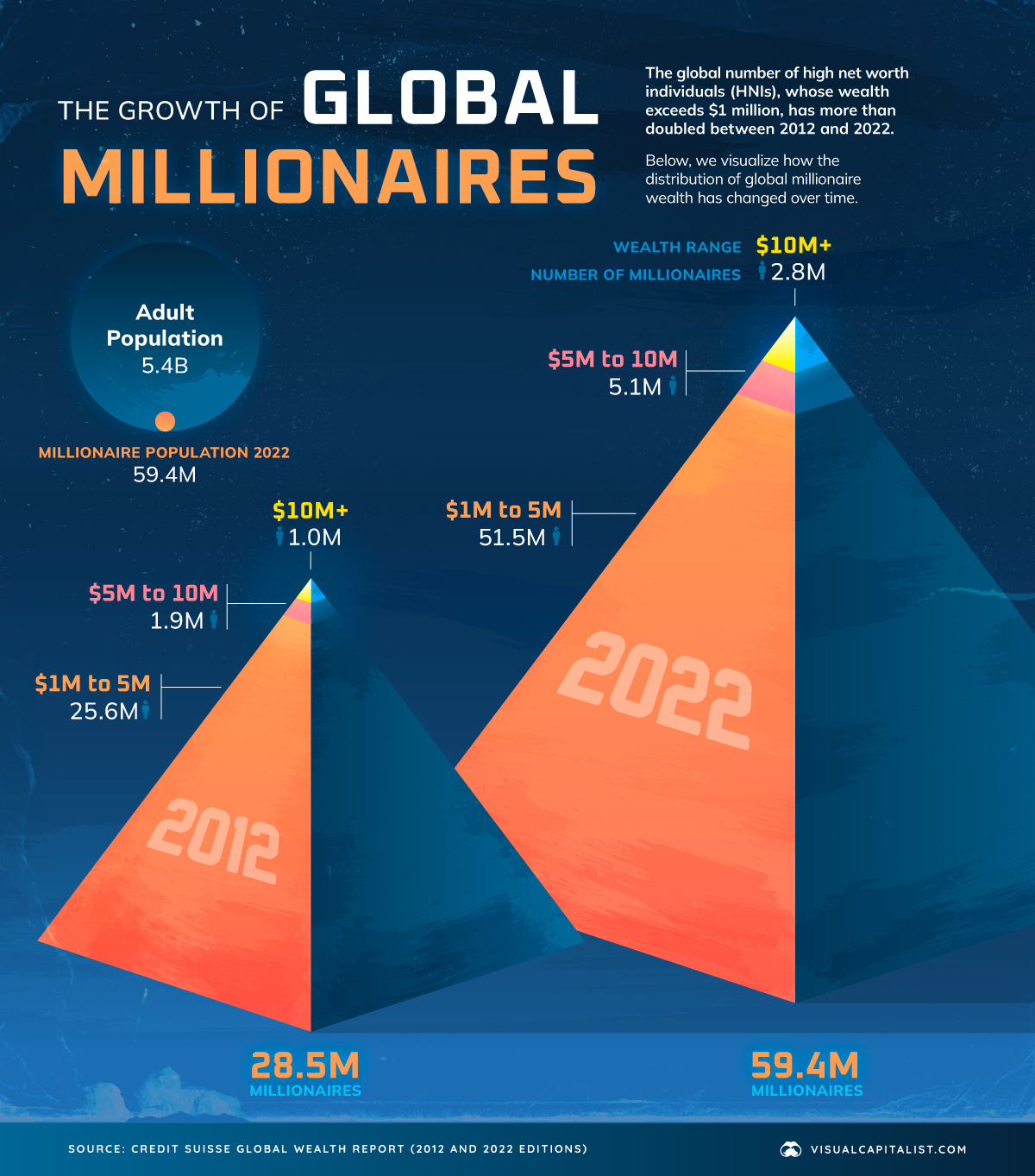
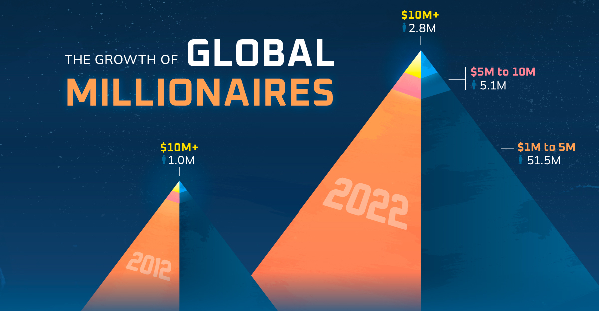
Visualizing the World’s Growing Millionaire Population (2012-2022)
The world’s millionaire population has more than doubled in the last decade between 2012 and 2022. We visualize these numbers here.
Visualizing the World’s Growing Millionaire Population
Reaping the rewards of tech revolutions, market booms, and more, the last decade has seen a remarkable increase in the global number of millionaires.
In 2022, 1.1% of all of the world’s adults were millionaires, up from 0.6% in 2012.
In today’s visualization, we dive into the world’s growing millionaire population using data from this year’s Global Wealth Report by Credit Suisse.
The Global Millionaire Population, Then and Now
In 2022, total millionaire wealth stood at $208.3 trillion, accounting for 45.8% of global wealth. That represents a 138% increase from 2011, when millionaires held $87.5 trillion in wealth.
While the rise can be attributed to a number of factors, financial assets have accounted for most of the increase in total wealth since the 2008 Financial Crisis, according to Credit Suisse.
Here’s a look at the explosive growth in the number of millionaires from 2012 to 2022:
| Wealth range | Number of adults (2012) | Number of adults (2022) |
|---|---|---|
| $1-5M | 25.6 million | 51.5 million |
| $5-10M | 1.9 million | 5.1 million |
| >$10M | 1.0 million | 2.8 million |
At the very apex of these pyramids, the number of ultra-high-net-worth individuals (all holding $50 million or more in wealth) has nearly tripled over the last decade.
Where are the world’s millionaires mostly found?
- 42%: North America
- 27%: Europe
- 16%: Asia-Pacific (ex. China and India)
- 10%: China
- 5%: Rest of the World
In total, the world’s millionaire population amounted to 59.4 million adults in 2022.
Despite inflation, interest rates, and current market conditions hampering wealth creation for many in 2022 and 2023, Credit Suisse forecasts that the number of millionaires will still grow to 86 million by 2027, a 45% increase from 2022.
The Outlook for Wealth Inequality
Although wealth inequality fell slightly in 2022, a significant chunk of overall global wealth still belongs to the wealthiest parts of the population.
In stark contrast to millionaires, 52.5% of the world’s adults had less than $10,000 in wealth, and combined for just 1.2% of global wealth.
From a big picture perspective, however, worldwide wealth inequality has trended downward over the last two decades. That is, before the 2020–2021 period when the wealth gap was exacerbated due to the pandemic and the subsequent boom in share and house prices.
Looking ahead to 2027, Credit Suisse forecasts that the share of adults with less than $10,000 in wealth will fall, with more adults moving into the middle and upper income levels. It’ll be interesting to see if global wealth inequality continues its long-term downward trajectory.
Where does this data come from?
Source: Credit Suisse Global Wealth Report (2022 and 2012 versions)

-
 Business2 weeks ago
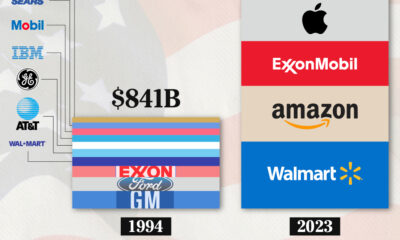
America’s Top Companies by Revenue (1994 vs. 2023)
-

 Environment1 week ago
Ranked: Top Countries by Total Forest Loss Since 2001
-

 Markets2 weeks ago
Visualizing America’s Shortage of Affordable Homes
-

 Maps2 weeks ago
Mapped: Average Wages Across Europe
-

 Mining2 weeks ago
Charted: The Value Gap Between the Gold Price and Gold Miners
-

 Demographics2 weeks ago
Visualizing the Size of the Global Senior Population
-

 Misc2 weeks ago
Tesla Is Once Again the World’s Best-Selling EV Company
-

 Technology2 weeks ago
Ranked: The Most Popular Smartphone Brands in the U.S.