Money
How Financially Literate Are You With Investing?
Are You Financially Literate?
If you’ve ever paid attention to any report on financial literacy from around the world, you’ll likely know that the results aren’t exactly awe-inspiring.
For example, according to one global survey, only about 33% of adults are financially literate.
Americans tend to fare better on average, but not as much as you might imagine. In fact, as we showed in our infographic on the Financial Literacy Problem, one ongoing survey actually sees average U.S. performance slowly dropping over time.
It raises the question: what do people actually know about money, investing, and wealth?
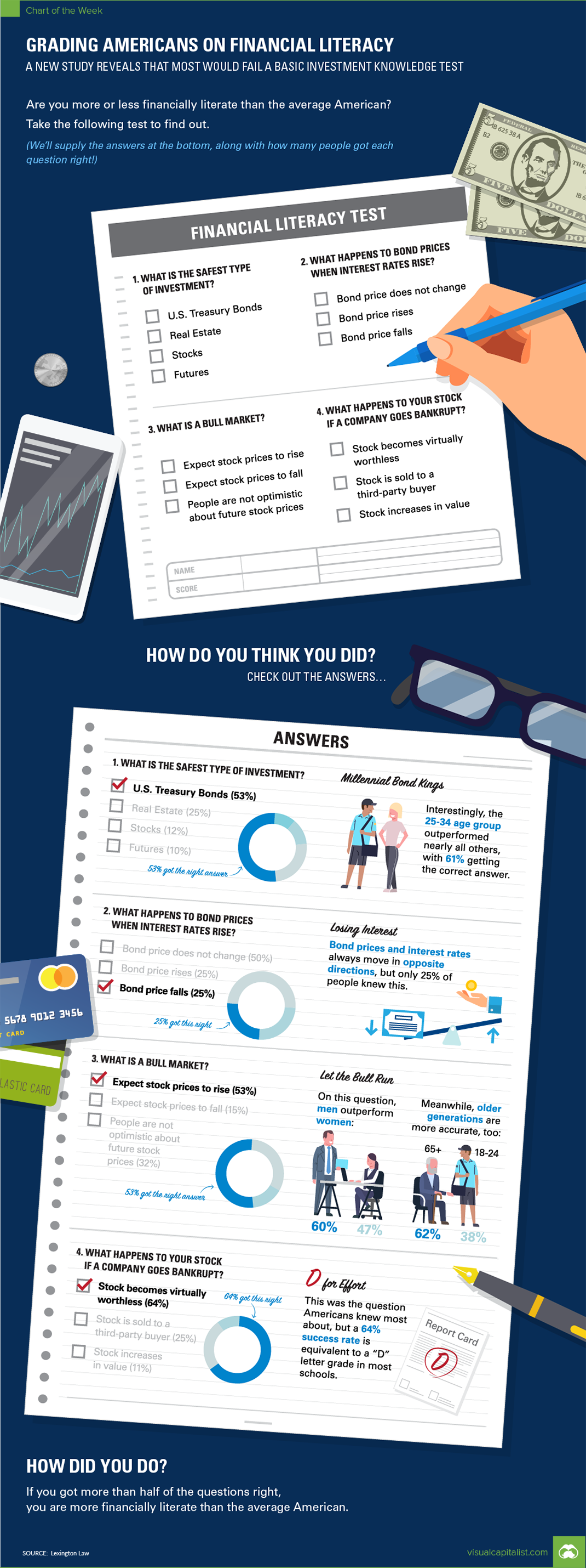
Investment Literacy
A recent poll by Lexington Law aimed to get a sense of U.S. financial literacy, with a focus on basic investment knowledge on stocks, bonds, and building a safe portfolio.
Specifically, it asked 4,000 Americans four different multiple choice questions:
- What is the safest investment type?
- What happens to bond prices when interest rates rise?
- What is a bull market?
- What happens to your stock if a company goes bankrupt?
If you think you know the answers to even two of these questions, you are off to a good start!
The survey ultimately found that the average score on this test was 48.8% – meaning that Americans get slightly fewer than two questions correct on average.
Cheat Sheet
Question #1: Safest Investment
Based on the options provided on the multiple choice, the correct answer was Treasury Bonds. Roughly 53% of Americans would get this right, if asked.
Question #2: Bond Prices
Only 25% of respondents said that bond prices would decrease if interest rates rise, which is the correct answer. To be fair, this relationship is somewhat counterintuitive.
Question #3: Bull Market
With the current bull market becoming the longest in history this month, this terminology has been all over the news. That said, just 53% of respondents understood a bull market to be a period in which stock prices are expected to rise.
Question #4: Bankruptcy
If you own a stock and the company goes bankrupt, what happens? Interestingly, people fared best on this question, with 64% realizing that the stock becomes “virtually worthless”. It’s worth noting, however, that a 64% success rate is still the grading equivalent of a “D”.
How did you do on this test – are you financially literate about investments? Where did you go wrong?
If you need to brush up on investing knowledge, don’t forget to visit our Wealth 101 project that features easy-to-use infographics about personal finance topics.


Money
How Debt-to-GDP Ratios Have Changed Since 2000
See how much the debt-to-GDP ratios of advanced economies have grown (or shrank) since the year 2000.


How Debt-to-GDP Ratios Have Changed Since 2000
This was originally posted on our Voronoi app. Download the app for free on Apple or Android and discover incredible data-driven charts from a variety of trusted sources.
Government debt levels have grown in most parts of the world since the 2008 financial crisis, and even more so after the COVID-19 pandemic.
To gain perspective on this long-term trend, we’ve visualized the debt-to-GDP ratios of advanced economies, as of 2000 and 2024 (estimated). All figures were sourced from the IMF’s World Economic Outlook.
Data and Highlights
The data we used to create this graphic is listed in the table below. “Government gross debt” consists of all liabilities that require payment(s) of interest and/or principal in the future.
| Country | 2000 (%) | 2024 (%) | Change (pp) |
|---|---|---|---|
| 🇯🇵 Japan | 135.6 | 251.9 | +116.3 |
| 🇸🇬 Singapore | 82.3 | 168.3 | +86.0 |
| 🇺🇸 United States | 55.6 | 126.9 | +71.3 |
| 🇬🇧 United Kingdom | 36.6 | 105.9 | +69.3 |
| 🇬🇷 Greece | 104.9 | 160.2 | +55.3 |
| 🇫🇷 France | 58.9 | 110.5 | +51.6 |
| 🇵🇹 Portugal | 54.2 | 104.0 | +49.8 |
| 🇪🇸 Spain | 57.8 | 104.7 | +46.9 |
| 🇸🇮 Slovenia | 25.9 | 66.5 | +40.6 |
| 🇫🇮 Finland | 42.4 | 76.5 | +34.1 |
| 🇭🇷 Croatia | 35.4 | 61.8 | +26.4 |
| 🇨🇦 Canada | 80.4 | 103.3 | +22.9 |
| 🇨🇾 Cyprus | 56.0 | 70.9 | +14.9 |
| 🇦🇹 Austria | 65.7 | 74.0 | +8.3 |
| 🇸🇰 Slovak Republic | 50.5 | 56.5 | +6.0 |
| 🇩🇪 Germany | 59.3 | 64.0 | +4.7 |
| 🇧🇪 Belgium | 109.6 | 106.8 | -2.8 |
| 🇮🇱 Israel | 77.4 | 56.8 | -20.6 |
| 🇮🇸 Iceland | 75.8 | 54.6 | -21.2 |
The debt-to-GDP ratio indicates how much a country owes compared to the size of its economy, reflecting its ability to manage and repay debts. Percentage point (pp) changes shown above indicate the increase or decrease of these ratios.
Countries with the Biggest Increases
Japan (+116 pp), Singapore (+86 pp), and the U.S. (+71 pp) have grown their debt as a percentage of GDP the most since the year 2000.
All three of these countries have stable, well-developed economies, so it’s unlikely that any of them will default on their growing debts. With that said, higher government debt leads to increased interest payments, which in turn can diminish available funds for future government budgets.
This is a rising issue in the U.S., where annual interest payments on the national debt have surpassed $1 trillion for the first time ever.
Only 3 Countries Saw Declines
Among this list of advanced economies, Belgium (-2.8 pp), Iceland (-21.2 pp), and Israel (-20.6 pp) were the only countries that decreased their debt-to-GDP ratio since the year 2000.
According to Fitch Ratings, Iceland’s debt ratio has decreased due to strong GDP growth and the use of its cash deposits to pay down upcoming maturities.
See More Debt Graphics from Visual Capitalist
Curious to see which countries have the most government debt in dollars? Check out this graphic that breaks down $97 trillion in debt as of 2023.

-

 Markets2 weeks ago
Visualizing America’s Shortage of Affordable Homes
-

 Technology1 week ago
Ranked: Semiconductor Companies by Industry Revenue Share
-

 Money2 weeks ago
Which States Have the Highest Minimum Wage in America?
-

 Real Estate2 weeks ago
Ranked: The Most Valuable Housing Markets in America
-

 Business2 weeks ago
Charted: Big Four Market Share by S&P 500 Audits
-

 AI2 weeks ago
The Stock Performance of U.S. Chipmakers So Far in 2024
-

 Misc2 weeks ago
Almost Every EV Stock is Down After Q1 2024
-

 Money2 weeks ago
Where Does One U.S. Tax Dollar Go?