Misc
Data Visualization and Cholera: An Unexpected Connection
View a high resolution version of this graphic
Data Visualization and Cholera: An Unexpected Connection
Necessity is the mother of invention, and in the mid-1800s, understanding the spread of cholera was a matter of life and death.
Ruthless Efficiency
Cholera was a ruthlessly efficient killer, with both rapid onset and severe symptoms. By the time the disease made its way to London and New York in the early 1830s, hundreds of thousands of people had died across Europe, Africa, and Asia.
Not only our personal and national interests, […] it may be said without exaggeration, [that cholera] concerns the whole human race.
– Thomas Whiteside Hime
Needless to say, the human race was concerned. Thanks to high-speed printing press technology, daily newspaper circulations were rising dramatically, and this allowed journalists to experiment with new reporting techniques, including charting data.
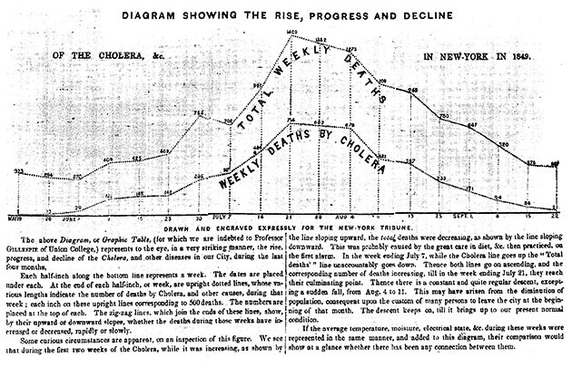
At the time, the chart above was such a novel approach that it required four paragraphs to explain how to read it. People of that era were simply not used to seeing data in a visual form. At a glance though, the chart is extremely effective at communicating a grim message: cholera had ravaged New York City over the summer of 1849.
Despite the concerted push to eradicate the disease, the medical community was still largely in the dark about how to prevent future outbreaks. Because doctors could treat numerous patients without falling ill, it was assumed that a miasmic environment (i.e. slums, densely-packed housing) was causing the spread.
Data Viz in the Time of Cholera
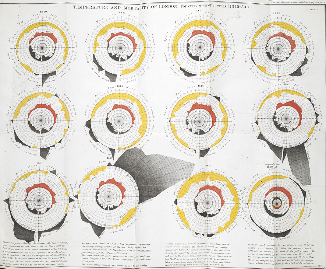
Today, we have tools that allow us to map just about anything, but in the mid-1800s, mapping data was still an innovative concept.
As early as the 1830s, geographers began using spatial analysis to study cholera epidemiology. The heat map below shows which sections of Paris were hardest hit by a recent outbreak of cholera.

In 1854, Dr. John Snow was convinced that cholera was spreading via tainted water and decided to display neighborhood mortality data directly on a map. This method clearly revealed a cluster of cases around a specific pump.

View the full version of the map here
The result is one of the most influential maps in modern history.
In addition to the real-world utility the map provided in helping physicians understand how cholera was spreading, it also exemplified a seismic shift in thinking that opened up new avenues for data to be analyzed and displayed.
Despite the tragic circumstances of the time period, we can be thankful that the urgency of the situation allowed the world’s pioneering researchers, journalists, and physicians to experiment with new data visualization techniques to better understand the world.


VC+
VC+: Get Our Key Takeaways From the IMF’s World Economic Outlook
A sneak preview of the exclusive VC+ Special Dispatch—your shortcut to understanding IMF’s World Economic Outlook report.

Have you read IMF’s latest World Economic Outlook yet? At a daunting 202 pages, we don’t blame you if it’s still on your to-do list.
But don’t worry, you don’t need to read the whole April release, because we’ve already done the hard work for you.
To save you time and effort, the Visual Capitalist team has compiled a visual analysis of everything you need to know from the report—and our upcoming VC+ Special Dispatch will be available exclusively to VC+ members on Thursday, April 25th.
If you’re not already subscribed to VC+, make sure you sign up now to receive the full analysis of the IMF report, and more (we release similar deep dives every week).
For now, here’s what VC+ members can expect to receive.
Your Shortcut to Understanding IMF’s World Economic Outlook
With long and short-term growth prospects declining for many countries around the world, this Special Dispatch offers a visual analysis of the key figures and takeaways from the IMF’s report including:
- The global decline in economic growth forecasts
- Real GDP growth and inflation forecasts for major nations in 2024
- When interest rate cuts will happen and interest rate forecasts
- How debt-to-GDP ratios have changed since 2000
- And much more!

Get the Full Breakdown in the Next VC+ Special Dispatch
VC+ members will receive the full Special Dispatch on Thursday, April 25th.
Make sure you join VC+ now to receive exclusive charts and the full analysis of key takeaways from IMF’s World Economic Outlook.
Don’t miss out. Become a VC+ member today.
What You Get When You Become a VC+ Member
VC+ is Visual Capitalist’s premium subscription. As a member, you’ll get the following:
- Special Dispatches: Deep dive visual briefings on crucial reports and global trends
- Markets This Month: A snappy summary of the state of the markets and what to look out for
- The Trendline: Weekly curation of the best visualizations from across the globe
- Global Forecast Series: Our flagship annual report that covers everything you need to know related to the economy, markets, geopolitics, and the latest tech trends
- VC+ Archive: Hundreds of previously released VC+ briefings and reports that you’ve been missing out on, all in one dedicated hub
You can get all of the above, and more, by joining VC+ today.

-

 Markets1 week ago
U.S. Debt Interest Payments Reach $1 Trillion
-

 Business2 weeks ago
Charted: Big Four Market Share by S&P 500 Audits
-

 Real Estate2 weeks ago
Ranked: The Most Valuable Housing Markets in America
-

 Money2 weeks ago
Which States Have the Highest Minimum Wage in America?
-

 AI2 weeks ago
Ranked: Semiconductor Companies by Industry Revenue Share
-

 Markets2 weeks ago
Ranked: The World’s Top Flight Routes, by Revenue
-

 Demographics2 weeks ago
Population Projections: The World’s 6 Largest Countries in 2075
-

 Markets2 weeks ago
The Top 10 States by Real GDP Growth in 2023