Misc
The Data on Death: How Perceived Causes Differ from Reality
The saying goes that nothing in this world is certain except for death and taxes.
And rightfully so, the inevitability of death is a prominent fear for many humans around the world. After all, death is universal, mysterious, immutable, and sometimes sudden – and it can shake up life in ways that no other event can.
But is how we perceive death, along with its common portrayal in media, something that is accurate?
Perceptions vs. Reality
Like anything that is shrouded in mystery, death has accumulated its fair share of myths and half-truths that get baked into our stories, perceptions, and societies.
Even further, high-profile and tragic events like terrorist attacks, murders, and suicides dominate many aspects of the news cycle. As a result, the causes of death that media outlets are the most fixated on couldn’t be further from actual causes of human death as shown through statistics.
The following animation, which comes from Aaron Penne, compares three data sets to show that our worries and media coverage have become quite disproportionate from the actual data. The animation looks at the following:
- Which causes do we worry the most about? (Google Search data)
- Which causes are talked about in the media? (NYT and Guardian headlines)
- What are actual causes of death in the U.S.? (CDC data)
And as you’ll see, the data is quite different for each source.
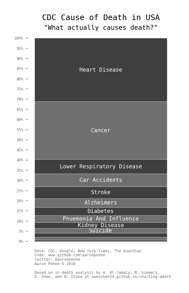
We worry about cancer 10x more than we worry about heart disease, but in reality both diseases kill roughly the same amount of people. Meanwhile, the media is fixated on terrorism, homicides, and cancer, but heart disease – which kills more than all put together – receives almost no coverage.
More Data on Death
Actual causes of death are quite different from personal and media perceptions, but this data is not absolute either. After all, how someone may die depends greatly upon other factors like age.
Here are causes of human death in the U.S. graphed by age group:
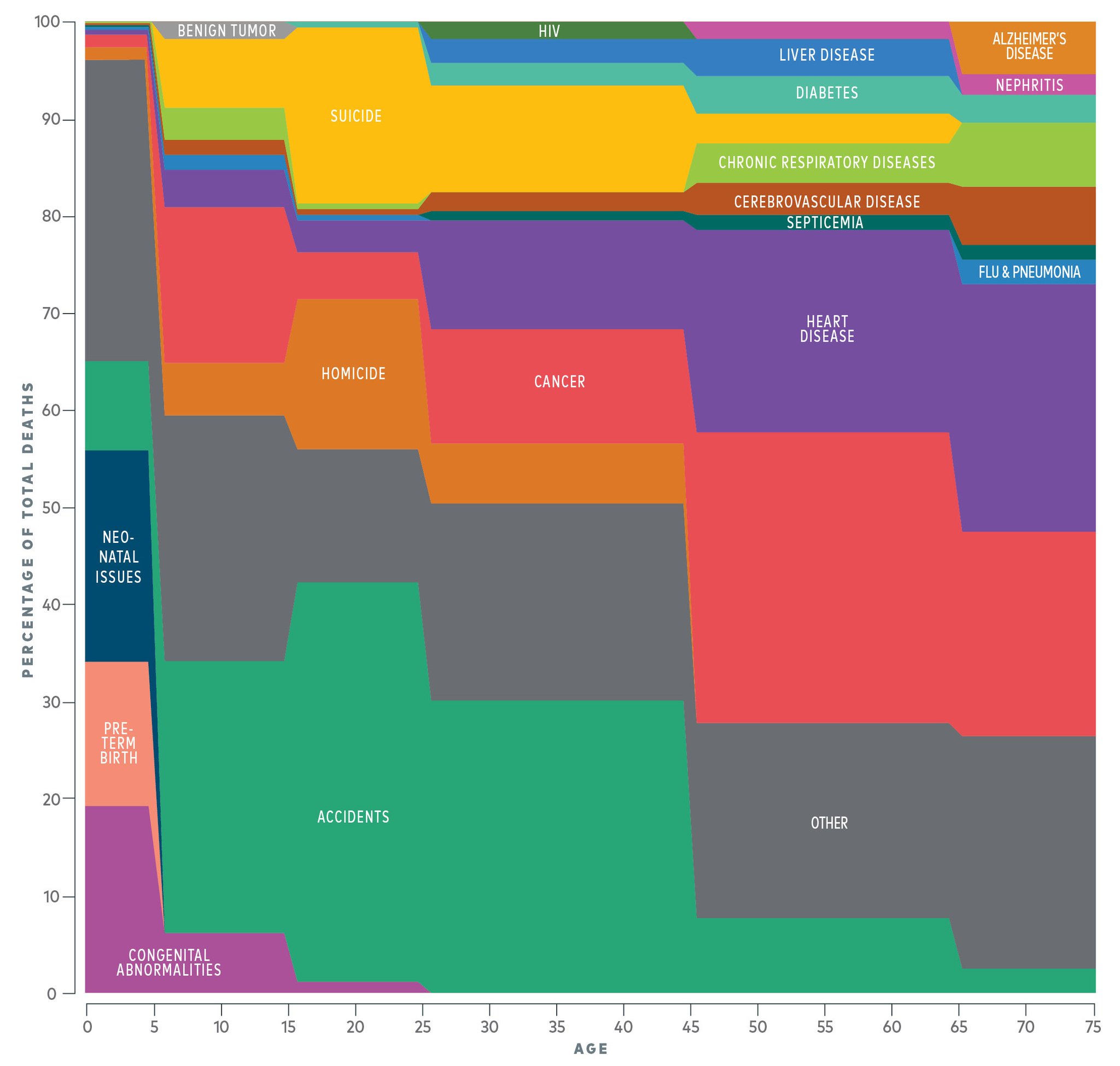
The data shows that accidents are the leading cause of death for most ages up until 45 years old, at which case cancer and heart disease take over.
While the topic of death is grim, the above data and statistics can arguably help provide a more realistic outlook regarding one of life’s certainties. It also shows that humans and media are not necessarily rational about this topic, so it’s important to think about it independently if at all possible.


VC+
VC+: Get Our Key Takeaways From the IMF’s World Economic Outlook
A sneak preview of the exclusive VC+ Special Dispatch—your shortcut to understanding IMF’s World Economic Outlook report.

Have you read IMF’s latest World Economic Outlook yet? At a daunting 202 pages, we don’t blame you if it’s still on your to-do list.
But don’t worry, you don’t need to read the whole April release, because we’ve already done the hard work for you.
To save you time and effort, the Visual Capitalist team has compiled a visual analysis of everything you need to know from the report—and our upcoming VC+ Special Dispatch will be available exclusively to VC+ members on Thursday, April 25th.
If you’re not already subscribed to VC+, make sure you sign up now to receive the full analysis of the IMF report, and more (we release similar deep dives every week).
For now, here’s what VC+ members can expect to receive.
Your Shortcut to Understanding IMF’s World Economic Outlook
With long and short-term growth prospects declining for many countries around the world, this Special Dispatch offers a visual analysis of the key figures and takeaways from the IMF’s report including:
- The global decline in economic growth forecasts
- Real GDP growth and inflation forecasts for major nations in 2024
- When interest rate cuts will happen and interest rate forecasts
- How debt-to-GDP ratios have changed since 2000
- And much more!

Get the Full Breakdown in the Next VC+ Special Dispatch
VC+ members will receive the full Special Dispatch on Thursday, April 25th.
Make sure you join VC+ now to receive exclusive charts and the full analysis of key takeaways from IMF’s World Economic Outlook.
Don’t miss out. Become a VC+ member today.
What You Get When You Become a VC+ Member
VC+ is Visual Capitalist’s premium subscription. As a member, you’ll get the following:
- Special Dispatches: Deep dive visual briefings on crucial reports and global trends
- Markets This Month: A snappy summary of the state of the markets and what to look out for
- The Trendline: Weekly curation of the best visualizations from across the globe
- Global Forecast Series: Our flagship annual report that covers everything you need to know related to the economy, markets, geopolitics, and the latest tech trends
- VC+ Archive: Hundreds of previously released VC+ briefings and reports that you’ve been missing out on, all in one dedicated hub
You can get all of the above, and more, by joining VC+ today.

-

 Green1 week ago
Ranked: The Countries With the Most Air Pollution in 2023
-

 Automotive2 weeks ago
Almost Every EV Stock is Down After Q1 2024
-

 AI2 weeks ago
The Stock Performance of U.S. Chipmakers So Far in 2024
-

 Markets2 weeks ago
Charted: Big Four Market Share by S&P 500 Audits
-

 Real Estate2 weeks ago
Ranked: The Most Valuable Housing Markets in America
-

 Money2 weeks ago
Which States Have the Highest Minimum Wage in America?
-

 AI2 weeks ago
Ranked: Semiconductor Companies by Industry Revenue Share
-

 Travel2 weeks ago
Ranked: The World’s Top Flight Routes, by Revenue