Money
Comparing the Wealth of U.S. Geographic Regions Over Time
Comparing the Wealth of U.S. Geographic Regions Over Time
The Chart of the Week is a weekly Visual Capitalist feature on Fridays.
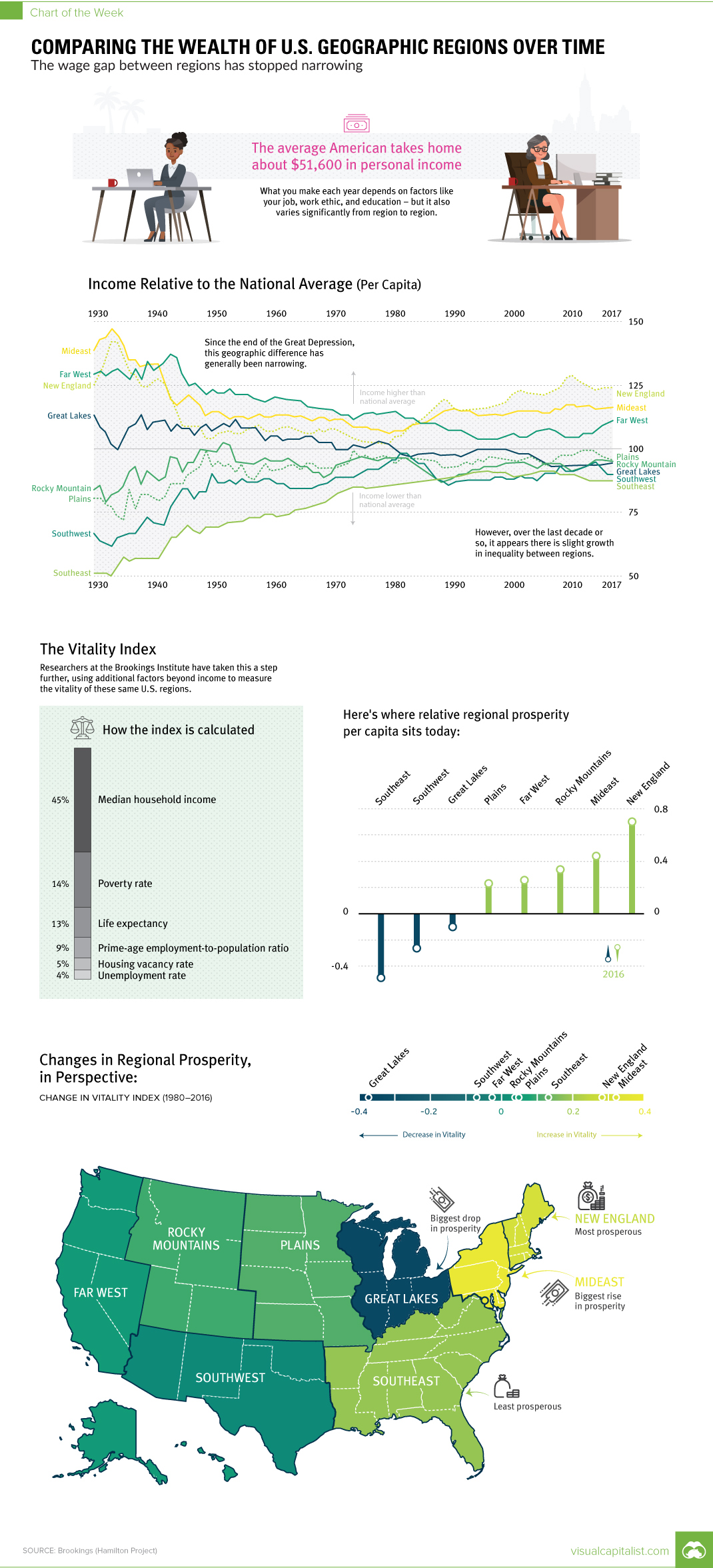
Every year, the average American takes home about $51,600 in personal income.
Of course, what you make each year depends on factors like your job, work ethic, education, and personal circumstances – but it also varies significantly over geography.
The Geographical Wage Gap
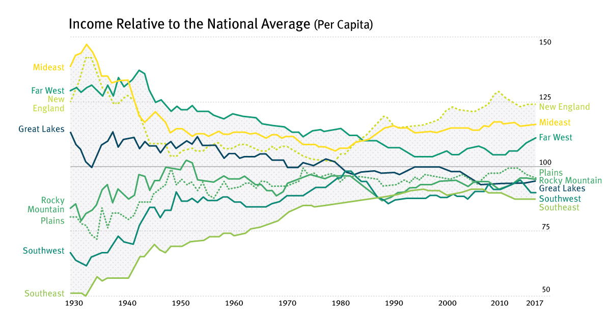
Today’s chart uses data from the Brookings Institute, and it focuses on the geographical wage gap, or the difference in per capita income that exists between various U.S. regions.
Interestingly, it’s a gap that has historically narrowed over time.
Just after the Great Depression, income per capita in the Mideast was 50% higher than the average American, and roughly three times higher than in the Southeast. Over the next 50 years, this gap would continue to narrow until reaching its smallest differential by the mid-1980s.
In the last couple of decades, however, the geographical wage gap has shown signs of a potential reversal: per capita incomes in New England, Mideast, and Far West have been increasing relative to the average American wage, while other regions are remaining more stagnant.
The Vitality Index
Wages are just one factor in measuring prosperity, and the Brookings Institute has attempted to create a more well-rounded approach to this with the Vitality Index.
The Vitality Index is comprised of the following variables:
- Median household income – 45%
- Poverty rate – 24%
- Life expectancy – 13%
- Prime-age employment-to-population ratio – 9%
- Housing vacancy rate – 5%
- Unemployment rate – 4%
The following map is directly from the aforementioned report, and it shows the Vitality Index by county, using recent data from the U.S. Census Bureau:
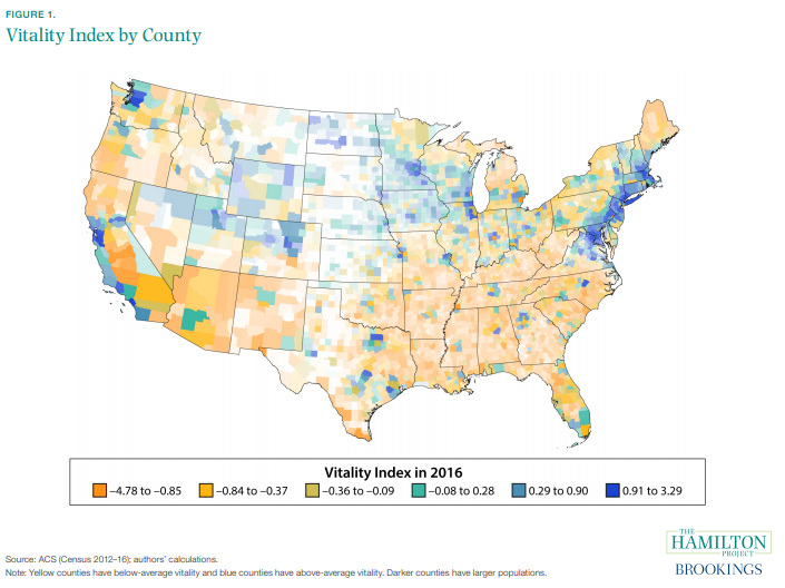
Which areas have seen the biggest increases and decreases in vitality?
The Great Lakes region, which relies heavily on manufacturing, has seen the most significant drop between 1980-2016, while the Mideast has seen the biggest rise over that same 26 year period.
Cost of Living
One fair point of objection to the analysis of the Vitality Index – or any measure of economic differences between geographic regions – is that cost of living is not taken directly into account.
Here is what the researchers had to say on this:
It would be reasonable to adjust median household income for cost of living, but we opted to not do this for two reasons. First, cost-of-living estimates that are comparable across places are not available for 1980. Second, cost of living may vary for reasons that are directly related to the county vitality we seek to measure. For example, a place with stronger labor demand or better local public goods could attract in-migration that contributes to higher housing prices. Finally, cost of living may reflect the amenity value of a place, and not simply inflated prices for the same goods and services.
No analysis is perfect, but the Vitality Index and historical data on per capita income are interesting to consider when framing any analysis on wages, prosperity, and economic inequality in America.


Money
How Debt-to-GDP Ratios Have Changed Since 2000
See how much the debt-to-GDP ratios of advanced economies have grown (or shrank) since the year 2000.


How Debt-to-GDP Ratios Have Changed Since 2000
This was originally posted on our Voronoi app. Download the app for free on Apple or Android and discover incredible data-driven charts from a variety of trusted sources.
Government debt levels have grown in most parts of the world since the 2008 financial crisis, and even more so after the COVID-19 pandemic.
To gain perspective on this long-term trend, we’ve visualized the debt-to-GDP ratios of advanced economies, as of 2000 and 2024 (estimated). All figures were sourced from the IMF’s World Economic Outlook.
Data and Highlights
The data we used to create this graphic is listed in the table below. “Government gross debt” consists of all liabilities that require payment(s) of interest and/or principal in the future.
| Country | 2000 (%) | 2024 (%) | Change (pp) |
|---|---|---|---|
| 🇯🇵 Japan | 135.6 | 251.9 | +116.3 |
| 🇸🇬 Singapore | 82.3 | 168.3 | +86.0 |
| 🇺🇸 United States | 55.6 | 126.9 | +71.3 |
| 🇬🇧 United Kingdom | 36.6 | 105.9 | +69.3 |
| 🇬🇷 Greece | 104.9 | 160.2 | +55.3 |
| 🇫🇷 France | 58.9 | 110.5 | +51.6 |
| 🇵🇹 Portugal | 54.2 | 104.0 | +49.8 |
| 🇪🇸 Spain | 57.8 | 104.7 | +46.9 |
| 🇸🇮 Slovenia | 25.9 | 66.5 | +40.6 |
| 🇫🇮 Finland | 42.4 | 76.5 | +34.1 |
| 🇭🇷 Croatia | 35.4 | 61.8 | +26.4 |
| 🇨🇦 Canada | 80.4 | 103.3 | +22.9 |
| 🇨🇾 Cyprus | 56.0 | 70.9 | +14.9 |
| 🇦🇹 Austria | 65.7 | 74.0 | +8.3 |
| 🇸🇰 Slovak Republic | 50.5 | 56.5 | +6.0 |
| 🇩🇪 Germany | 59.3 | 64.0 | +4.7 |
| 🇧🇪 Belgium | 109.6 | 106.8 | -2.8 |
| 🇮🇱 Israel | 77.4 | 56.8 | -20.6 |
| 🇮🇸 Iceland | 75.8 | 54.6 | -21.2 |
The debt-to-GDP ratio indicates how much a country owes compared to the size of its economy, reflecting its ability to manage and repay debts. Percentage point (pp) changes shown above indicate the increase or decrease of these ratios.
Countries with the Biggest Increases
Japan (+116 pp), Singapore (+86 pp), and the U.S. (+71 pp) have grown their debt as a percentage of GDP the most since the year 2000.
All three of these countries have stable, well-developed economies, so it’s unlikely that any of them will default on their growing debts. With that said, higher government debt leads to increased interest payments, which in turn can diminish available funds for future government budgets.
This is a rising issue in the U.S., where annual interest payments on the national debt have surpassed $1 trillion for the first time ever.
Only 3 Countries Saw Declines
Among this list of advanced economies, Belgium (-2.8 pp), Iceland (-21.2 pp), and Israel (-20.6 pp) were the only countries that decreased their debt-to-GDP ratio since the year 2000.
According to Fitch Ratings, Iceland’s debt ratio has decreased due to strong GDP growth and the use of its cash deposits to pay down upcoming maturities.
See More Debt Graphics from Visual Capitalist
Curious to see which countries have the most government debt in dollars? Check out this graphic that breaks down $97 trillion in debt as of 2023.

-

 Real Estate2 weeks ago
Visualizing America’s Shortage of Affordable Homes
-

 Technology1 week ago
Ranked: Semiconductor Companies by Industry Revenue Share
-

 Money1 week ago
Which States Have the Highest Minimum Wage in America?
-

 Real Estate1 week ago
Ranked: The Most Valuable Housing Markets in America
-

 Business1 week ago
Charted: Big Four Market Share by S&P 500 Audits
-

 AI2 weeks ago
The Stock Performance of U.S. Chipmakers So Far in 2024
-

 Misc2 weeks ago
Almost Every EV Stock is Down After Q1 2024
-

 Money2 weeks ago
Where Does One U.S. Tax Dollar Go?