Misc
Charts: How Americans Differ by Age
From the day of birth, most Americans are told by society that their life should follow a certain trajectory: go to school, get a higher education, get married, start a career, and retire as soon as they are gray and old.
For many people, their life story plays out exactly like this – but people actually do it at very different speeds, or people end up hitting these milestones in different orders. Meanwhile, some Americans deviate from the typical path altogether, forging their own unique stories.
Charting Life Events
Interestingly, all of these landmark life events can be viewed through the lens of demographics, and today’s charts from Overflow Data help to tell this tale. In the below charts, we’ll look at education, employment, and marital status all visualized based on a spectrum of age.
The end result? You’ll see when people hit certain landmarks such as graduating from college, getting married, or getting a job. You’ll also see an alternate perspective as well, such as the points in time where millions of people are outside of the workforce, or when divorce rates spike.
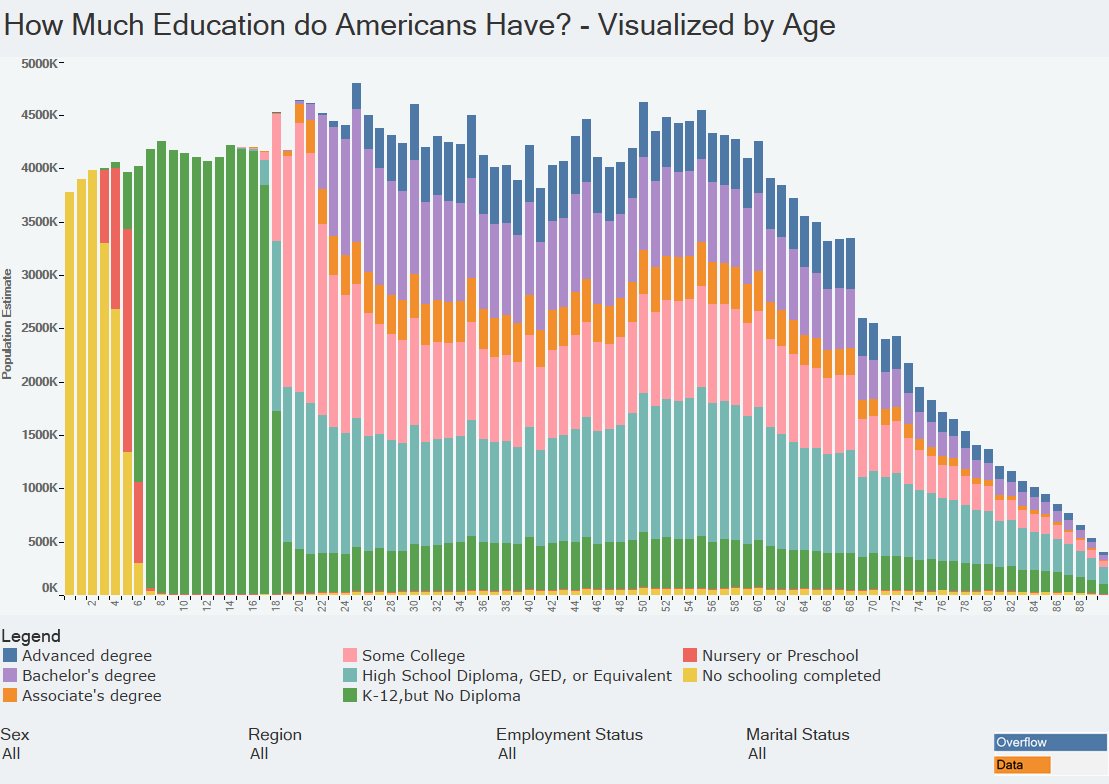
Getting an Education
The below chart shows the American population by age, sorted by the level of education attained.
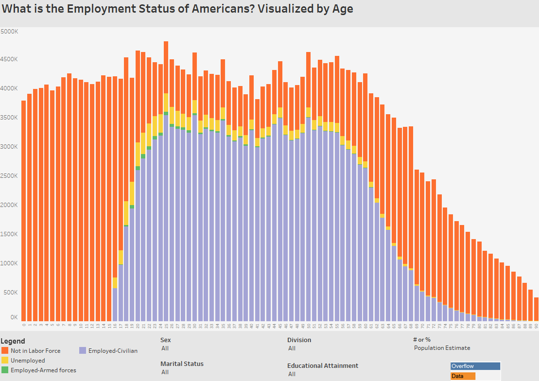
Getting a Job
Next, here is the U.S. population by age, sorted by status in the labor force.
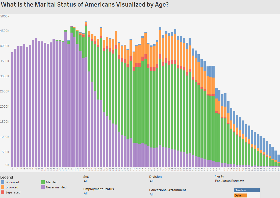
Getting Married
The below chart shows the American population by age, sorted by marital status.
Even though each person charts their own unique course in life, it is interesting to look at the data in aggregate as well.
From these three charts we can see when most major life events occur, and they help to paint an even bigger picture of the lives of the 323 million people in the U.S. population.


VC+
VC+: Get Our Key Takeaways From the IMF’s World Economic Outlook
A sneak preview of the exclusive VC+ Special Dispatch—your shortcut to understanding IMF’s World Economic Outlook report.

Have you read IMF’s latest World Economic Outlook yet? At a daunting 202 pages, we don’t blame you if it’s still on your to-do list.
But don’t worry, you don’t need to read the whole April release, because we’ve already done the hard work for you.
To save you time and effort, the Visual Capitalist team has compiled a visual analysis of everything you need to know from the report—and our upcoming VC+ Special Dispatch will be available exclusively to VC+ members on Thursday, April 25th.
If you’re not already subscribed to VC+, make sure you sign up now to receive the full analysis of the IMF report, and more (we release similar deep dives every week).
For now, here’s what VC+ members can expect to receive.
Your Shortcut to Understanding IMF’s World Economic Outlook
With long and short-term growth prospects declining for many countries around the world, this Special Dispatch offers a visual analysis of the key figures and takeaways from the IMF’s report including:
- The global decline in economic growth forecasts
- Real GDP growth and inflation forecasts for major nations in 2024
- When interest rate cuts will happen and interest rate forecasts
- How debt-to-GDP ratios have changed since 2000
- And much more!

Get the Full Breakdown in the Next VC+ Special Dispatch
VC+ members will receive the full Special Dispatch on Thursday, April 25th.
Make sure you join VC+ now to receive exclusive charts and the full analysis of key takeaways from IMF’s World Economic Outlook.
Don’t miss out. Become a VC+ member today.
What You Get When You Become a VC+ Member
VC+ is Visual Capitalist’s premium subscription. As a member, you’ll get the following:
- Special Dispatches: Deep dive visual briefings on crucial reports and global trends
- Markets This Month: A snappy summary of the state of the markets and what to look out for
- The Trendline: Weekly curation of the best visualizations from across the globe
- Global Forecast Series: Our flagship annual report that covers everything you need to know related to the economy, markets, geopolitics, and the latest tech trends
- VC+ Archive: Hundreds of previously released VC+ briefings and reports that you’ve been missing out on, all in one dedicated hub
You can get all of the above, and more, by joining VC+ today.

-

 Markets1 week ago
U.S. Debt Interest Payments Reach $1 Trillion
-

 Markets2 weeks ago
Ranked: The Most Valuable Housing Markets in America
-

 Money2 weeks ago
Which States Have the Highest Minimum Wage in America?
-

 AI2 weeks ago
Ranked: Semiconductor Companies by Industry Revenue Share
-

 Markets2 weeks ago
Ranked: The World’s Top Flight Routes, by Revenue
-

 Demographics2 weeks ago
Population Projections: The World’s 6 Largest Countries in 2075
-

 Markets2 weeks ago
The Top 10 States by Real GDP Growth in 2023
-

 Money2 weeks ago
The Smallest Gender Wage Gaps in OECD Countries