Markets
Chart: Where are the Ultra-Rich Buying Luxury Homes?
Where are the Ultra-Rich Buying Luxury Homes?
Ranking the world’s best cities for luxury
The Chart of the Week is a weekly Visual Capitalist feature on Fridays.
Whether it’s a 10,000 sq. ft mansion in Bel Air, or a classy penthouse in Monaco with a harbor view, the buyers of top-end real estate tend to be very particular.
In fact, the most robust markets for luxury real estate can be found concentrated in only a few world-class cities like Hong Kong, London, or New York, or in luxury destinations like Cannes or The Hamptons. These are all timeless locations that have the amenities and activities to appeal to large amounts of high net worth individuals.
But at the same time, what is trending at any given time is a lot less predictable. Only so many homes change hands every year, and they do so based on global macroeconomic trends, the political environment, changing tastes, speculation, and shifts at a local level.
In the luxury home market, one year’s boom is another year’s bust – it just depends on who is buying and selling, and why.
Price Disparity for Luxury
As with all real estate, pricing is not uniform across the board.
In the city-state of Monaco, it costs $5,420 per square foot for top-end real estate. Interestingly, the same space can be bought for a fraction of the cost for only $1,068 in Los Angeles or $831 in Hawaii (Kauai).
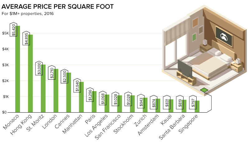
This is yet another factor to consider in where the rich are buying. Is it worth it to go a bit over the top and buy a house on The Peak in Hong Kong, or will a mansion in Singapore suffice at a 84% discount?
Timeless vs. Hot Markets
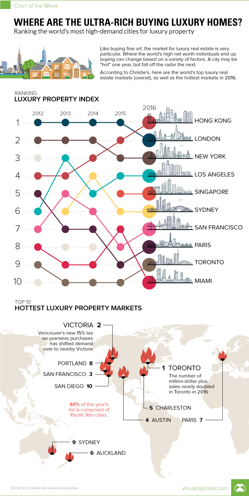
In a 2017 whitepaper from Christie’s International Real Estate, markets are ranked based on two ideas: the Luxury Index and the Luxury Thermometer.
The former rates timeless markets, like New York and Hong Kong, which tend to have the most luxury sales overall. The latter does so based on what’s “hot” and trending upwards in a given year. These may not necessarily be the biggest markets, but they are ones that are getting an influx of new activity and interest from buyers.
The Luxury Index
| 2016 Rank | City | Change from prev. year |
|---|---|---|
| #1 | Hong Kong | +1 |
| #2 | London | -1 |
| #3 | New York | - |
| #4 | Los Angeles | - |
| #5 | Singapore | - |
| #6 | Sydney | - |
| #7 | San Francisco | +1 |
| #8 | Paris | +1 |
| #9 | Toronto | +1 |
| #10 | Miami | -3 |
In the aftermath of Brexit, Christie’s noted that sales in London of $1 million+ primary homes declined by -35% in 2016. It’s no surprise then, that Hong Kong has displaced London as the top city for prime real estate sales according to the index.
The Luxury Thermometer
| 2016 Rank | City | Change from prev. year |
|---|---|---|
| #1 | Toronto | +1 |
| #2 | Victoria (Canada) | +1 |
| #3 | San Francisco | +1 |
| #4 | Austin | New |
| #5 | Charleston (S.C.) | New |
| #6 | Auckland | -5 |
| #7 | Paris | New |
| #8 | Portland | - |
| #9 | Sydney | -3 |
| #10 | San Diego | New |
The Canadian market continues to be madness, with luxury sales up 83%.
We previously documented Vancouver’s real estate mania, but the city has since implemented a 15% tax on overseas buyers. As a result, these buyers are turning increasingly towards nearby Victoria, BC, Canada, the #2 ranked city on the Luxury Thermometer in 2016.


Markets
U.S. Debt Interest Payments Reach $1 Trillion
U.S. debt interest payments have surged past the $1 trillion dollar mark, amid high interest rates and an ever-expanding debt burden.


U.S. Debt Interest Payments Reach $1 Trillion
This was originally posted on our Voronoi app. Download the app for free on iOS or Android and discover incredible data-driven charts from a variety of trusted sources.
The cost of paying for America’s national debt crossed the $1 trillion dollar mark in 2023, driven by high interest rates and a record $34 trillion mountain of debt.
Over the last decade, U.S. debt interest payments have more than doubled amid vast government spending during the pandemic crisis. As debt payments continue to soar, the Congressional Budget Office (CBO) reported that debt servicing costs surpassed defense spending for the first time ever this year.
This graphic shows the sharp rise in U.S. debt payments, based on data from the Federal Reserve.
A $1 Trillion Interest Bill, and Growing
Below, we show how U.S. debt interest payments have risen at a faster pace than at another time in modern history:
| Date | Interest Payments | U.S. National Debt |
|---|---|---|
| 2023 | $1.0T | $34.0T |
| 2022 | $830B | $31.4T |
| 2021 | $612B | $29.6T |
| 2020 | $518B | $27.7T |
| 2019 | $564B | $23.2T |
| 2018 | $571B | $22.0T |
| 2017 | $493B | $20.5T |
| 2016 | $460B | $20.0T |
| 2015 | $435B | $18.9T |
| 2014 | $442B | $18.1T |
| 2013 | $425B | $17.2T |
| 2012 | $417B | $16.4T |
| 2011 | $433B | $15.2T |
| 2010 | $400B | $14.0T |
| 2009 | $354B | $12.3T |
| 2008 | $380B | $10.7T |
| 2007 | $414B | $9.2T |
| 2006 | $387B | $8.7T |
| 2005 | $355B | $8.2T |
| 2004 | $318B | $7.6T |
| 2003 | $294B | $7.0T |
| 2002 | $298B | $6.4T |
| 2001 | $318B | $5.9T |
| 2000 | $353B | $5.7T |
| 1999 | $353B | $5.8T |
| 1998 | $360B | $5.6T |
| 1997 | $368B | $5.5T |
| 1996 | $362B | $5.3T |
| 1995 | $357B | $5.0T |
| 1994 | $334B | $4.8T |
| 1993 | $311B | $4.5T |
| 1992 | $306B | $4.2T |
| 1991 | $308B | $3.8T |
| 1990 | $298B | $3.4T |
| 1989 | $275B | $3.0T |
| 1988 | $254B | $2.7T |
| 1987 | $240B | $2.4T |
| 1986 | $225B | $2.2T |
| 1985 | $219B | $1.9T |
| 1984 | $205B | $1.7T |
| 1983 | $176B | $1.4T |
| 1982 | $157B | $1.2T |
| 1981 | $142B | $1.0T |
| 1980 | $113B | $930.2B |
| 1979 | $96B | $845.1B |
| 1978 | $84B | $789.2B |
| 1977 | $69B | $718.9B |
| 1976 | $61B | $653.5B |
| 1975 | $55B | $576.6B |
| 1974 | $50B | $492.7B |
| 1973 | $45B | $469.1B |
| 1972 | $39B | $448.5B |
| 1971 | $36B | $424.1B |
| 1970 | $35B | $389.2B |
| 1969 | $30B | $368.2B |
| 1968 | $25B | $358.0B |
| 1967 | $23B | $344.7B |
| 1966 | $21B | $329.3B |
Interest payments represent seasonally adjusted annual rate at the end of Q4.
At current rates, the U.S. national debt is growing by a remarkable $1 trillion about every 100 days, equal to roughly $3.6 trillion per year.
As the national debt has ballooned, debt payments even exceeded Medicaid outlays in 2023—one of the government’s largest expenditures. On average, the U.S. spent more than $2 billion per day on interest costs last year. Going further, the U.S. government is projected to spend a historic $12.4 trillion on interest payments over the next decade, averaging about $37,100 per American.
Exacerbating matters is that the U.S. is running a steep deficit, which stood at $1.1 trillion for the first six months of fiscal 2024. This has accelerated due to the 43% increase in debt servicing costs along with a $31 billion dollar increase in defense spending from a year earlier. Additionally, a $30 billion increase in funding for the Federal Deposit Insurance Corporation in light of the regional banking crisis last year was a major contributor to the deficit increase.
Overall, the CBO forecasts that roughly 75% of the federal deficit’s increase will be due to interest costs by 2034.

-

 Travel1 week ago
Airline Incidents: How Do Boeing and Airbus Compare?
-

 Real Estate3 weeks ago
Visualizing America’s Shortage of Affordable Homes
-

 Green2 weeks ago
Ranked: Top Countries by Total Forest Loss Since 2001
-

 Money2 weeks ago
Where Does One U.S. Tax Dollar Go?
-

 Misc2 weeks ago
Almost Every EV Stock is Down After Q1 2024
-

 AI2 weeks ago
The Stock Performance of U.S. Chipmakers So Far in 2024
-

 Markets2 weeks ago
Charted: Big Four Market Share by S&P 500 Audits
-

 Real Estate2 weeks ago
Ranked: The Most Valuable Housing Markets in America