Technology
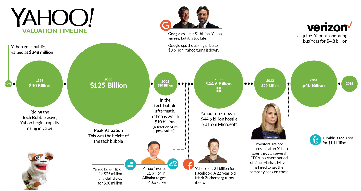
Chart: The Rise and Fall of Yahoo
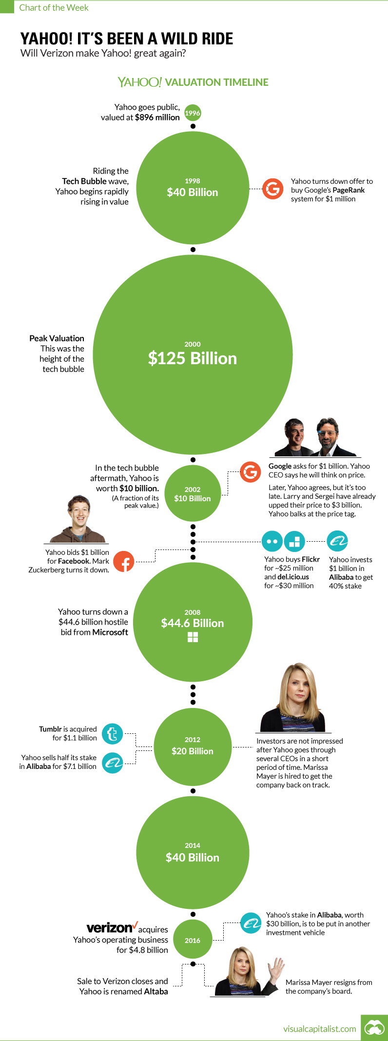
Chart: The Rise and Fall of Yahoo
The 20 year roller coaster for Yahoo finally ends
The Chart of the Week is a weekly Visual Capitalist feature on Fridays.
The saga surrounding one of the world’s most recognizable internet stocks has come to a close.
Yahoo has finally sold its operating business to the highest bidder. The winner was Verizon – and the price was $4.8 billion.
That’s worth less than 1% of the company it had multiple opportunities to buy: Google (now Alphabet).
What Happened?
Technology changes fast, and successful companies must leverage smart acquisitions in building for the future. Facebook bought Oculus Rift and Instagram, and Google bought companies like Youtube, DoubleClick, Boston Dynamics, and DeepMind to help flush out its strategy.
The executives running Yahoo have a rough track record in reading industry tea leaves. It’s not just about the deals they made, but it’s also the deals they failed to make.
In the end, a lack of execution with acquisitions proved to be the company’s Achilles’ Heel.
Missed Opportunities
In 1998, Yahoo was approached by two young Stanford Ph.D. students to buy their search engine algorithm. Larry Page and Sergey Brin had created PageRank – a quick way to find the most relevant website for a given search query. Yahoo skipped out on buying it for $1 million, rationalizing that it would take people off of Yahoo’s website, while decreasing traffic and ad revenues.
Even later on when Google’s search business was well-established, Yahoo CEO Terry Semel balked at Larry and Sergey’s $1 billion asking price. He would eventually agree to it, but by then it was too late. The Google guys had already decided to up their price to a heftier $3 billion.
Around that same time, Yahoo was turned down by a 22-year-old Mark Zuckerberg. Yahoo offered to buy Facebook for $1 billion, but Zuckerberg declined. This was a moment that billionaire Facebook investor Peter Thiel lauds as the major turning point for the company that allowed it to become the behemoth it is today. Some sources even say that if the offer was increased to $1.1 billion, that Facebook’s board would have forced Zuckerberg to take it.
But it’s not just the offers made that were missed opportunities. Yahoo also turned down a hostile takeover from Microsoft in 2008 for $44.6 billion that valued the company for far more than it is worth today.
Deals that Bombed
Finally, the deals that did close were unable to add any value to the company.
Yahoo famously made two acquisitions in 1999 that are now ranked by Forbes as some of the worst internet acquisitions of all-time.
The first was a $4.58 billion deal for Geocities, a site that enabled users to build their own personal websites. While Geocities was a pioneer in this regard, it eventually was shuttered in 2009 after failing to deliver any value to Yahoo shareholders.
The second was the famous $5.7 billion deal for Broadcast.com, an online television site that was founded by Mark Cuban. Perhaps way ahead of its time, internet connections were too slow in 1999 to run this type of video content off the web.
Yahoo also bought Tumblr for $1.1 billion in 2013. While it is not ranked as one of the worst acquisitions of all time, it is not doing particularly well either.
Yahoo’s Saving Grace
There was one M&A decision that wasn’t a whiff. In 2005, the company bought a 40% stake in emerging online retail company Alibaba. The remainder of those holdings, now worth $30 billion, make up the majority of Yahoo’s market capitalization today.
In the context of the recent Verizon deal, the Alibaba shares are likely being spun off into a separate investment vehicle.


Brands
How Tech Logos Have Evolved Over Time
From complete overhauls to more subtle tweaks, these tech logos have had quite a journey. Featuring: Google, Apple, and more.


How Tech Logos Have Evolved Over Time
This was originally posted on our Voronoi app. Download the app for free on iOS or Android and discover incredible data-driven charts from a variety of trusted sources.
One would be hard-pressed to find a company that has never changed its logo. Granted, some brands—like Rolex, IBM, and Coca-Cola—tend to just have more minimalistic updates. But other companies undergo an entire identity change, thus necessitating a full overhaul.
In this graphic, we visualized the evolution of prominent tech companies’ logos over time. All of these brands ranked highly in a Q1 2024 YouGov study of America’s most famous tech brands. The logo changes are sourced from 1000logos.net.
How Many Times Has Google Changed Its Logo?
Google and Facebook share a 98% fame rating according to YouGov. But while Facebook’s rise was captured in The Social Network (2010), Google’s history tends to be a little less lionized in popular culture.
For example, Google was initially called “Backrub” because it analyzed “back links” to understand how important a website was. Since its founding, Google has undergone eight logo changes, finally settling on its current one in 2015.
| Company | Number of Logo Changes |
|---|---|
| 8 | |
| HP | 8 |
| Amazon | 6 |
| Microsoft | 6 |
| Samsung | 6 |
| Apple | 5* |
Note: *Includes color changes. Source: 1000Logos.net
Another fun origin story is Microsoft, which started off as Traf-O-Data, a traffic counter reading company that generated reports for traffic engineers. By 1975, the company was renamed. But it wasn’t until 2012 that Microsoft put the iconic Windows logo—still the most popular desktop operating system—alongside its name.
And then there’s Samsung, which started as a grocery trading store in 1938. Its pivot to electronics started in the 1970s with black and white television sets. For 55 years, the company kept some form of stars from its first logo, until 1993, when the iconic encircled blue Samsung logo debuted.
Finally, Apple’s first logo in 1976 featured Isaac Newton reading under a tree—moments before an apple fell on his head. Two years later, the iconic bitten apple logo would be designed at Steve Jobs’ behest, and it would take another two decades for it to go monochrome.

-

 Markets1 week ago
Ranked: The Largest U.S. Corporations by Number of Employees
-

 Green3 weeks ago
Ranked: Top Countries by Total Forest Loss Since 2001
-

 Money2 weeks ago
Where Does One U.S. Tax Dollar Go?
-

 Automotive2 weeks ago
Almost Every EV Stock is Down After Q1 2024
-

 AI2 weeks ago
The Stock Performance of U.S. Chipmakers So Far in 2024
-

 Markets2 weeks ago
Charted: Big Four Market Share by S&P 500 Audits
-

 Real Estate2 weeks ago
Ranked: The Most Valuable Housing Markets in America
-

 Money2 weeks ago
Which States Have the Highest Minimum Wage in America?