Technology
Chart: Here’s How 5 Tech Giants Make Their Billions

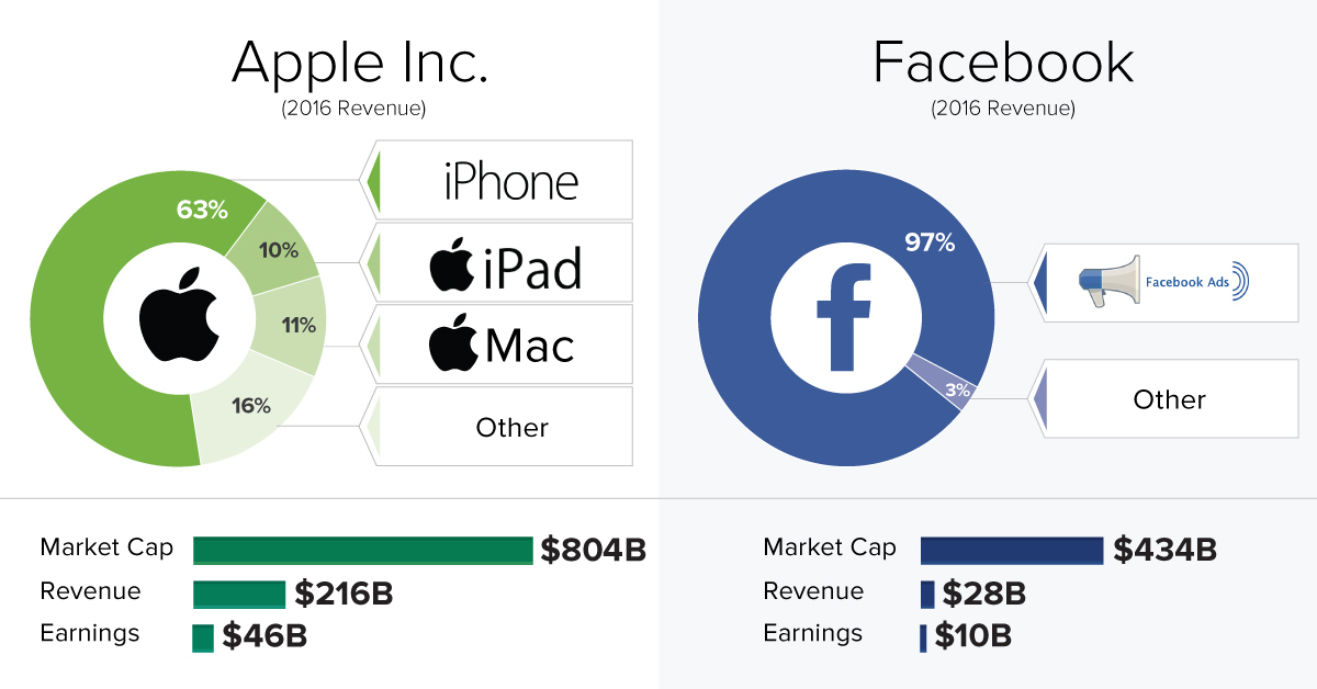
The Revenue Streams of the Five Largest Tech Companies
The Chart of the Week is a weekly Visual Capitalist feature on Fridays.
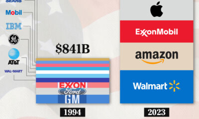
Last year, we published a chart showing that tech companies have displaced traditional blue chip companies like Exxon Mobil and Walmart as the most valuable companies in the world.
Here are the latest market valuations for those same five companies:
| Rank | Company | Market Cap (Billions, as of May 11, 2017) | Primary Revenue Driver |
|---|---|---|---|
| #1 | Apple | $804 | Hardware |
| #2 | Alphabet | $651 | Advertising |
| #3 | Microsoft | $536 | Software |
| #4 | Amazon | $455 | Online Retail |
| #5 | $434 | Advertising | |
| TOTAL | $2,880 |
Together, they are worth $2.9 trillion in market capitalization – and they combined in FY2016 for revenues of $555 billion with a $94 billion bottom line.
Bringing Home the Bacon?
Despite all being at the top of the stock market food chain, the companies are at very different stages.
In 2016, Apple experienced its first annual revenue decline since 2001, but the company brought home a profit equal to that of all other four companies combined.
On the other hand, Amazon is becoming a revenue machine with very little margin, while Facebook generates 5x more profit despite far smaller top line numbers.
| Company | 2016 Revenue (Billions) | 2016 Net Income (Billions) | Margin |
|---|---|---|---|
| Apple | $216 | $46 | 21% |
| Alphabet | $90 | $19 | 21% |
| Microsoft | $85 | $17 | 20% |
| Amazon | $136 | $2 | 2% |
| $28 | $10 | 36% |
How They Make Their Billions
Each of these companies is pretty unique in how they generate revenue, though there is some overlap:
- Facebook and Alphabet each make the vast majority of their revenues from advertising (97% and 88%, respectively)
- Apple makes 63% of their revenue from the iPhone, and another 21% coming from the iPad and Mac lines
- Amazon makes 90% from its “Product” and “Media” categories, and 9% from AWS
- Microsoft is diverse: Office (28%), servers (22%), Xbox (11%), Windows (9%), ads (7%), Surface (5%), and other (18%)
Lastly, for fun, what if we added all these companies’ revenues together, and categorized them by source?
| Category | 2016 Revenue (Millions) | % Total | Description |
|---|---|---|---|
| Hardware | $197,020 | 36% | iPhone, iPad, Mac, Xbox, Surface |
| Online Retail | $122,205 | 22% | Amazon (Product and Media Categories) |
| Advertising | $112,366 | 20% | Google, Facebook, YouTube, Bing ads |
| Software | $31,692 | 6% | Office, Windows |
| Cloud/Server | $31,396 | 6% | AWS, Microsoft Server, Azure |
| Other | $60,177 | 11% | Consulting, other services (iTunes, Google Play), etc. |
| $554,856 | 100% |
Note: this isn’t perfect. As an example, Amazon’s fast-growing advertising business gets lumped into their “Other” category.
Hardware, e-commerce, and and advertising make up 76% of all revenues.
Meanwhile, software isn’t the cash cow it used to be, but it does help serve as a means to an end for some companies. For example, Android doesn’t generate any revenue directly, but it does allow more users to buy apps in the Play Store and to search Google via their mobile devices. Likewise, Apple bundles in operating systems with each hardware purchase.


Brands
How Tech Logos Have Evolved Over Time
From complete overhauls to more subtle tweaks, these tech logos have had quite a journey. Featuring: Google, Apple, and more.


How Tech Logos Have Evolved Over Time
This was originally posted on our Voronoi app. Download the app for free on iOS or Android and discover incredible data-driven charts from a variety of trusted sources.
One would be hard-pressed to find a company that has never changed its logo. Granted, some brands—like Rolex, IBM, and Coca-Cola—tend to just have more minimalistic updates. But other companies undergo an entire identity change, thus necessitating a full overhaul.
In this graphic, we visualized the evolution of prominent tech companies’ logos over time. All of these brands ranked highly in a Q1 2024 YouGov study of America’s most famous tech brands. The logo changes are sourced from 1000logos.net.
How Many Times Has Google Changed Its Logo?
Google and Facebook share a 98% fame rating according to YouGov. But while Facebook’s rise was captured in The Social Network (2010), Google’s history tends to be a little less lionized in popular culture.
For example, Google was initially called “Backrub” because it analyzed “back links” to understand how important a website was. Since its founding, Google has undergone eight logo changes, finally settling on its current one in 2015.
| Company | Number of Logo Changes |
|---|---|
| 8 | |
| HP | 8 |
| Amazon | 6 |
| Microsoft | 6 |
| Samsung | 6 |
| Apple | 5* |
Note: *Includes color changes. Source: 1000Logos.net
Another fun origin story is Microsoft, which started off as Traf-O-Data, a traffic counter reading company that generated reports for traffic engineers. By 1975, the company was renamed. But it wasn’t until 2012 that Microsoft put the iconic Windows logo—still the most popular desktop operating system—alongside its name.
And then there’s Samsung, which started as a grocery trading store in 1938. Its pivot to electronics started in the 1970s with black and white television sets. For 55 years, the company kept some form of stars from its first logo, until 1993, when the iconic encircled blue Samsung logo debuted.
Finally, Apple’s first logo in 1976 featured Isaac Newton reading under a tree—moments before an apple fell on his head. Two years later, the iconic bitten apple logo would be designed at Steve Jobs’ behest, and it would take another two decades for it to go monochrome.

-

 Travel1 week ago
Airline Incidents: How Do Boeing and Airbus Compare?
-

 Markets2 weeks ago
Visualizing America’s Shortage of Affordable Homes
-

 Green2 weeks ago
Ranked: Top Countries by Total Forest Loss Since 2001
-

 Money2 weeks ago
Where Does One U.S. Tax Dollar Go?
-

 Misc2 weeks ago
Almost Every EV Stock is Down After Q1 2024
-

 AI2 weeks ago
The Stock Performance of U.S. Chipmakers So Far in 2024
-

 Markets2 weeks ago
Charted: Big Four Market Share by S&P 500 Audits
-

 Real Estate2 weeks ago
Ranked: The Most Valuable Housing Markets in America