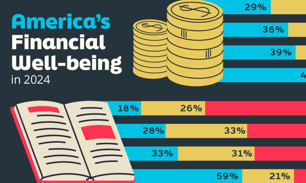
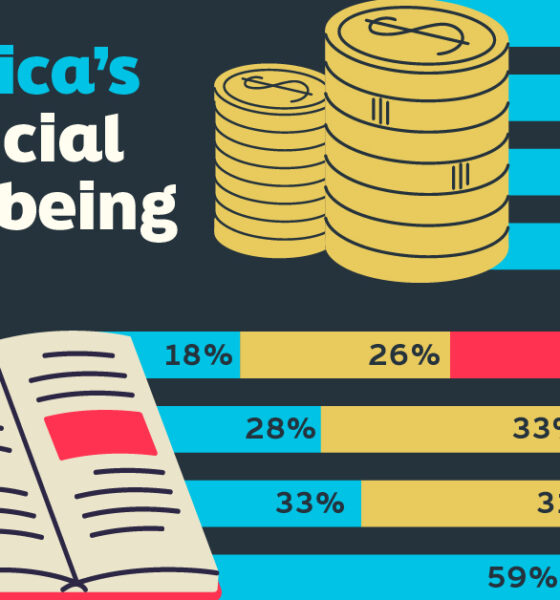
Older, better-educated adults are winning the savings game, reveals a January survey by the National Opinion Research Center at the...
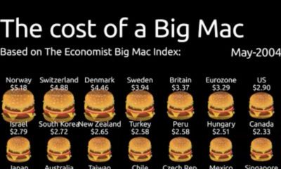

Spanning from 2004-2022, this animation of the Big Mac Index shows the rise in burger prices, and which currencies may be under or overvalued.
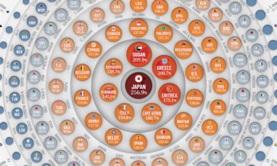

Global debt reached $226T by the end of 2020 – the biggest one-year jump since WWII. This graphic compares the debt-to-GDP ratio of various countries.


Corporate finance oversees trillions of dollars and makes modern markets and economies possible, but who are the main players?
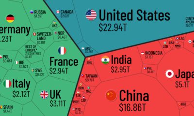

Which countries and regions contribute the most to the world economy? In this infographic, we break down all $94 trillion of global GDP by country.
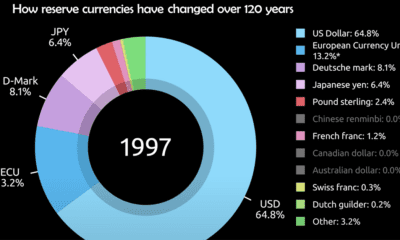

Today, the U.S. dollar makes up 60% of held reserve currency. See how global preferences have shifted since 1900.


Central bank digital currencies are on the horizon. What do 65 central banks representing 91% of global GDP think about them?
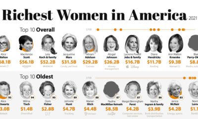

Only 12% of billionaires in the U.S. are women. Who is part of this prestigious group of the richest women in America?
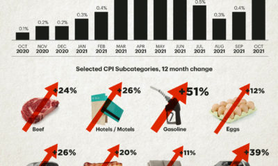

The U.S. inflation rate has seen its fastest annual increase in over 30 years. Which consumer spending categories have been hit the hardest?
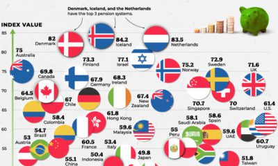

Which countries are best equipped to support their elderly citizens? This graphic compares pension plans around the world.
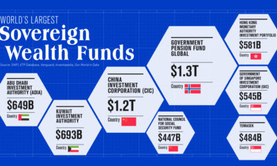

To date, only two countries have sovereign wealth funds worth over $1 trillion. Learn more about them in this infographic.


 Creator Program