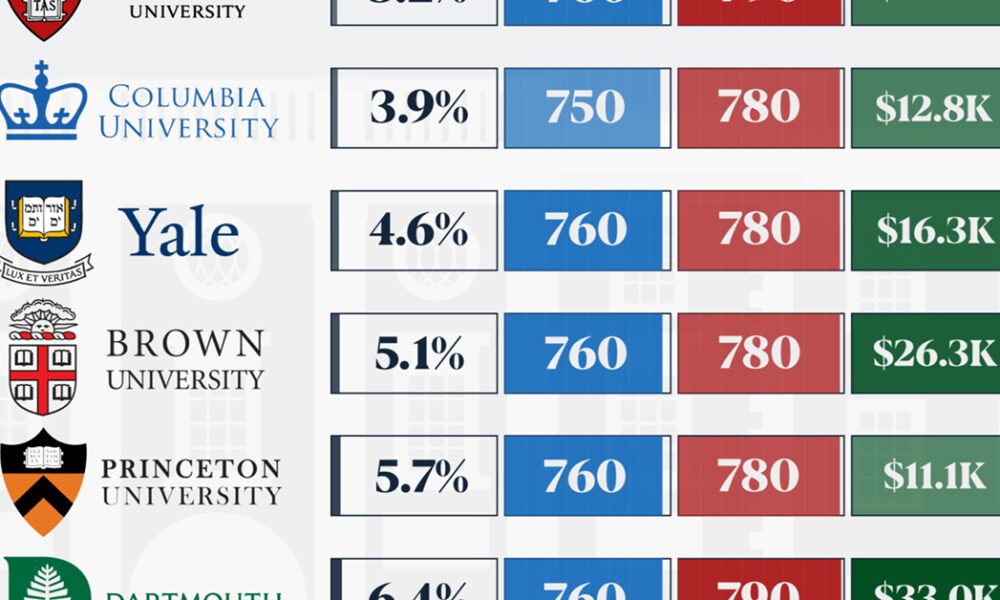
We detail the admission rates and average annual cost for Ivy League schools, as well as the median SAT scores...
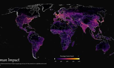

How far has humanity spread, and where haven't we gone? This graphic maps the extent of humanity’s impact on the world from 1993 to 2009.
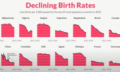

For the last 70 years, birth rates for the 49 most populous countries of the world have fallen sharply, heralding an uncertain future.
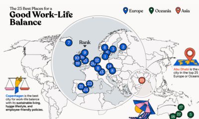

In this infographic, we explore which cities around the world excel in prioritizing work–life balance.
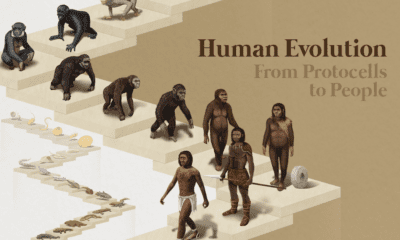

From single cells to bipedalism, humans have come a long way. Explore the fascinating journey of human evolution in this infographic.
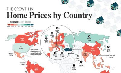

Global house prices were resilient in 2022, rising 6%. We compare nominal and real price growth by country as interest rates surged.
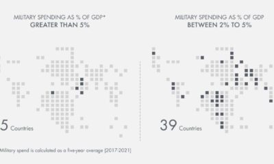

Which countries have the highest military spend relative to their economy? This visual breaks down the amount spent in each country by GDP.
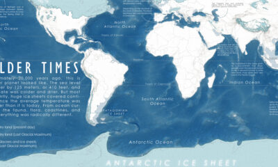

A map of the Earth 20,000 years ago, at the peak of the last ice age, when colder temperatures transformed the planet we know so well.
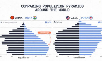

Population pyramids can show a country's demographic advantages and challenges at a glance. See how different parts of the world stack up.


This graphic describes new U.S. renewable energy installations by state along with nameplate capacity, planned to come online in 2023.
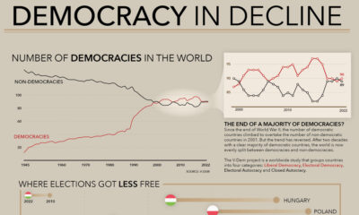

How many democracies does the world have? This visual shows the change since 1945 and the top nations becoming more (and less) democratic.


 Creator Program