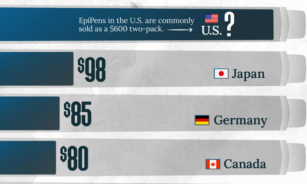
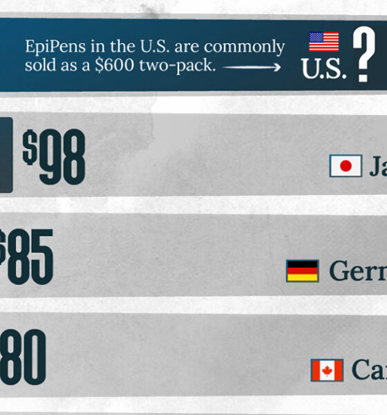
This visualization compares EpiPen prices around the world, with the U.S. having the highest prices by far.
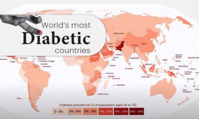

Diabetes affects millions of people around the world, but the spread isn't equal. This map highlights diabetes rates by country in 2021.
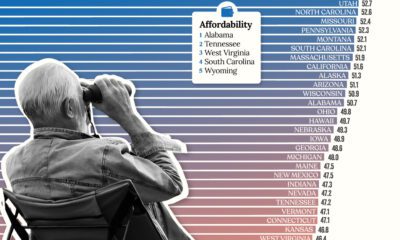

Getting ready for retirement? See which states score the highest in terms of affordability, quality of life, and health care.
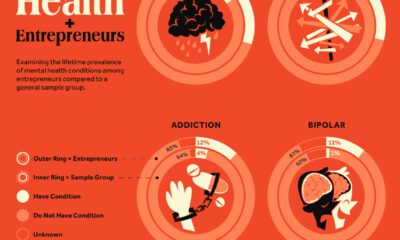

Research explores the link between entrepreneurship and mental health conditions such as ADHD and bipolar disorder
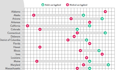

At the federal level, cannabis is illegal, but state laws differ. This graphic looks at the timelines of cannabis legislation in the U.S.
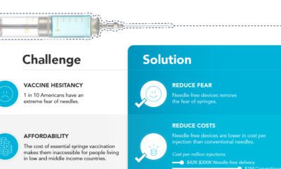

A backlog of routine and COVID-19 vaccinations has led to skyrocketing demand for syringes. What role will needle-free devices play?
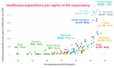

This graphic looks at average life expectancies in countries around the world, compared to each country's healthcare spending per capita.
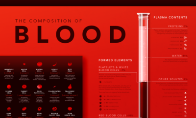

Despite its simple appearance, blood is made up of many microscopic elements. This infographic visualizes the composition of blood.
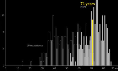

Global life expectancy has been increasing worldwide over the last 70 years. But how does the picture break down by region and by sex?
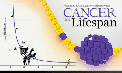

New research links mutation rates and lifespan. We visualize the data supporting this new framework for understanding cancer.
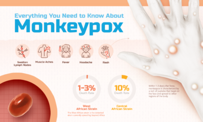

What is monkeypox, and what risk does it pose to the public? This infographic breaks down the symptoms, transmission, and more.


 Creator Program