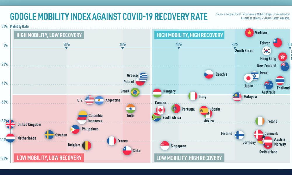
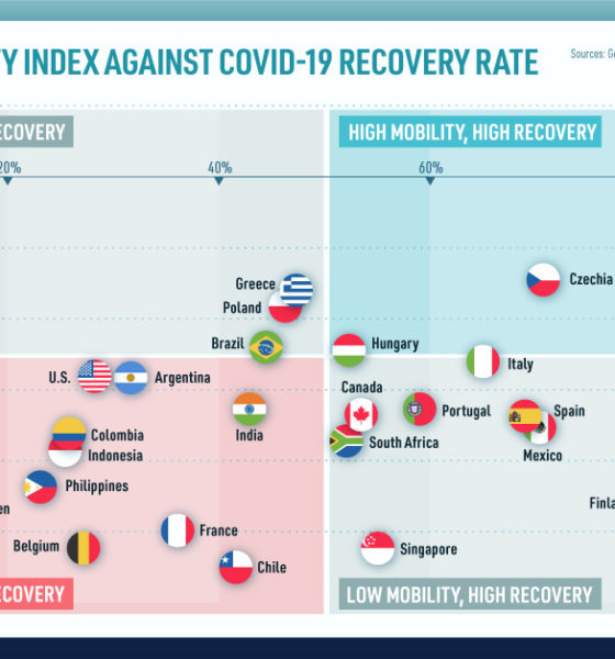
We look at mobility rates as well as COVID-19 recovery rates for 41 economies, to see which countries are reopening...

Collectively, the Big Five tech giants combine for revenues of $802 billion, which is bigger than Saudi Arabia's economy. Here's how it breaks down.

Where do the world's top billionaires live, and how has this distribution changed over time? We take a look at the top 50 billionaires .
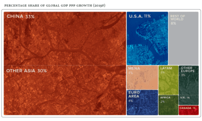

Global economics is effectively a numbers game - here are the countries and regions projected to contribute the most to global growth in 2019.
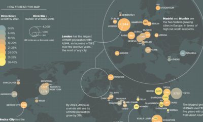

What cities are the world's ultra-rich flocking to? This map looks at ultra high net worth individual (UHNWI) growth rates in cities around the world.
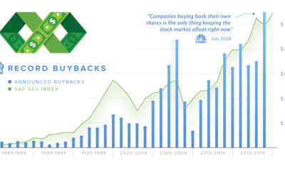

In 2018, companies announced over $1 trillion in stock buybacks. We explain what the proponents and detractors of buybacks are arguing about.
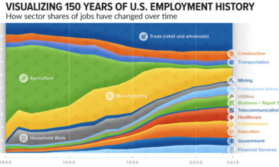

How has the share of total jobs changed over time by sector? This compelling chart shows over 150 years of U.S. employment history by industry.
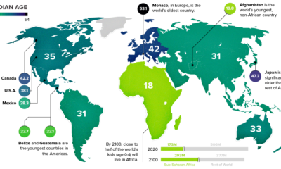

This chart takes a look at the median age of every continent, while also breaking down the youngest and oldest countries in the world.
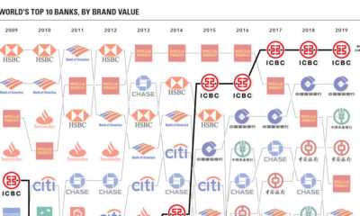

These charts visualize the most valuable bank brands around the world, while also showing the rise of China's financial services sector over time.
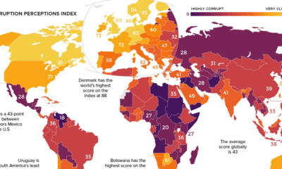

Which countries are the most (and least) corrupt? This world map shows the figures for the Corruption Perceptions Index (CPI) for 2018.
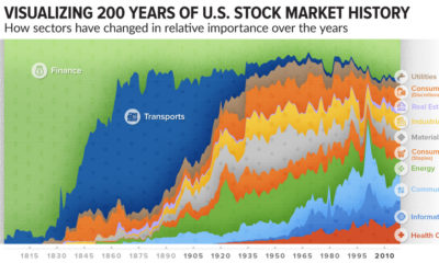

How has the composition of the market changed over time? This incredible chart plots U.S. stock market sectors over 200 years to reveal how much it's...


