We round up the most popular, most discussed, and most liked visualizations of the month on Voronoi, our new data...

We round up the most popular, most discussed, and most liked visualizations of the month on Voronoi, our new data storytelling platform.

We round up the most popular, most discussed, and most liked visualizations of the month on Voronoi, our new and free data storytelling platform.

See the most popular, most discussed, and most liked visualizations on our new data storytelling app Voronoi in December.


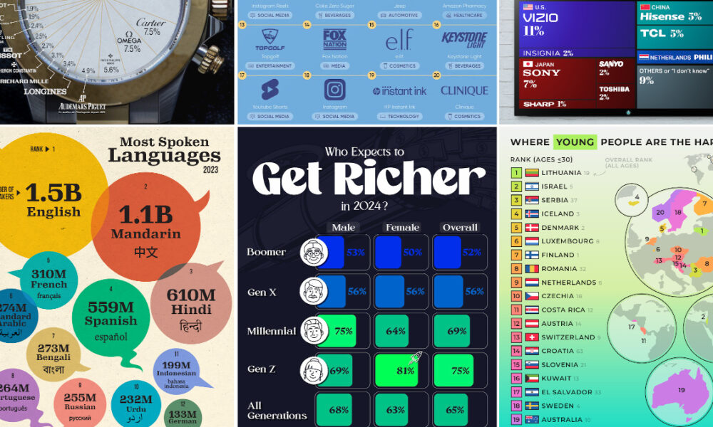
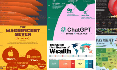
What were the top data visualizations on Visual Capitalist in 2023? We highlight the best charts, maps, and infographics from the year.

In this ninth edition of our yearly round-up, we highlight visualizations that broke new ground in design and data-driven reporting.

In this eighth edition of our yearly round-up, we highlight visualizations that broke new ground in design and data-driven reporting.

In a complex world, the combined forces of data and visual communication take on new importance. See our top 20 visualizations for 2020.
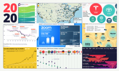

These 20 charts, maps, and visualizations help capture what happened in a tumultuous year around the globe.
A countdown of our top infographics from 2019, including some of our most viewed graphics and other hand-picked entries from our staff.


