Technology
Bitcoin: The Past, Present, and Future
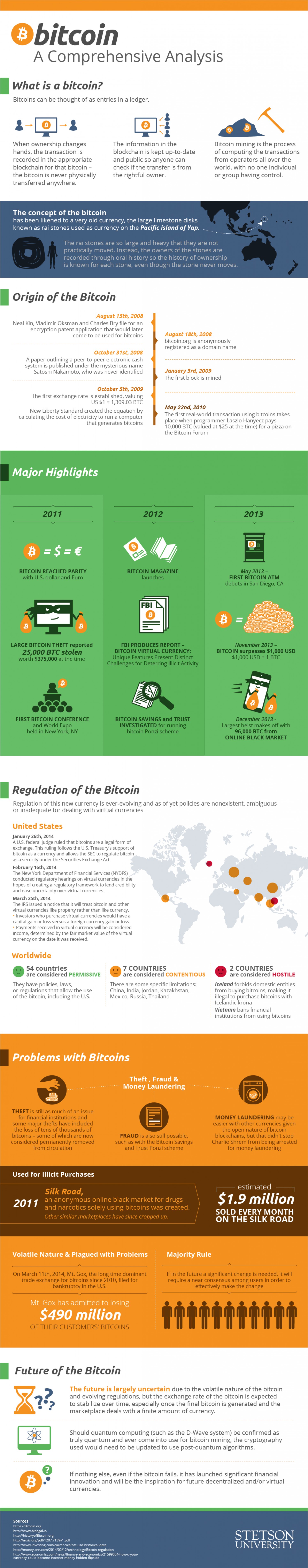
Bitcoin: The Past, Present, and Future
Bitcoin and cryptocurrency are topics that we have covered to a good extent here, including our history of the first five years of Bitcoin.
Today’s infographic covers some of the same essentials, but then goes on to also cover regulation of the cryptocurrency, recent events such as the Mt. Gox bankruptcy, as well as some interesting commentary.
One interesting point brought up for the future is related to quantum computing, which was explained also in a recent infographic. Quantum computing uses subatomic particles that can store information as a “1”, “0” or both simultaneously. If computers had this capability, breaking codes will be much simpler. This means the cryptographic infrastructure behind bitcoins and other currencies would have to be updated.
Lastly, in light of Ross Ulbricht’s recent sentencing, it is interesting to consider the role of cryptocurrency in future e-commerce including the lucrative drug trade. Along with other events, many considered the demise of the original Silk Road to be a catalyst that helped bring the value of bitcoins down from their peak. The theory was that without the Silk Road marketplace, there would be less trade, and therefore bitcoins would be less valuable.
However, since then, a new Silk Road was created (and later seized), and many other attempts to build better mouse traps on the Dark Web are underway. Some people say the current markets such as Agora are bigger than Silk Road ever was. In other words, bitcoins remain just as important to this commerce aspect, but lost some of the narrative associated with it.
Original graphic by: Stetson


Brands
How Tech Logos Have Evolved Over Time
From complete overhauls to more subtle tweaks, these tech logos have had quite a journey. Featuring: Google, Apple, and more.


How Tech Logos Have Evolved Over Time
This was originally posted on our Voronoi app. Download the app for free on iOS or Android and discover incredible data-driven charts from a variety of trusted sources.
One would be hard-pressed to find a company that has never changed its logo. Granted, some brands—like Rolex, IBM, and Coca-Cola—tend to just have more minimalistic updates. But other companies undergo an entire identity change, thus necessitating a full overhaul.
In this graphic, we visualized the evolution of prominent tech companies’ logos over time. All of these brands ranked highly in a Q1 2024 YouGov study of America’s most famous tech brands. The logo changes are sourced from 1000logos.net.
How Many Times Has Google Changed Its Logo?
Google and Facebook share a 98% fame rating according to YouGov. But while Facebook’s rise was captured in The Social Network (2010), Google’s history tends to be a little less lionized in popular culture.
For example, Google was initially called “Backrub” because it analyzed “back links” to understand how important a website was. Since its founding, Google has undergone eight logo changes, finally settling on its current one in 2015.
| Company | Number of Logo Changes |
|---|---|
| 8 | |
| HP | 8 |
| Amazon | 6 |
| Microsoft | 6 |
| Samsung | 6 |
| Apple | 5* |
Note: *Includes color changes. Source: 1000Logos.net
Another fun origin story is Microsoft, which started off as Traf-O-Data, a traffic counter reading company that generated reports for traffic engineers. By 1975, the company was renamed. But it wasn’t until 2012 that Microsoft put the iconic Windows logo—still the most popular desktop operating system—alongside its name.
And then there’s Samsung, which started as a grocery trading store in 1938. Its pivot to electronics started in the 1970s with black and white television sets. For 55 years, the company kept some form of stars from its first logo, until 1993, when the iconic encircled blue Samsung logo debuted.
Finally, Apple’s first logo in 1976 featured Isaac Newton reading under a tree—moments before an apple fell on his head. Two years later, the iconic bitten apple logo would be designed at Steve Jobs’ behest, and it would take another two decades for it to go monochrome.

-

 Green1 week ago
Ranked: The Countries With the Most Air Pollution in 2023
-

 Automotive2 weeks ago
Almost Every EV Stock is Down After Q1 2024
-

 AI2 weeks ago
The Stock Performance of U.S. Chipmakers So Far in 2024
-

 Markets2 weeks ago
Charted: Big Four Market Share by S&P 500 Audits
-

 Real Estate2 weeks ago
Ranked: The Most Valuable Housing Markets in America
-

 Money2 weeks ago
Which States Have the Highest Minimum Wage in America?
-

 AI2 weeks ago
Ranked: Semiconductor Companies by Industry Revenue Share
-

 Travel2 weeks ago
Ranked: The World’s Top Flight Routes, by Revenue