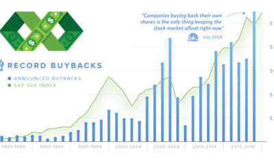

In 2018, companies announced over $1 trillion in stock buybacks. We explain what the proponents and detractors of buybacks are arguing about.
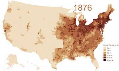

This animation shows the population density of U.S. counties between 1790 and 2010, showing the westward expansion of the country's population.
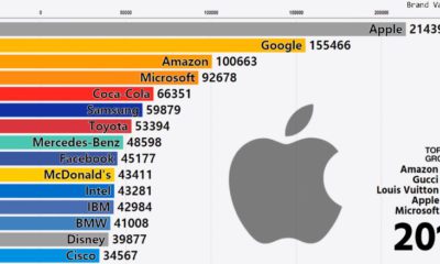

This stunning animation shows a dramatic change in the world's most valuable global brands. Watch tech companies like Apple shoot up the rankings in style.
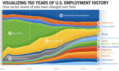

How has the share of total jobs changed over time by sector? This compelling chart shows over 150 years of U.S. employment history by industry.
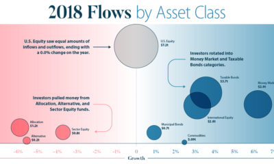

This infographic breaks down investment flows into funds (mutual funds, ETFs, etc.) over the course of 2018 to show how and when investors changed strategies.
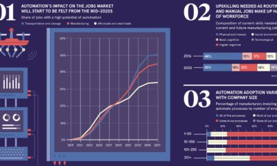

How will technologies such as automation and artificial intelligence end up impacting jobs and the workforce? Here are seven charts that tell the story.
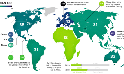

This chart takes a look at the median age of every continent, while also breaking down the youngest and oldest countries in the world.
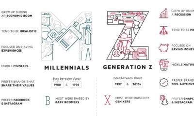

As Millennials enter their early-30s, the focus is now shifting to Generation Z - a group that is just starting to enter the workforce for the...
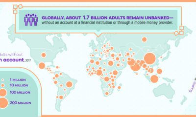

Since the invention of banking, the global financial system has increasingly become more centralized. Here are the big flaws it has, as a result.
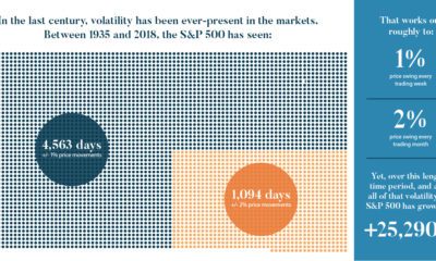

We look at the last century of markets to discover five important lessons about volatility. Here's what you should know about volatility going forward.
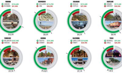

This infographic uses the measure of median household income to contrast the wealthiest and poorest counties in every U.S. state.
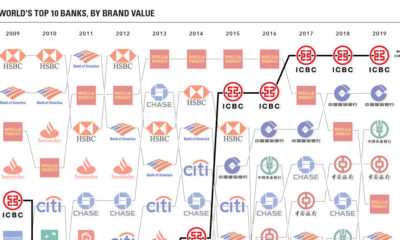

These charts visualize the most valuable bank brands around the world, while also showing the rise of China's financial services sector over time.


An additional $2.1 trillion of spending will be needed to get America's infrastructure back on track - here's how that creates an opportunity for investors.
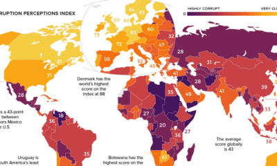

Which countries are the most (and least) corrupt? This world map shows the figures for the Corruption Perceptions Index (CPI) for 2018.
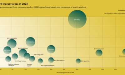

With prescription drugs expected to be a $1.2 trillion industry by 2024, which are the most anticipated drugs and therapy areas in the pharma market?
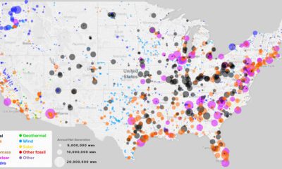

What sources of power are closest to you, and how has this mix changed over the last 10 years? See every power plant in the U.S....
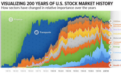

How has the composition of the market changed over time? This incredible chart plots U.S. stock market sectors over 200 years to reveal how much it's...
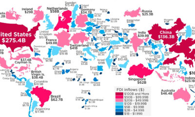

Which economies get the most inflows from foreign direct investment (FDI)? See the world map redrawn based on this important economic metric.
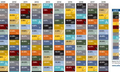

This unique chart shows the performance of individual commodities over the last decade - see commodity returns in 2018, and how they compared to previous years.
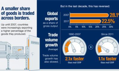

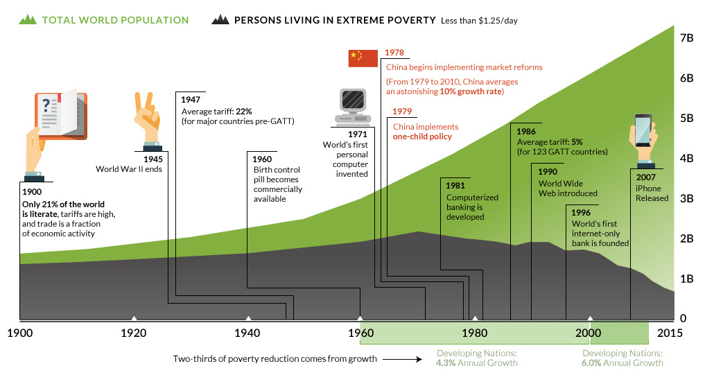
Evidence is growing that the nature of globalization is changing dramatically - and the countries, companies, and workers that benefit are changing as well.


Everything you need to know about the history of Tesla, including Elon Musk's vision for the future of the iconic electric car company.
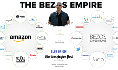

Jeff Bezos is on the brink of becoming the world's richest man. Along with the Whole Foods acquisition by Amazon, see where he and his companies...
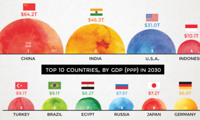

According to projections by a prominent multinational bank, 7 of the world's 10 largest economies will be in emerging markets in 2030.

The emergence of the world’s renewable energy sector is setting the stage for a commodity boom - here's the bull case for 12 different metals going...
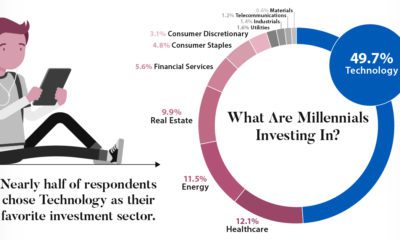

A survey of 9,800 millennials reveals what investing habits will define a generation set to receive a $30 trillion wealth transfer in the coming years.
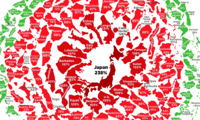

See the latest levels of government debt, based on the IMF's most recent data. Where does your country sit in the snowball?
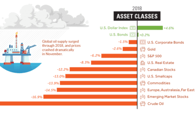

Investors saw a sea of red in 2018 - here's a visual recap of how markets performed, including the big winners and losers from a volatile...
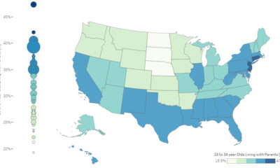

It's estimated that 34.5% of young adults (18-34 years old) in the U.S live at home with their parents. Here's how it varies by state, as...

The city will remain the centerpiece of economic growth in the 21st century. Here's how we're using smart city technology to optimize them even further.
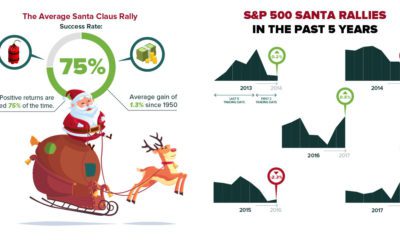

Here's the historical data on the fabled Santa Claus Rally that occurs in the stock market, and how things are shaping up so far this holiday...

A countdown of our top infographics from the last year, including some of our most viewed graphics as well as other hand-picked entries from our staff.
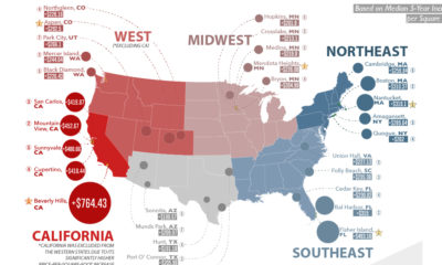

Here are the biggest increases in median housing prices (per sq. ft) over the last 5 years. See where real estate prices are rising (and falling)...
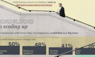

What are the roadblocks to achieving scale? We look at these growing pains, as well as the steps needed to get past them in scaling your...
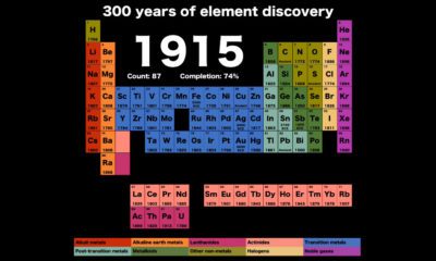

Watch discoveries of new elements as the years flip by, in this short and compelling animation that shows how the periodic table has changed over 300...
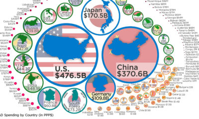

Just four countries (U.S., China, Japan, and Germany) account for nearly two-thirds of global expenditures on R&D. Here's global data on R&D visualized.
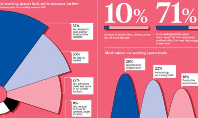

More and more startups are moving to co-working spaces, which provide a scalable office space solution. See more on why the co-working space is booming.

An interactive look at which tech giants and unicorns are winning in the battle for patents - including a look at patent categories and patent-leading CEOs.


This in-depth infographic provides a practical guide on how anyone can increase privacy on their browser, social media networks, and mobile device.


Submit your idea for the chance to win great prizes, including having your infographic idea designed and published, or a signed copy of our new book!
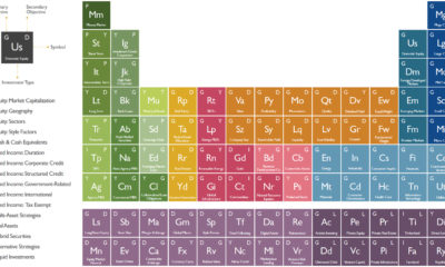

The investment universe is vast - but it's also made up of many smaller components. See it all depicted in this nifty periodic table of investments.
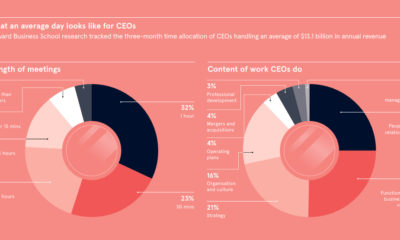

Top-performing CEOs are paid the big bucks to take their companies to the next level. Here's how they spend their time, and the biggest challenges they...
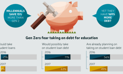

Gen Z saw their older friends take on massive amounts of debt, while struggling to secure stable jobs - and now they are learning from those...
This interactive graphic shows the poverty rate of every state, and also how poverty levels have changed over time according to the U.S. Census Bureau.

All five tech giants are now officially in a bear market - we visualize the damage to the FAANG stocks and the wider market, and evaluate...
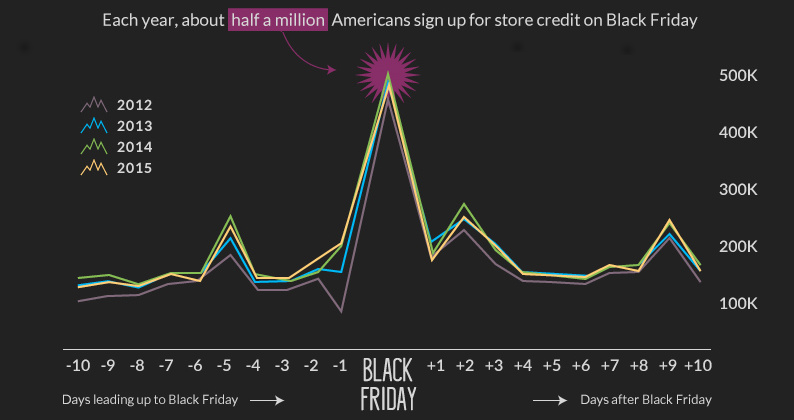
Black Friday is the kickoff to the holiday shopping season - and it often starts it with a bang. See the crazy retail numbers behind the...
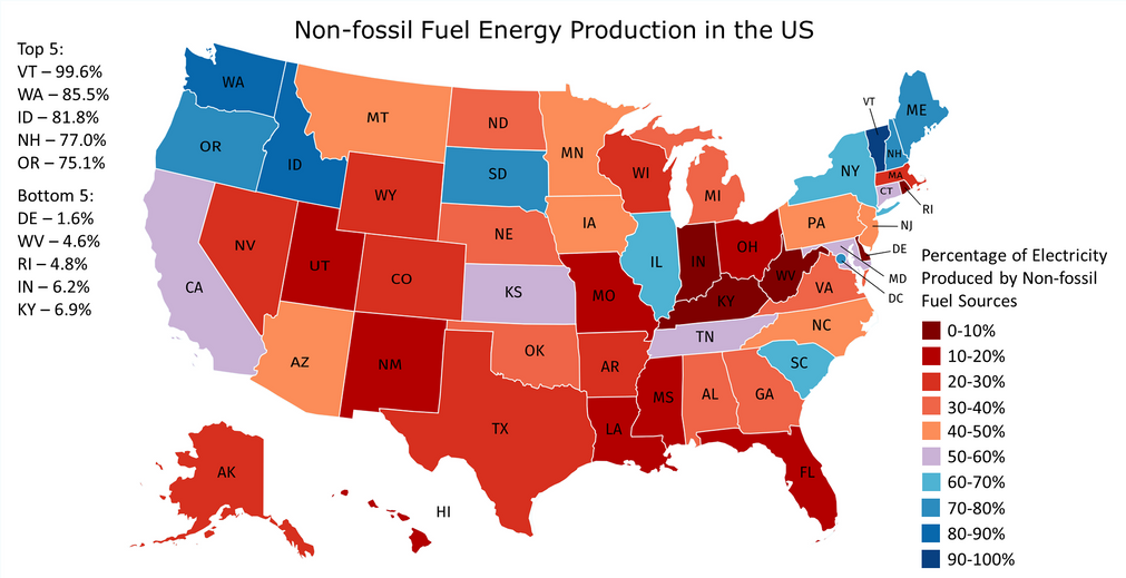
In countries where energy is plentiful, we often take the grid for granted. But do you know where your power comes from, and how green it...
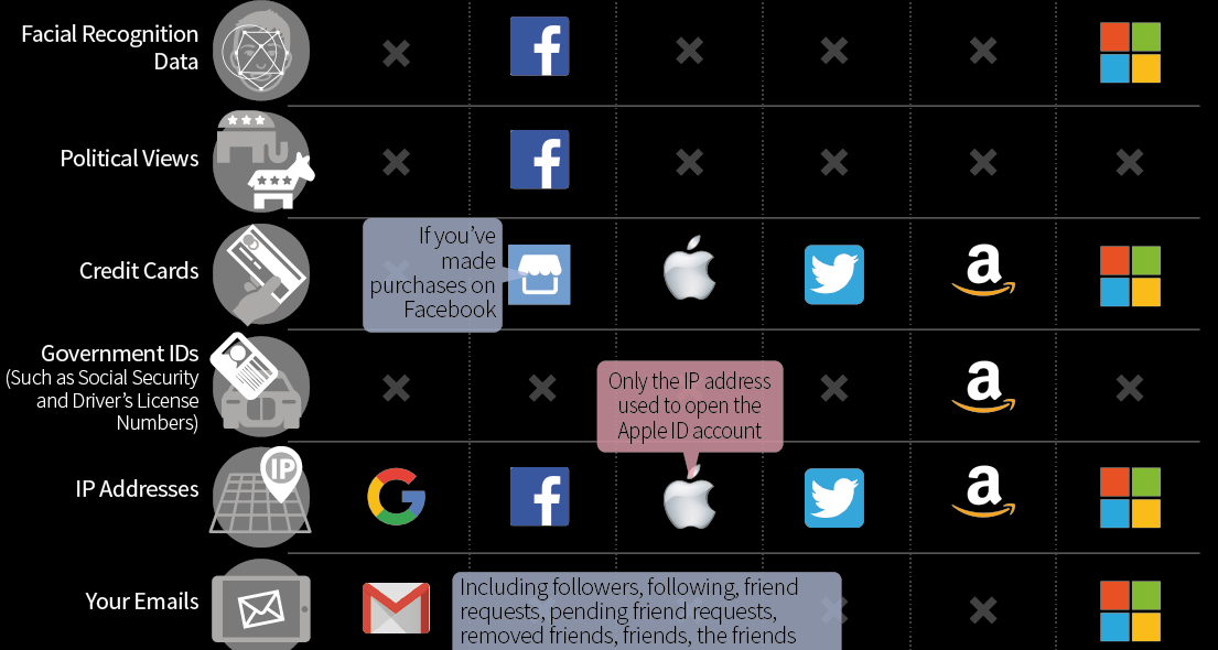
Comparing the types of data that the big tech companies like Facebook, Google, and Amazon admit to collecting in their privacy policies.
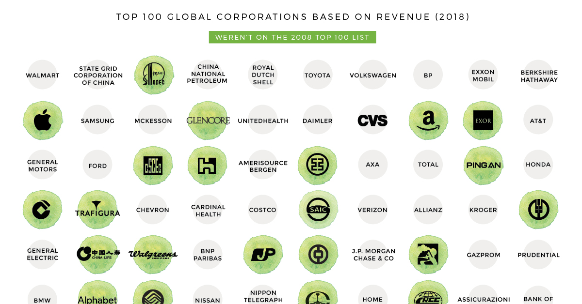
This nifty animated chart shows how the list of the world's biggest companies by revenue have changed over the last decade.

Need to get something for the person who has everything, or the client who just loves jaw-dropping data? See why the Visual Capitalist book may be...
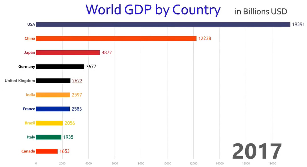
This rapid-paced animation shows year-by-year changes in GDP for the world's 10 largest economies over the course of 57 years.


