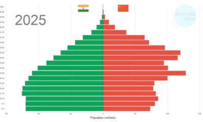

The world's two most populous countries have some economic similarities, but China and India are also diverging in one key area: demographics.
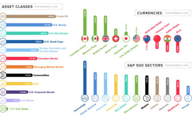

This quick graphic summary breaks down the final market numbers for 2019, looking at everything from currencies to broad asset classes.
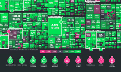

The U.S. stock market had a banner year, but some sectors were notable outliers. Here are the ones that outperformed (and underperformed) in 2019.

See every major coal power plant ever commissioned on this animation, which covers a time period from 1927 until 2019.
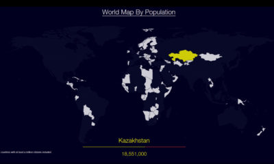

Watch countries appear one-by-one to form a cohesive world map, when they are ordered by population.
A countdown of our top infographics from 2019, including some of our most viewed graphics and other hand-picked entries from our staff.
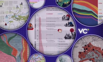

A sneak preview of three special features that will be sent to VC+ members in December 2019.
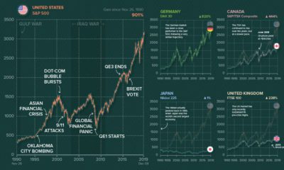

Ever wonder what other major stock markets would look like, if they were on the same scale of the S&P 500? We chart them all over...
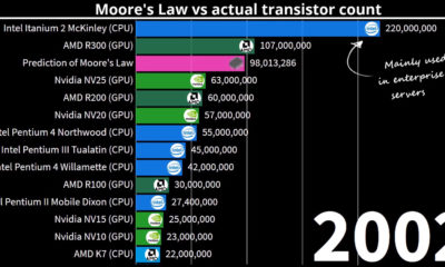

Can the predictions from Moore's Law keep up with technological innovation spanning almost 50 years? Watch this stunning animation to find out.
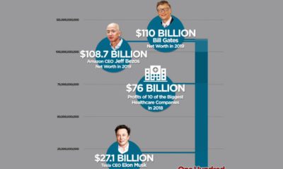

Bill Gates is the world's wealthiest person again, with a fortune of $110 billion. This short animation helps visualize the extent of this wealth.

Upcoming special features for our VC+ members, including one on global demographics and a behind-the-scenes look at how we made a popular graphic.
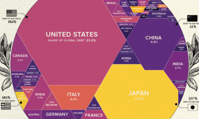

What share of government world debt does each country owe? See it all broken down in this stunning visualization.


In our every day lives, light is instantaneous - but in the context of our solar system and beyond, light is surprisingly slow.
Introducing VC+, a premium subscription that gets you even more of what you love from Visual Capitalist.
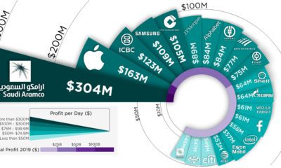

Saudi Aramco, the state oil producer in Saudi Arabia, rakes in $304 million of profit per day - putting it atop the list of the world's...
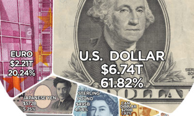

Here are the reserve currencies that the world's central banks hold onto for a rainy day.
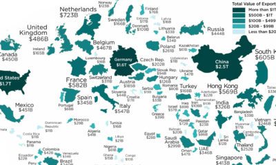

These are the largest international trade powerhouses of the world, resized on the map based on their annual exports in 2018.


After adjusting GDP for purchasing power parity (PPP), here is how the composition of the world economy breaks down by country.
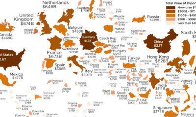

Which economies are the world's biggest importers of goods? See for yourself in this visualization, which resizes countries based on the value of imports.
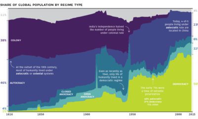

At the start of the 19th century, less than 1% of humanity lived under democratic rule. See how systems of government have changed over the last...
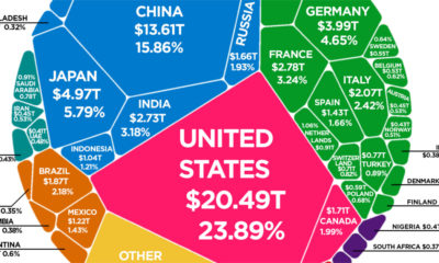

According to the latest World Bank data, the global economy is now $85.8 trillion in nominal terms. Here's how it breaks down.
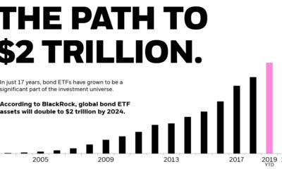

Bonds are a staple in every portfolio, but up until recently were hard to own. Here's how bond ETFs changed that, reaching $1 trillion in global...


A collection of the best Warren Buffett quotes, accompanied with illustrations, to close out our infographic series on the famous investor.
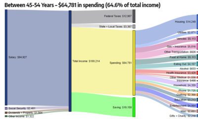

These interesting diagrams break down how Americans of different age groups earn and spend their money, and what the money goes towards.
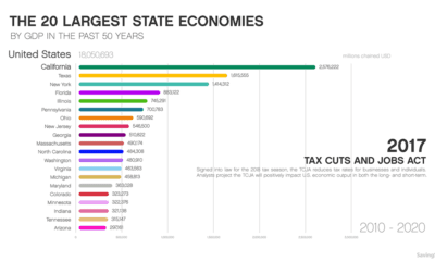

This animation shows how the largest state economies by GDP have changed over the last five decades of time, and what such a ranking looks like...

Last year, the global banking industry cashed in an impressive $1.36 trillion in profits. Here's where they made their money, and how it breaks down.
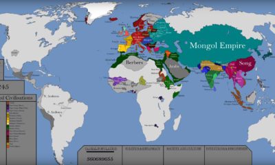

This epic attempt to condense the history of the world — including the rise and fall of empires — fits into a single video.

See how consumer credit has evolved through the ages — from its ancient origins, to the use of game-changing technologies like artificial intelligence.


This stunning set of 3d maps purposefully exaggerate the elevation scale to show you the mountains of both the United States and North America.
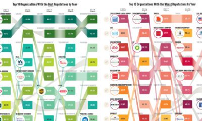

According to a representational poll of 18,228 Americans, these are the organizations considered to have the best and worst reputations.
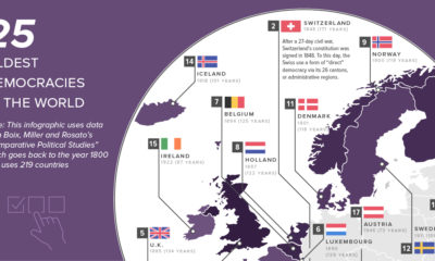

This map shows the 25 oldest democracies in the world, based on how long current democratic governments have been in continuous power.
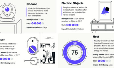

The future of the home is with smart technology - see the key smart home inventions that are set to influence the industry going forward.
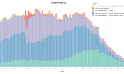

This interactive infographic allows you sort data on the U.S. population using a variety of topics, to see how Americans differ by age.
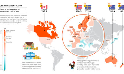

Which real estate markets have the highest risk of seeing a correction? These maps highlight housing bubble risks using data from four key indicators.
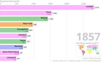

This two-minute animation shows changes in the last 500 years of historical rankings for the world's 10 most populous cities.


Visualizing the vast amount of data produced every single minute, and why it's still early days in the big data era of technology.
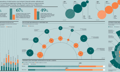

Each generation was shaped by unique circumstances, and these differences translate directly to the investing world as well.
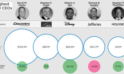

Does high pay for CEOs translate into company performance? See for yourself in this visualization featuring the top CEOs of companies on the S&P 500.
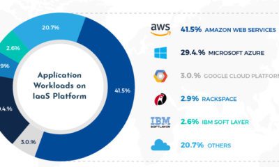

Do you watch Netflix or use Facebook? If so, then you are indirectly leveraging Amazon's incredible scale and dominance of the cloud.
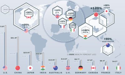

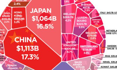
These 10 countries hold 74% of the world's $204 trillion in private wealth. How will this wealth of nations change over the next decade?

More than $6 trillion of U.S. debt is owned by foreign governments such as China or Japan. See how it all breaks down, and what it...


Trust is the glue of modern organizations to ensure collaboration and healthy conflict. Here are proven ways to build trust with employees.
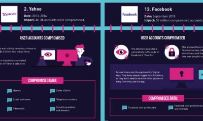

Did you know that 6.5 million data records are stolen each day? Here are the biggest data breaches over the years, and what happened in each...
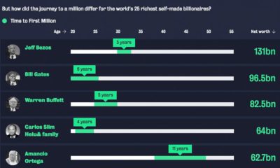

For the world's wealthiest self-made billionaires, how long did it take to earn the very first $1 million of their vast fortunes?
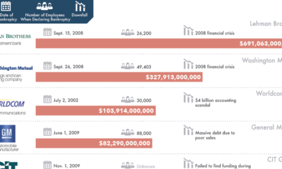

There is always risk in business - but for these 20 companies, which caused the biggest bankruptcies in history, those risks didn't quite pan out.

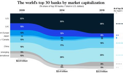
See how the world's largest companies have changed over time, and how this helps tell a broader story about what the market is thinking.

This video highlights the basics of the stock market, how they work, and also the history of how the first markets got started.
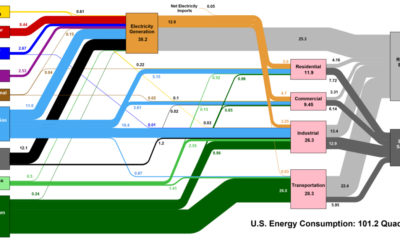

This interesting diagram breaks down all U.S. energy use by both source and industry, and everything that happens in between.
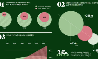

These pivotal trends show how urban demographics are aiding in the transition to a very different economic and investment landscape.
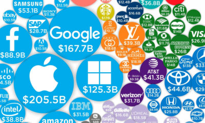

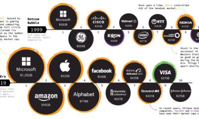
Technology brands account for 20 of the world's 100 most valuable brands in 2019, combining for a whopping 43% of total brand value.


