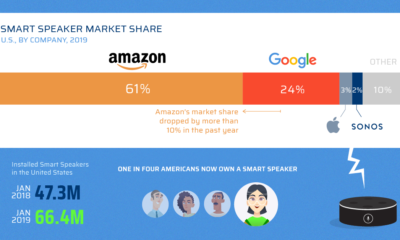

Tech brands are betting that the future of personal computing will be driven by the sound of your voice, and the fight for smart speaker market...

When goods traveled to new regions, their native names sometimes hitchhiked along with them. This map shows the spread of loanwords around the world.
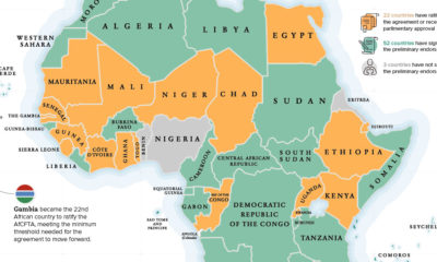

The Gambia recently became the latest country to ratify the African Continental Free Trade Area (AfCFTA), helping the landmark agreement reach critical mass to move forward.
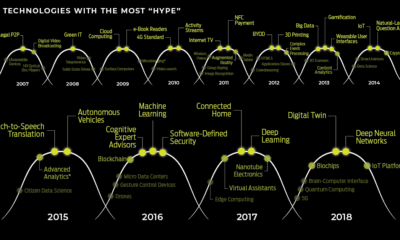

We look back at every year's Hype Cycle this millennium to see which emerging technologies captured our imagination.
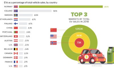

With global sales hitting new milestones and adoption rates rising, are electric vehicles now becoming a mainstream option for drivers around the world?
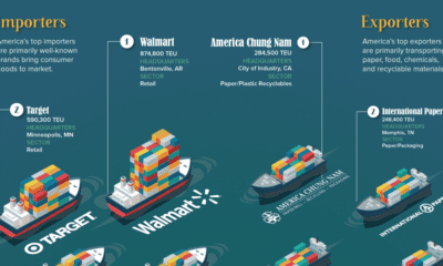

Millions of tons of cargo get moved in and out of the U.S. every day. Which companies are bringing goods in, and which are shipping them...
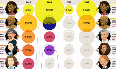

Celebrity status can be a powerful tool for building a fortune. These infographics visualize the world's top earning celebrities, both living and dead.
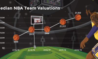

Buoyed by hefty broadcast agreements and superstars like LeBron James, NBA team valuations are hitting new heights. Let's break down the data by team.
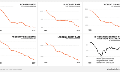

There's a persistent belief across America that crime is on the rise. This graphic amalgamates crime rate data from the FBI to show a very different...
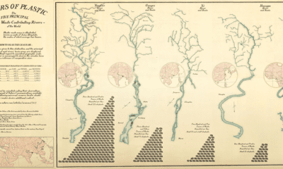

Every year, 8 million metric tons of plastic enters the world's oceans – much of it through our river systems. See which rivers are polluting the...
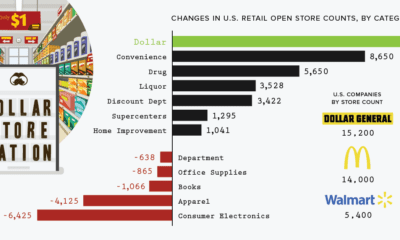

The retail apocalypse has forced the closure of many types of brick-and-mortar stores around the country. Despite this, here's why dollar stores are thriving.
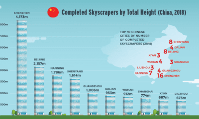

Nearly 150 skyscrapers were completed around the world last year. Find out which cities and regions are growing skyward the fastest.
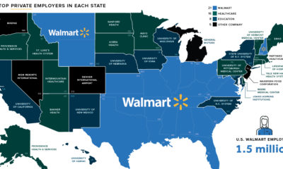

On this map of biggest employers in each state, there's one regional trend that stands out the most – the broad blue expanse of Walmart country.
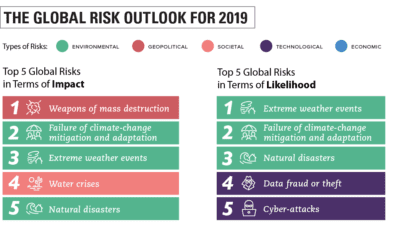

This year's Global Risks Report helps put the world's most pressing issues into focus by identifying the top risks for 2019.
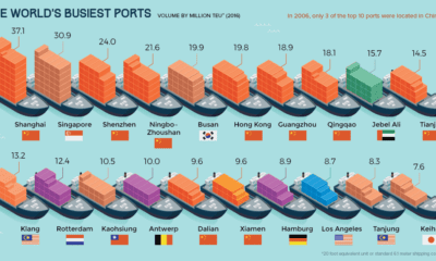

Every day, millions of tons of goods pass through ports to get to their end consumers. Here are the world's busiest ports, and how numbers have...
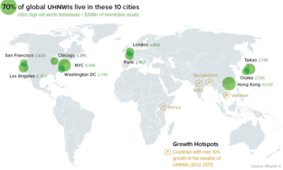

A data-driven snapshot of global wealth distribution. The average person around the world is doing better, but big-picture inequality is still staggering.
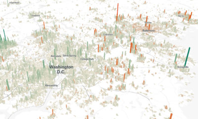

Cities are constantly evolving over time. These 3d graphics visualize both growth and decline with a focus on North American cities from 1990-2015.
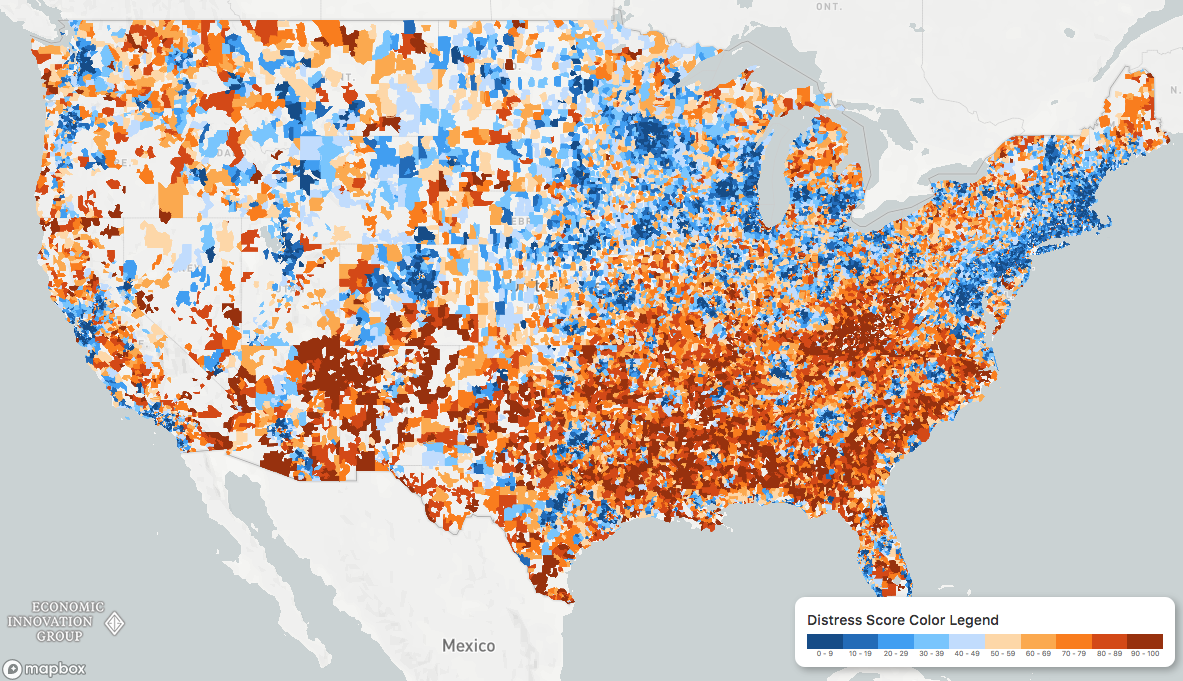
While the U.S. economic picture remains quite rosy, things change quickly when you zoom to the local level. This map shows the country's distressed communities.
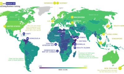

In some countries, launching a business is easy. In others? It's a hassle that is littered with bureaucracy, corruption, and a lack of basic services.
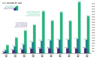

What is the relationship between age and income level? We visualize the data and compare it to commonly held beliefs on the topic.
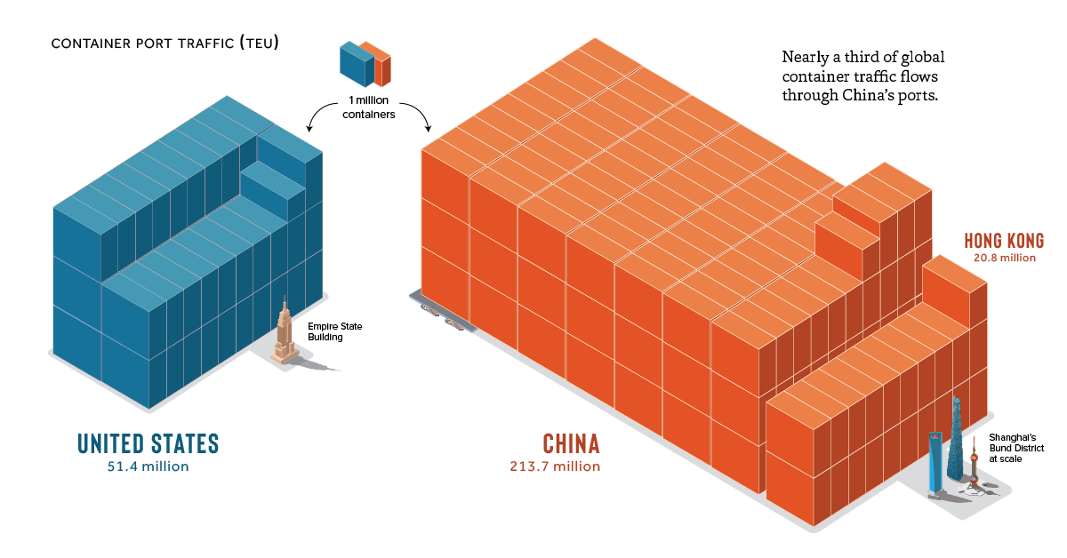
Globalization owes a lot to the humble shipping container. See the massive scale of global container shipping, and which countries are moving the most units.
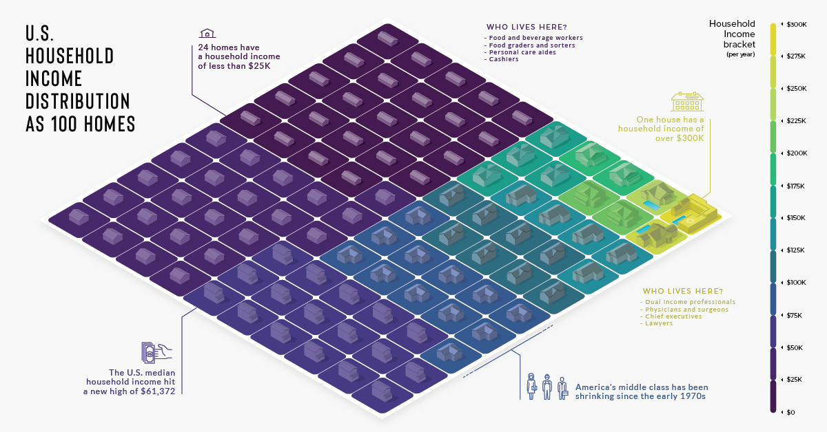
There are over 125 million households in the U.S., each with varying incomes. He's how they look distilled down into a visualization of 100 homes.
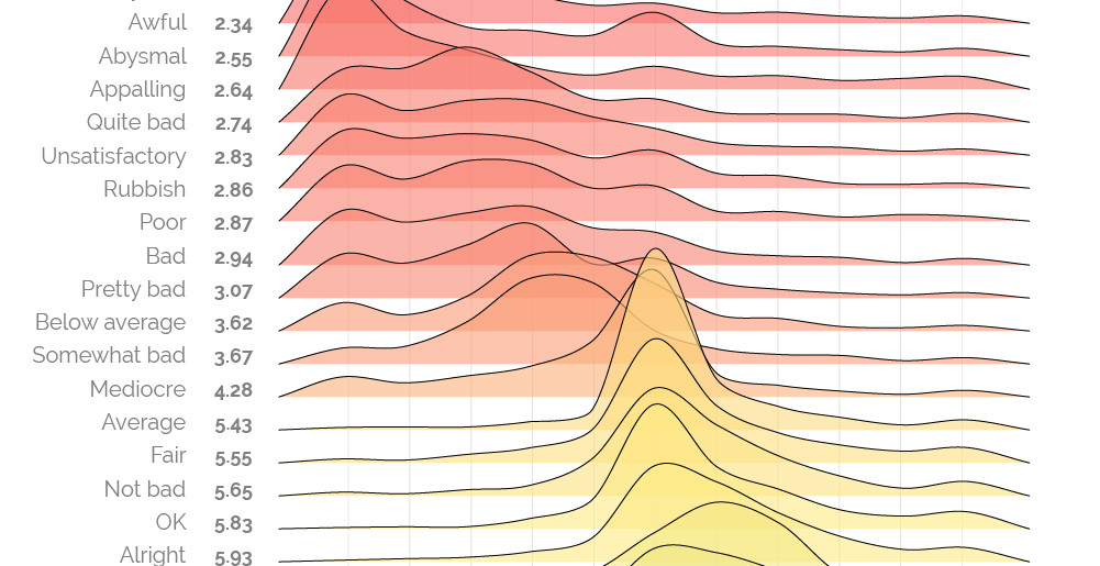
The words 'bad' and 'awful' may not appear very different, but as this sentiment scale reveals, some words and phrases are more potent than others.
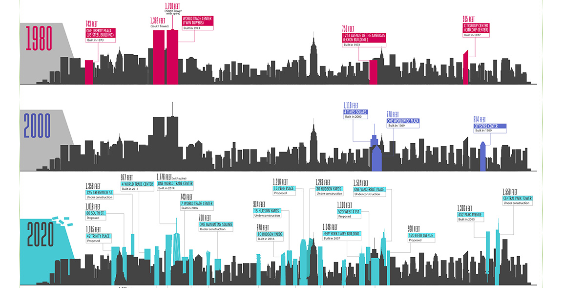
Icons on the New York City skyline, like the Empire State Building, will soon be sharing the sky with a new generation of slender skyscrapers.
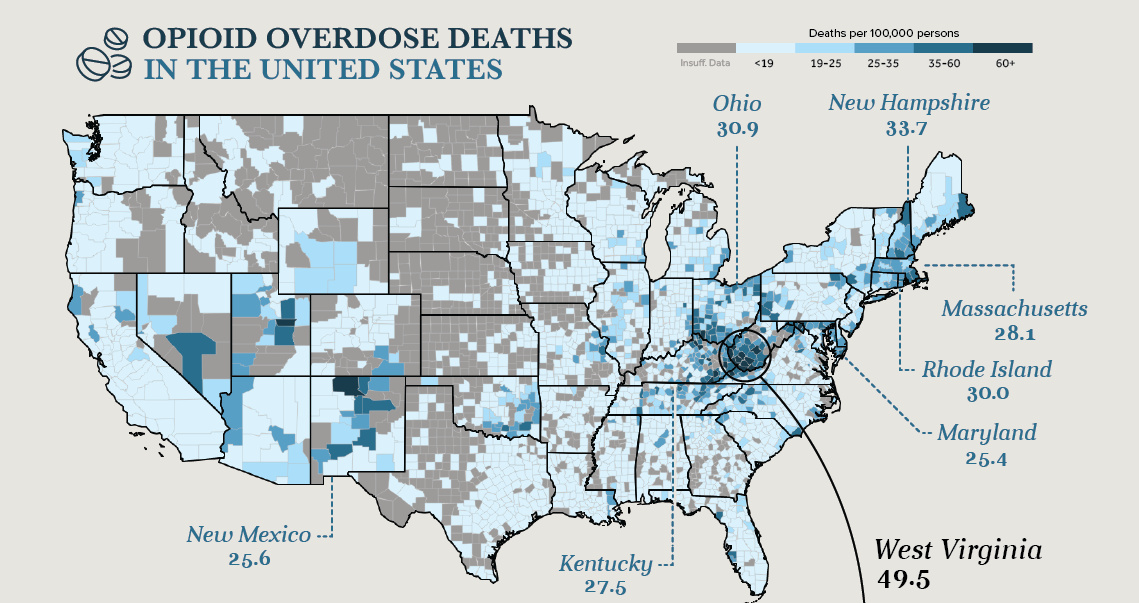
Drug overdoses are the leading cause of death for Americans under the age of 50. A hard look at the numbers behind this unparalleled public health...
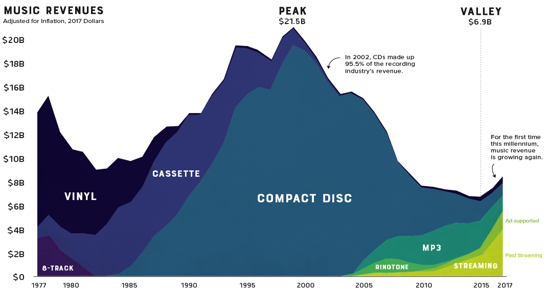
A revealing look at three decades of music industry sales. After a devastating decline, streaming services like Spotify are helping the industry regain its footing.
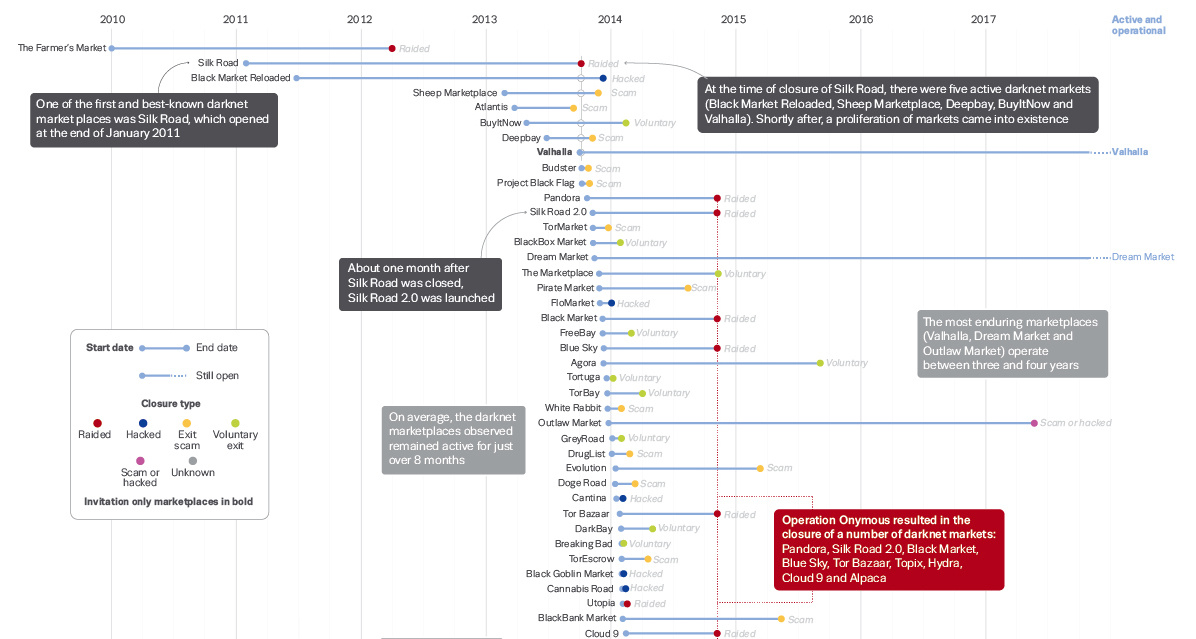
How often does a dark web marketplace last, on average? This data visualization offers a data-driven look at the survival rate of underground marketplaces.
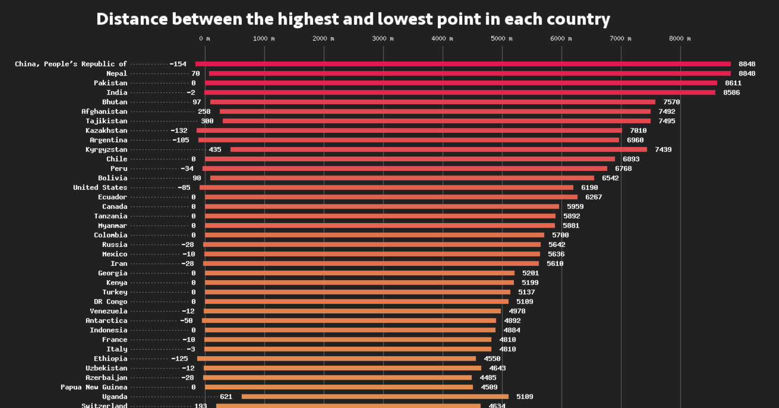
This data visualization compares the elevation span of every country, ranging from the mountain peaks of Bhutan, to the Dead Sea depression.
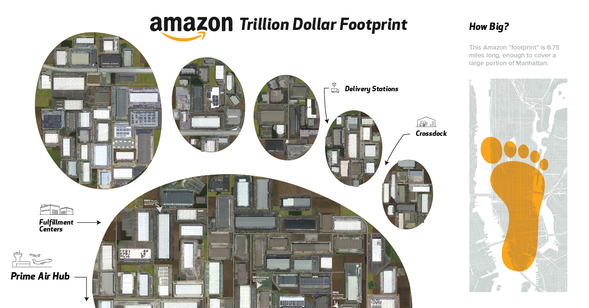
This visualization shows satellite imagery of all of Amazon's warehouses in the U.S. to put the size of its physical distribution network in perspective.
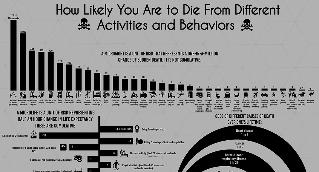
Science has given us insight into which behaviors may prolong or shorten life, but is there a universal, data-driven way to quantify death?
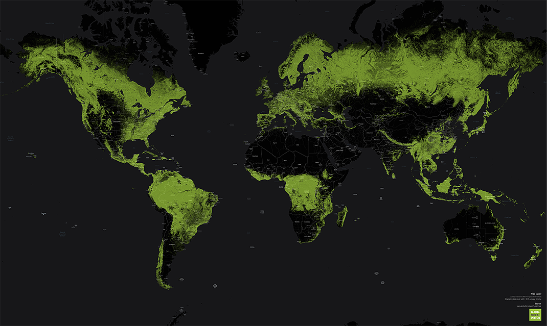
Forests cover 30% of the world’s land. These maps and charts shows where forests are flourishing, and where human activity is chipping away at the tree...
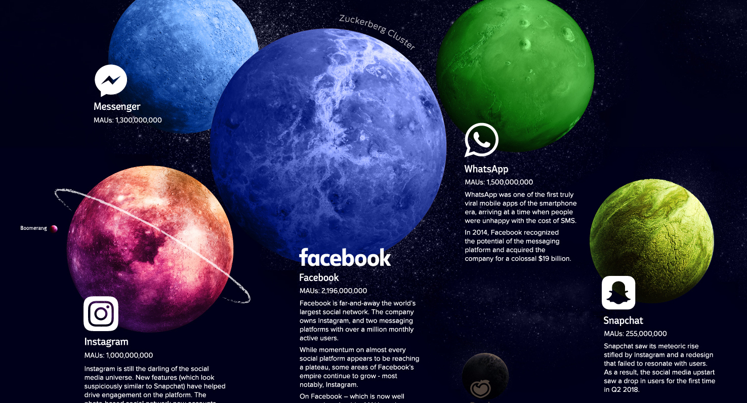
Explore the social media universe in this giant infographic, where every platform is a planet sized based on the amount of users it has.
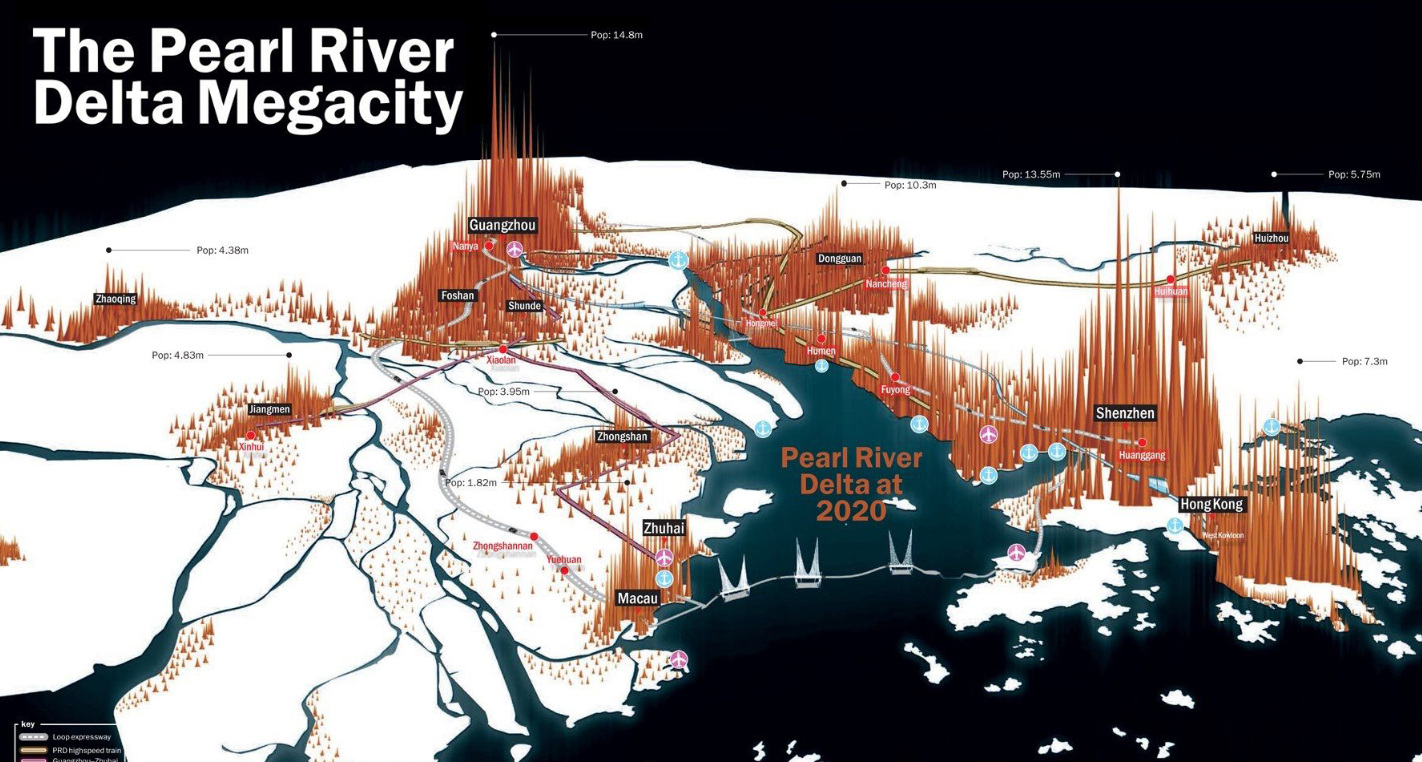
China's Pearl River Delta, in an unprecedented growth spurt, has seen cities expand and merge to become the largest contiguous urban region in the world.
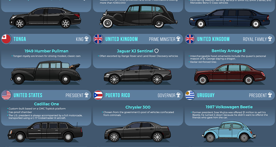
From bombproof luxury to vintage style, heads of state choose a wide variety of vehicles to get around.
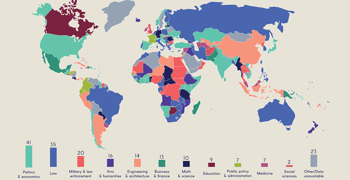
The vast majority of heads of government have some sort of post-secondary education, but their areas of study vary greatly.
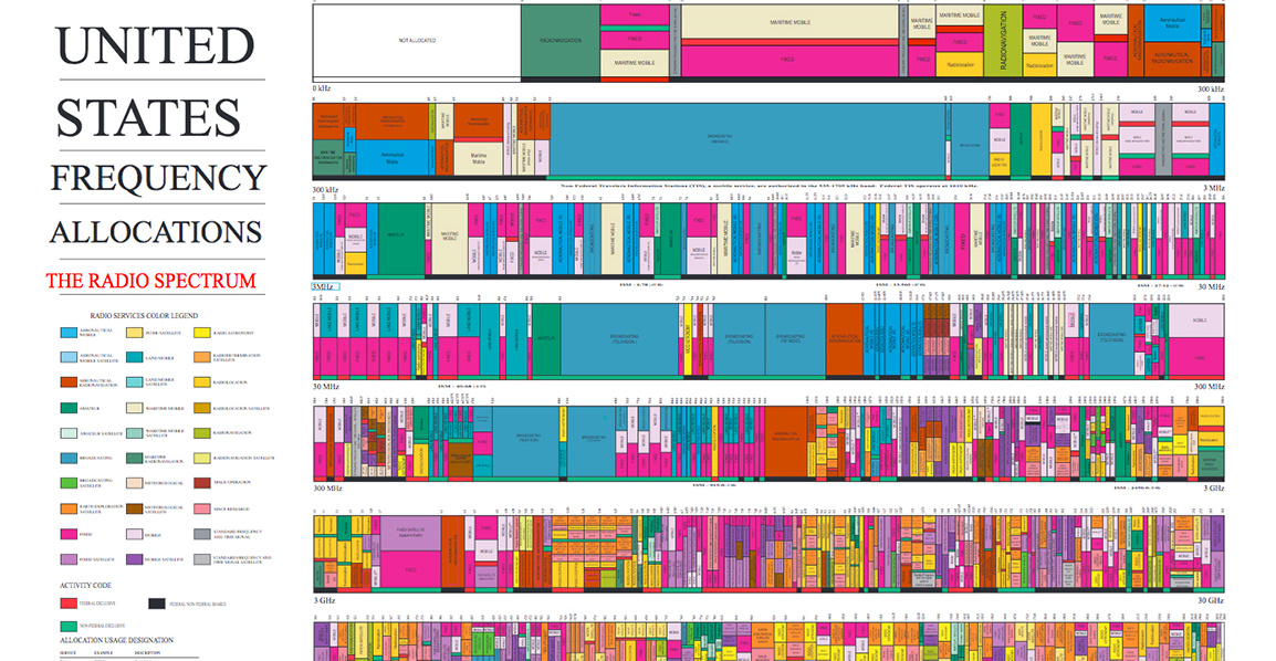
The radio spectrum is the 'transportation network' for wireless communication. Learn how this complex system works, and how IoT is causing a spectrum crunch.
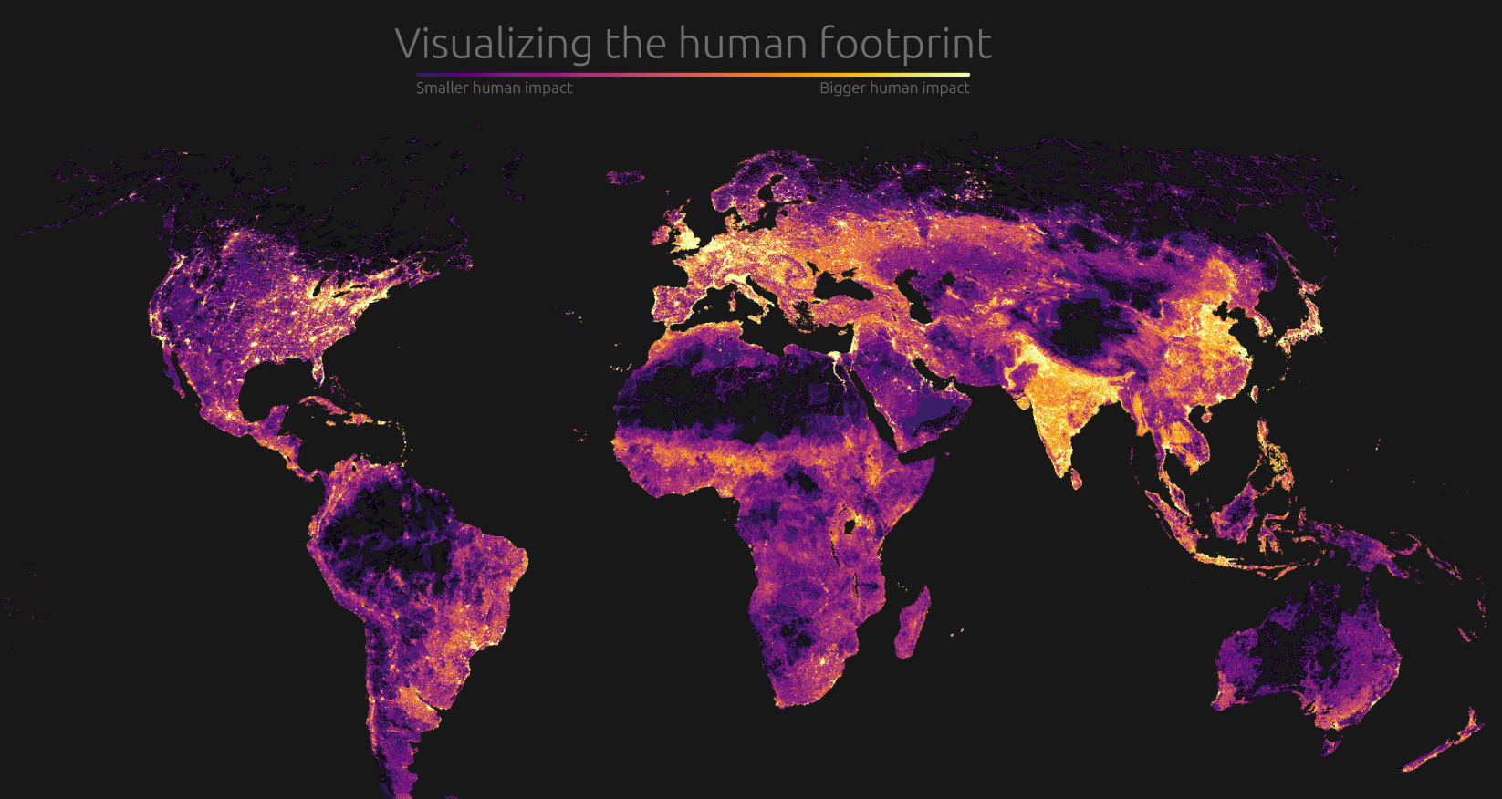
Our impact on the planet has been profound. Today's graphic visualizes this human footprint by looking at population density, roads, undersea cables, and more.
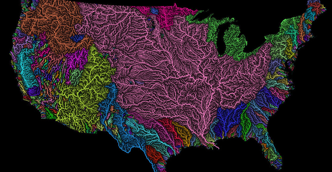
Nothing is more fundamental to life than water - so see the world's watersheds like never before with these colorful and absolutely stunning maps.
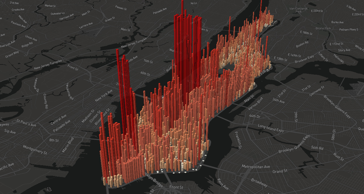
An eye-opening look at the population 'heartbeat' of Manhattan, which swells to an incredible four million people during an average workday.
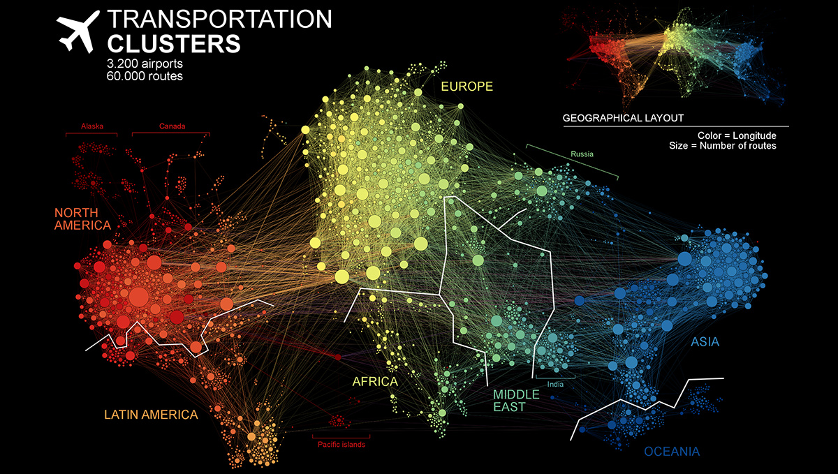
This unique network map of 3,200 air traffic hubs is a new way to visualize connectivity between the world's population centers.
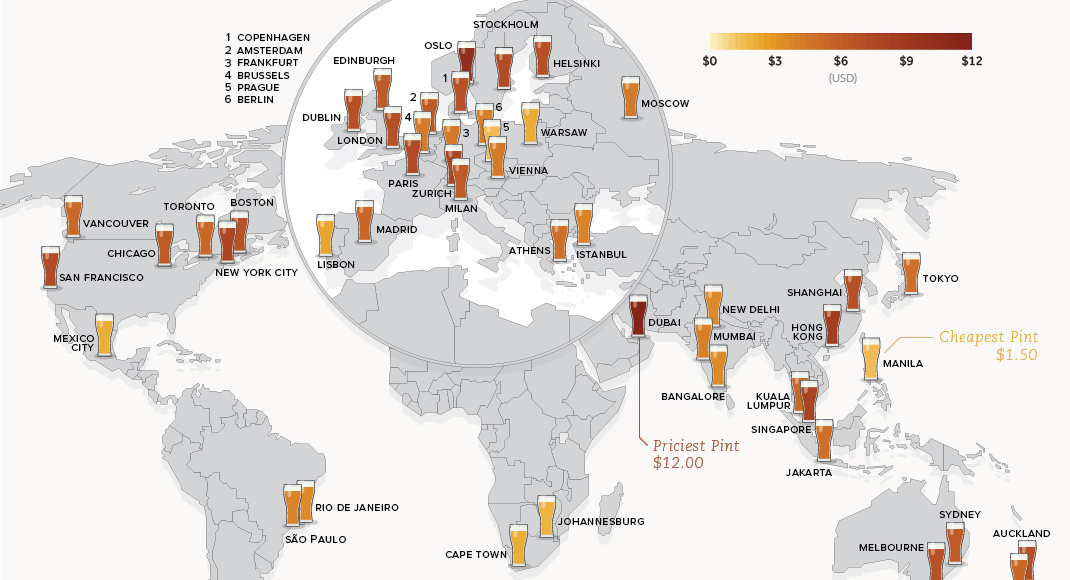
This data on the price of beer is fresh from the tap. See how much a pint of beer costs in 48 different major cities around...
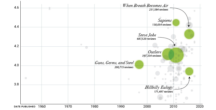
Bill Gates has amassed over 150 nonfiction book recommendations on his blog. We've visualized and analyzed that list through this set of graphics.
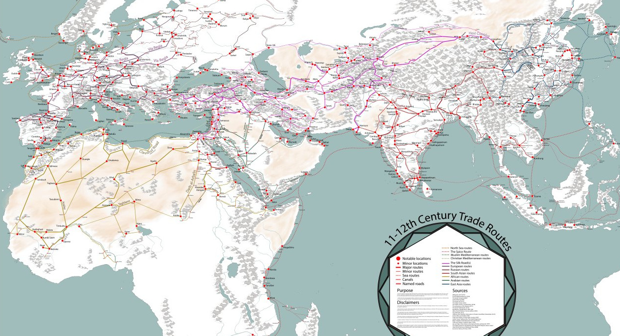
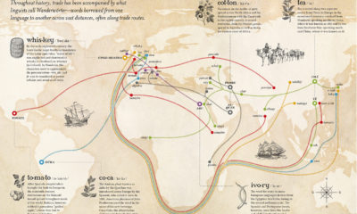
Long before container ships zig-zagged the oceans, caravans and single-sail cogs hauled goods across the world. This map is a fascinating look at that era.
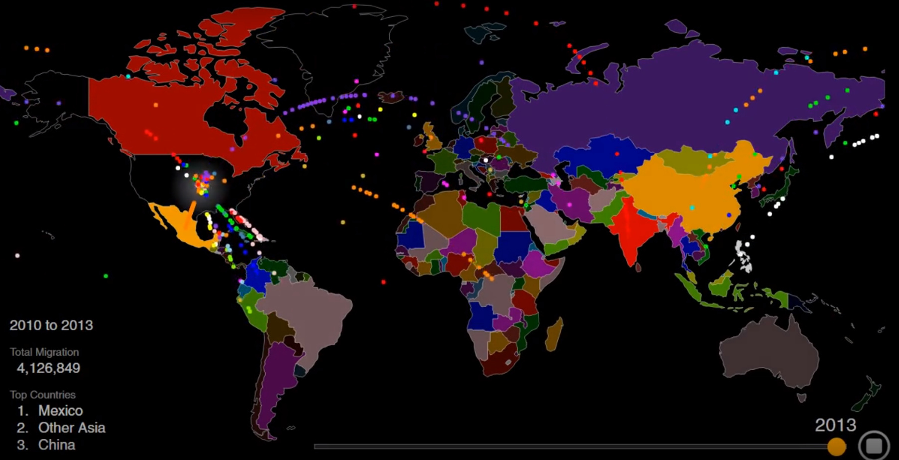
The U.S. is known as a nation of immigrants - but just who came to America, and why? This striking animation tells the story.
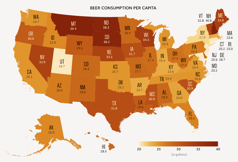
A data-driven look at consumption of America's most popular alcoholic beverage: beer.

In just a half-century, Dubai has gone from a fishing village to a global real estate hub. Today's video and graphic track the city's stunning transformation.
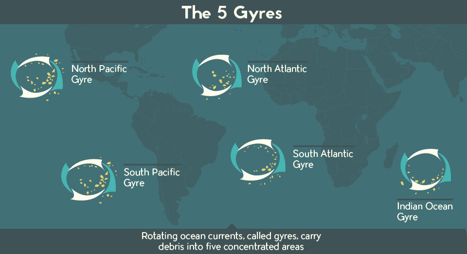
There is a staggering amount of plastic debris swirling around our oceans. This infographic and video help put this plastic problem in perspective.
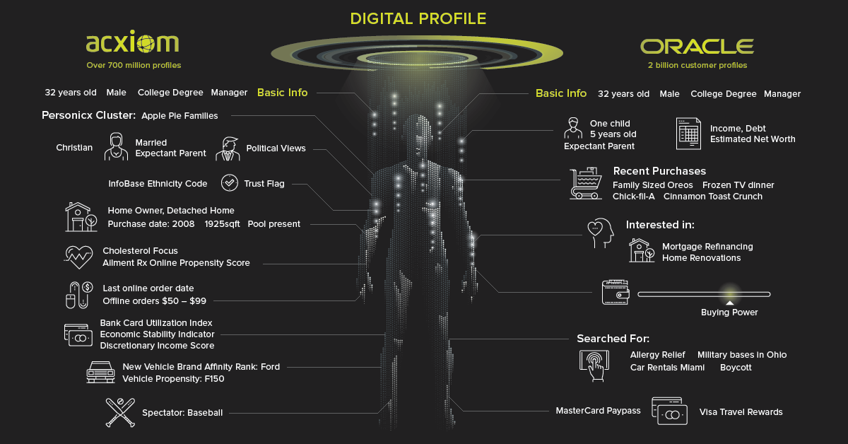
Though Facebook has been in the spotlight, it's only one part of a complex, multi-billion dollar industry that makes a living from your personal data.

How a devastating series of cholera outbreaks in the 19th century inadvertently spurred innovation in the field of data visualization.
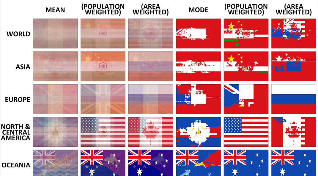
The average flag of the world, as well as different continents, if every flag were combined together. Also, a look at the building blocks of flag...


