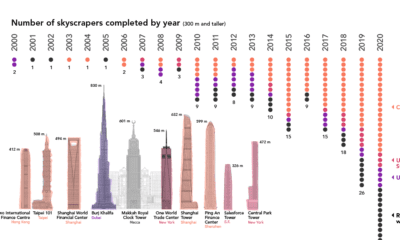

Once a rarity, supertall skyscrapers now punctuate the skylines of cities around the world. We chart the construction of these structures over the past 20 years
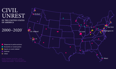

This map of civil unrest in the United States helps provide much needed context on how individual events fit within the nation-wide pattern over time.
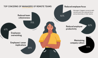

During the pandemic, millions of people have transitioned to working remotely. But how do workers and managers actually feel about it?
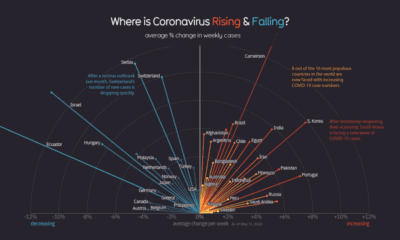

Globally, the curve of COVID-19 cases is flattening, but individual countries vary considerably as new pockets of the world deal with the pandemic.
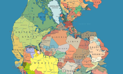

Many millions of years ago, the world was one. This nifty map shows this Pangea supercontinent overlaid with modern country borders.
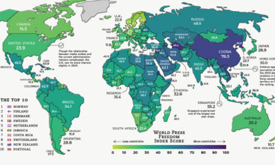

Global press freedom improved slightly in 2019, but censorship, intimidation, and violence remain a fact of life for many journalists around the world.
As millions of people continue to show up for work during the COVID-19 pandemic, many face a higher risk of potential exposure to the virus.
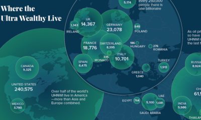

Here's where the world's ultra-rich (>$30 million in assets) live, and also how the landscape is projected to change over the coming years.


A visual explainer on what COVID-19 does to your body once you become infected, and how the virus uses our immune system against us.
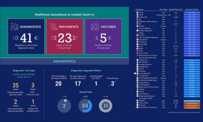

As the number of confirmed COVID-19 cases continues to skyrocket, healthcare researchers around the world are working to defeat the virus.
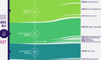

A visual breakdown of the CARES Act, the $2 trillion package to provide COVID-19 economic relief. It's the largest stimulus bill in modern history.
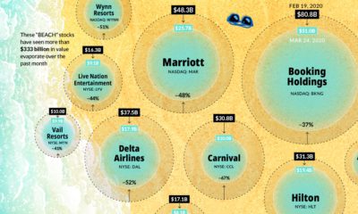

As investor confidence across the travel industry slumps amid COVID-19, market capitalizations across 'BEACH' stocks shrink to unprecedented levels.
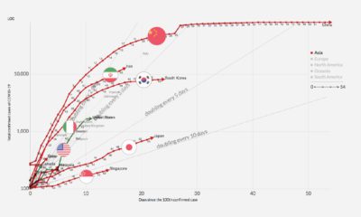

The number of COVID-19 cases around the world continues to grow, but each country has a different infection trajectory. This chart tells the story.
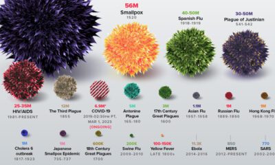

The history of pandemics, from the Antonine Plague to the novel coronavirus (COVID-19) event, ranked by their impact on human life.
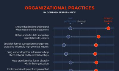

What impact does leadership accountability have on the performance of an organization? As it turns out, a lot.
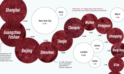

China has the same amount of 1 million+ population cities as both North America and the EU combined. Here they all are, from biggest to smallest.
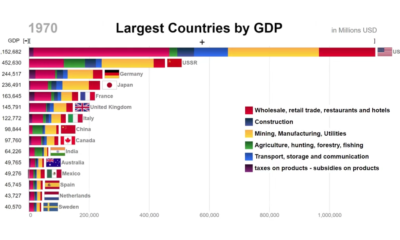

This animation looks at the top countries in the world by GDP, while also showing the components that comprised economic activity at the time.
A data-driven look at America's nuclear weapons arsenal – both location and deployment, and the costs associated with refurbishing an aging nuclear program.
Tesla is not only the top valued U.S. automaker, it's now worth more than Ford and GM combined. Will the rally continue, or will short sellers...
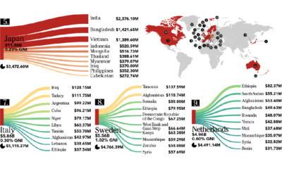

This infographic looks at who is giving – and who is receiving – the billions of dollars in foreign aid that flows between countries each year.
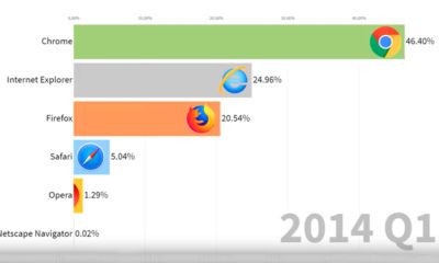

This animation provides a nostalgic look back at the market share of various web browsers, from Netscape Navigator to Google Chrome.
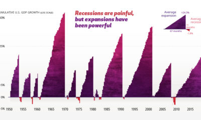

The economic cycle is a series of peaks and valleys. Analyzing economic data going back to 1950 helps put recessions into perspective.
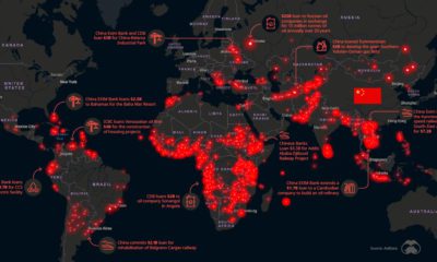

A look at how Chinese diplomacy spending is fueling global megaprojects, as well as growing the country's influence on the world stage.
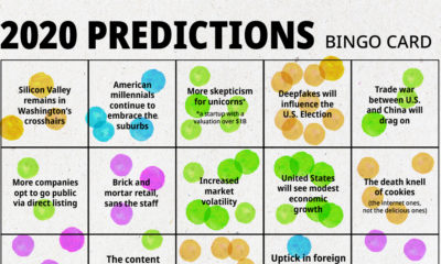

We analyzed 100+ articles, whitepapers, and interviews to answer the question: Is there a consensus on what we can expect in 2020?
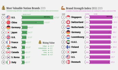

A country's national image can have a big impact on its economic fortunes. See which countries have the highest ranked nation brands.
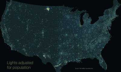

This unique map subtracts population from nighttime light output, giving us a unique perspective into America's rural light pollution hot spots.


Buoyed by innovation and user-friendly experiences, biometric security measures will soon be a mainstream method of keeping your online accounts safe.
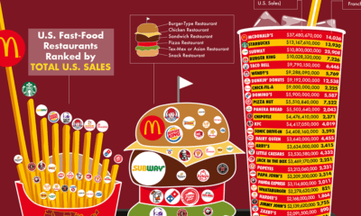

Every year, fast food chains rake in north of $200 billion in revenue per year. Here are the biggest chains, ranked by revenue and number of...
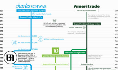

A look at the histories of Charles Schwab and TD Ameritrade, what comes next after the merger, and the potential impacts on the financial services industry.
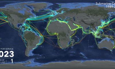

Watch the explosive growth of the global submarine cable network, and learn who's funding the next generation of cables.
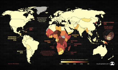

A surprising number of people around the world are still living without access to reliable electricity. This map shows where they live.

A breakdown of which factors that comprise economic complexity, and which global economies rank the highest.
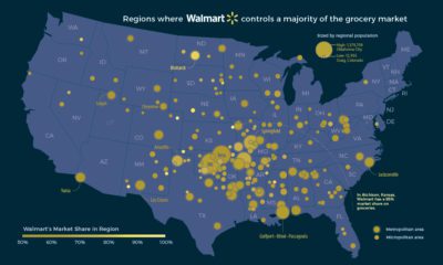

If you want to buy groceries, in some places Walmart is the only game in town. Here's a look at Walmart's domination of the U.S. grocery...


This infographic highlights some of the most promising nanotechnology breakthroughs in medicine, from 'smart pills' to targeted cancer treatment.
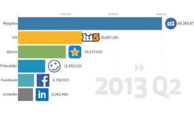

This animation provides an entertaining look at the popularity of social media platforms over time, from MySpace to TikTok.
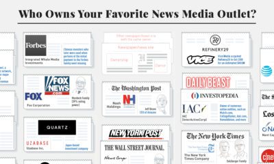

A revealing look at consolidation and ownership of news media outlets in the United States. See who owns news media, and where 'news deserts' exist.
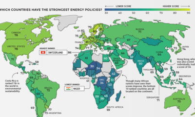

Which countries are able to balance prosperity and sustainability in their energy mixes? See the countries with the most sustainable energy policies.
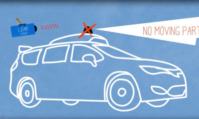

This video breaks down the complex technology allowing a new generation of self-driving cars to view the world around them.
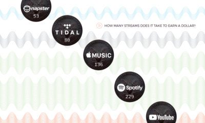

Streaming has breathed new life into the music business, but as new data shows, these services pay out wildly different rates per stream.
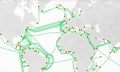

An informative look at the global fiber optic network, how the cables actually work, and the technology that will power the 6G network.
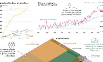

We highlight the five most important takeaways from the IPCC's recent 1,400+ page report on climate change and land use.
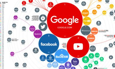

The top 100 websites ranking reveals how people around the world search for information, which services they use, and how they spend time online.
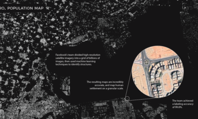

Machine learning technology is allowing researchers at Facebook to map the world population in unprecedented detail.
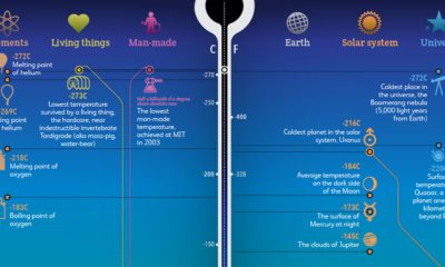

From the Big Bang to the Boomerang Nebula, this stunning data visualization puts the extreme temperatures of our universe into perspective.
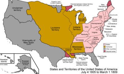

From the Thirteen Colonies to present-day USA, this animation is a detailed look at how borders have shifted throughout the nation's history.
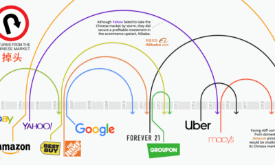

It's hard to ignore the massive economic opportunities available in the Chinese market, but it's also notoriously difficult to succeed in.
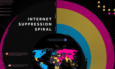

Freedom of speech on the internet has been on decline for eight consecutive years. We visualize the death spiral to show who limits speech the most.
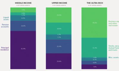

Today's chart shows how the composition of wealth tends to change as net worth increases, illustrating the building blocks that make up household net worth.
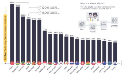

This telling chart shows how national wealth markets have changed over the past decade, highlighting the biggest winners and losers.
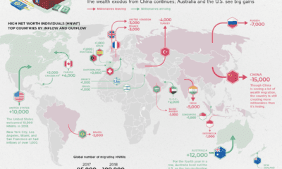

Which countries are magnets for the world's rich, and which countries are seeing a wealth exodus? Mapping the migration of the world's millionaires.


