Markets
Animation: 100 Years of the Most Populous Countries
Animation: 100 Years of the Most Populous Countries
“I think ageing demographics is a bigger issue in China than people think. And the problems it creates should be become evident as early as 2016.” – Stan Druckenmiller, a 2013 quote
Over the last year, we’ve been very skeptical of the near-term potential for robust global economic growth.
The media narrative throughout 2015 was that U.S. rates were on the rise, and that the American economy would finally normalize post-crisis. Stock and real estate prices reached record highs on this optimism, and many pundits expected growth and interest rates to return to more traditional levels.
Over the last few months, we’ve noticed that this narrative has changed significantly. Even though the U.S. is doing “okay” for growth, the global economy is now more entwined than ever. It’s more challenging than ever before for one economy to prop up the rest during stagnation.
Markets this year got off to their worst-ever start after jitters from China rippled through international markets. Oil has continued its plunge and is now trading near $30/bbl. Manufacturing is slowing in the United States. Europe and Japan are going nowhere, and the amount of global debt is starting to signal alarm bells.
Finally, media and investors are accepting the idea that things may not normalize the way they “should”. Instead, the question has become more fundamental: are there even any bright spots in the first place?
Back to Basics
We welcome this new found skepticism, and over the coming months part of our focus here will be to go back to the basics.
Markets aren’t rational, but we can still aim to provide rational context around the fundamentals of the market. In the long run, we believe this will help investors and regular people understand the world better.
A big part of this fundamental approach is demographics, or the changing composition of population over time.
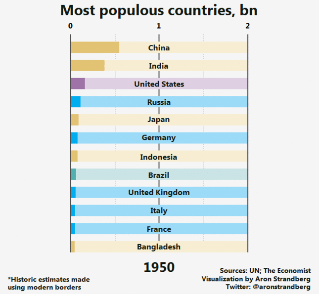
Today’s animation, which covers the change in populations over 100 years for the most populous countries, is a starting place for this.
The first point of interest is that by about the year 2000, all European countries dropped out of the rankings. At the beginning of the animation, the United Kingdom, Germany, France, and Italy were all there. Birth rates have declined to the lowest in the world, which establishes immigration as the only potential option for economic growth. With the recent events in Paris and the current backlash against Middle Eastern immigrants, this Catch-22 becomes even more interesting and important.
Germany, in particular, faces a crucial demographic cliff. We aim to cover this in the very near future, since the country is an important engine for Europe.
Another major point of interest, as we referenced in the opening quote, is the changing demographics of China. In the next decade or so, China’s population will stop growing altogether – and then it will start shrinking. This is the predictable aftermath of China’s one-child policy for many decades. The country still has a giant portion of the population that will continue to move up the ladder economically, but we will be looking at what these circumstances could mean as they loom closer.
Lastly, the rise of India and Nigeria can’t be understated in importance. Both are home to the fastest growing cities in the world. Nigeria will pass the U.S. to become the third largest country in the world by population in the coming decades, and India could be the world’s next China.
When will this potential growth factor into the economy and investments? That’s something else we plan to look at as it becomes more relevant.
Original graphic by: Aron Strandberg


Markets
U.S. Debt Interest Payments Reach $1 Trillion
U.S. debt interest payments have surged past the $1 trillion dollar mark, amid high interest rates and an ever-expanding debt burden.


U.S. Debt Interest Payments Reach $1 Trillion
This was originally posted on our Voronoi app. Download the app for free on iOS or Android and discover incredible data-driven charts from a variety of trusted sources.
The cost of paying for America’s national debt crossed the $1 trillion dollar mark in 2023, driven by high interest rates and a record $34 trillion mountain of debt.
Over the last decade, U.S. debt interest payments have more than doubled amid vast government spending during the pandemic crisis. As debt payments continue to soar, the Congressional Budget Office (CBO) reported that debt servicing costs surpassed defense spending for the first time ever this year.
This graphic shows the sharp rise in U.S. debt payments, based on data from the Federal Reserve.
A $1 Trillion Interest Bill, and Growing
Below, we show how U.S. debt interest payments have risen at a faster pace than at another time in modern history:
| Date | Interest Payments | U.S. National Debt |
|---|---|---|
| 2023 | $1.0T | $34.0T |
| 2022 | $830B | $31.4T |
| 2021 | $612B | $29.6T |
| 2020 | $518B | $27.7T |
| 2019 | $564B | $23.2T |
| 2018 | $571B | $22.0T |
| 2017 | $493B | $20.5T |
| 2016 | $460B | $20.0T |
| 2015 | $435B | $18.9T |
| 2014 | $442B | $18.1T |
| 2013 | $425B | $17.2T |
| 2012 | $417B | $16.4T |
| 2011 | $433B | $15.2T |
| 2010 | $400B | $14.0T |
| 2009 | $354B | $12.3T |
| 2008 | $380B | $10.7T |
| 2007 | $414B | $9.2T |
| 2006 | $387B | $8.7T |
| 2005 | $355B | $8.2T |
| 2004 | $318B | $7.6T |
| 2003 | $294B | $7.0T |
| 2002 | $298B | $6.4T |
| 2001 | $318B | $5.9T |
| 2000 | $353B | $5.7T |
| 1999 | $353B | $5.8T |
| 1998 | $360B | $5.6T |
| 1997 | $368B | $5.5T |
| 1996 | $362B | $5.3T |
| 1995 | $357B | $5.0T |
| 1994 | $334B | $4.8T |
| 1993 | $311B | $4.5T |
| 1992 | $306B | $4.2T |
| 1991 | $308B | $3.8T |
| 1990 | $298B | $3.4T |
| 1989 | $275B | $3.0T |
| 1988 | $254B | $2.7T |
| 1987 | $240B | $2.4T |
| 1986 | $225B | $2.2T |
| 1985 | $219B | $1.9T |
| 1984 | $205B | $1.7T |
| 1983 | $176B | $1.4T |
| 1982 | $157B | $1.2T |
| 1981 | $142B | $1.0T |
| 1980 | $113B | $930.2B |
| 1979 | $96B | $845.1B |
| 1978 | $84B | $789.2B |
| 1977 | $69B | $718.9B |
| 1976 | $61B | $653.5B |
| 1975 | $55B | $576.6B |
| 1974 | $50B | $492.7B |
| 1973 | $45B | $469.1B |
| 1972 | $39B | $448.5B |
| 1971 | $36B | $424.1B |
| 1970 | $35B | $389.2B |
| 1969 | $30B | $368.2B |
| 1968 | $25B | $358.0B |
| 1967 | $23B | $344.7B |
| 1966 | $21B | $329.3B |
Interest payments represent seasonally adjusted annual rate at the end of Q4.
At current rates, the U.S. national debt is growing by a remarkable $1 trillion about every 100 days, equal to roughly $3.6 trillion per year.
As the national debt has ballooned, debt payments even exceeded Medicaid outlays in 2023—one of the government’s largest expenditures. On average, the U.S. spent more than $2 billion per day on interest costs last year. Going further, the U.S. government is projected to spend a historic $12.4 trillion on interest payments over the next decade, averaging about $37,100 per American.
Exacerbating matters is that the U.S. is running a steep deficit, which stood at $1.1 trillion for the first six months of fiscal 2024. This has accelerated due to the 43% increase in debt servicing costs along with a $31 billion dollar increase in defense spending from a year earlier. Additionally, a $30 billion increase in funding for the Federal Deposit Insurance Corporation in light of the regional banking crisis last year was a major contributor to the deficit increase.
Overall, the CBO forecasts that roughly 75% of the federal deficit’s increase will be due to interest costs by 2034.

-

 Green2 weeks ago
Ranked: Top Countries by Total Forest Loss Since 2001
-

 Travel1 week ago
Ranked: The World’s Top Flight Routes, by Revenue
-

 Technology1 week ago
Ranked: Semiconductor Companies by Industry Revenue Share
-

 Money2 weeks ago
Which States Have the Highest Minimum Wage in America?
-

 Real Estate2 weeks ago
Ranked: The Most Valuable Housing Markets in America
-

 Markets2 weeks ago
Charted: Big Four Market Share by S&P 500 Audits
-

 AI2 weeks ago
The Stock Performance of U.S. Chipmakers So Far in 2024
-

 Automotive2 weeks ago
Almost Every EV Stock is Down After Q1 2024