Misc
Here’s 5 Infographics That Inspire Our Creative Team
Over the years, the Visual Capitalist creative team has created thousands of maps, charts, infographics, videos, data visualizations, and everything in between.
Through our online travels, we’ve encountered countless data-infused pieces – but only a select few stand out above the noise and filler. Below, five members of our creative team have each selected a piece that has inspired them in some way.
Let’s dive in!
— VC Creative Team

1. “The Weight of Walmart” by Nick Routley
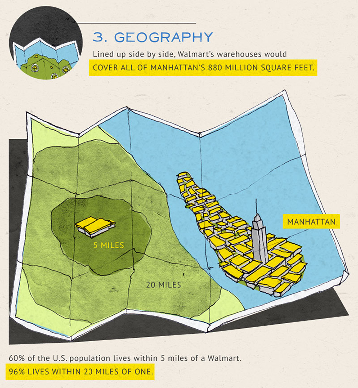
See the full piece here.
There was an explosion in the number of infographics being produced around 2010-2011, and in many ways, that wave of popularity is what got me interested in fusing data with storytelling and design.
I can’t look back at that era with rose coloured glasses though; most of the pieces I encountered were dysfunctional and ugly. There was, however, a batch of really amazing infographics that tapped into clever illustrations and concepts to get their point across.
In my opinion, the piece that sums up that style best is “The Weight of Walmart”.
I love “The Weight of Walmart” for a number of reasons, but foremost, the content is genuinely interesting. In 2011, when the piece was released, Walmart was a retail juggernaut. As a result, some of the stats in this infographic are pretty remarkable.
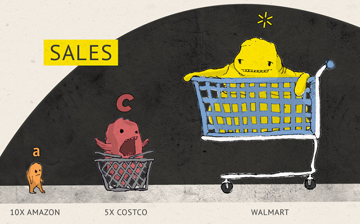
Next, the idea of the obese anthropomorphic monster is weird and amazing, yet doesn’t detract from the subject matter at all. It also sets a very interesting aesthetic tone in the piece that is a big contrast from the staid, icon-filled infographics many people are used to.
As well, the infographic uses colour in an extremely effective, strategic way. Note the colour yellow as you scroll. Aside from being an overt hat tip to Walmart’s branding, that pop colour leads you through the content so you’re never stuck wondering where you should be looking next.
“The Weight of Walmart” made a big impact on me as a budding designer and even today – when we have more creative leeway on a piece – I look to that weird, wonderful example as one to emulate.
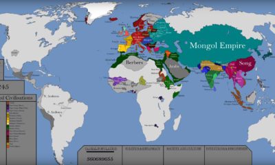
2. “The World’s First Writing Systems” by Melissa Haavisto
Watch the video embedded above
I’ve heard it said that while language could exist without writing, history books depend on the written word.
From our earliest days, humanity has shared information in an ever-evolving sequence of symbols, crude cave paintings, and timeworn inscriptions etched into stone. Fast-forward to 2017, and this habit of sharing knowledge has only continued to grow at breakneck speeds, with an explosion of data and information being created every second.
As a designer, I’ve always loved three things beyond the pure aesthetics: maps, history, and storytelling. Released in 2016 by Business Insider, “The Spread of the World’s First Writing Systems” concisely uses the first two points – maps and history — to paint the complexity of the third point (storytelling) in stunning detail.
In the span of two and a half minutes, the map follows a surge of evolving literacy systems across the world. Red is used to highlight six geographic regions, and colored timelines mark the birth (or death) of each script.
If you pause the video around the two-minute mark and look at the timelines, you can clearly see how complicated the evolution of language is. Winding new branches and dialects move across geographic borders, while some ancient scripts defy the odds and remain intact for millennia. Among the excerpts of each script, you may even notice some symbols that seem vaguely familiar to the modern eye.
Beyond its data functionality, the map pairs realistic beauty with a clean aesthetic and groups each family of written languages well.
As part of a series of concise, animated maps, “The Spread of the World’s First Writing Systems” remains one example among many that inspired my fascination with time, geographic space, and information.
3. “Earth Temperature Timeline” by Harrison Schell
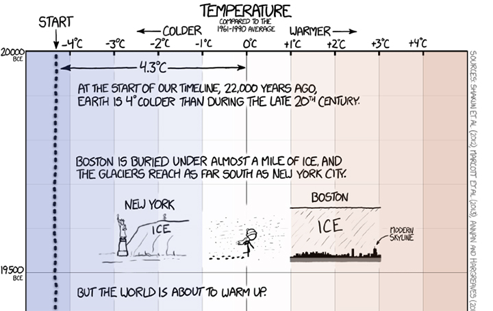
See the full piece here.
Where a graphic really sets itself apart is how effectively it can communicate its intended message. The “Earth Temperature Timeline” by xkcd takes a huge amount of data, quite literally all of human history in the past 22,000 years, and makes it easy, fun, and informative to follow.
The strong points of this graphic cannot be overstated. The storytelling, with added jokes, keeps the reader engaged and interested, even if there is no flashy graphics or icons to accompany every slab of text. This is a great example of how writing and concept can carry the reader with sparse graphics, acting only as simple nudges to deliver the concept.
And finally, when you are happily comparing historic events and their relation to one another, the reality sets in. The whole 15,000 pixels set us up for the last inch, a swift blow to the stomach — climate change is here, and we are responsible.
This graphic altered my perspective on climate change — it made it real, and it made it ridiculous to claim “the climate has changed before”. When it comes down to it, making infographics is about taking data and making it digestible, and xkcd did just that, even if it was hard to swallow.
(After setting your car on fire) Listen, your car’s temperature has changed before.
– Randall Munroe of xkcd
>> View the Earth Temperature Timeline
4. “The Fallen of World War II” by Clayton Wadsworth
Watch the video embedded above
When we hear about the great wars of human history, it’s difficult to picture the sheer scale of the devastation in our minds.
What does 100,000 people look like? That one is simple enough – I can mentally picture a large stadium filled with people. But, what about 70 million people? There you’ve lost me. That is such a large number that I can no longer accurately visualize what that looks like.
That is the wonder of “The Fallen of World War II” by Neil Halloran. It takes the colossal numbers of casualties of both soldiers and civilians in WWII, and visually compares them to many of the other conflicts through human history in one brilliant video.
This award-winning motion graphic has inspired my own work here at Visual Capitalist, and was one of my primary animation references for the initial draft for “How Much Money have Humans Created?”, which we released in 2016. The success of this piece for me is largely due to its ability to contextualize history, allowing us to visually see the drastic difference between modern day conflicts and those of the past by using numbers effectively.
While its subject matter and length might turn away some from watching it in full, I strongly encourage you do so, as it is wonderfully made and incredibly captivating.
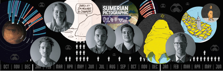
5. “Mission(s) to Mars” by Bennett Slater
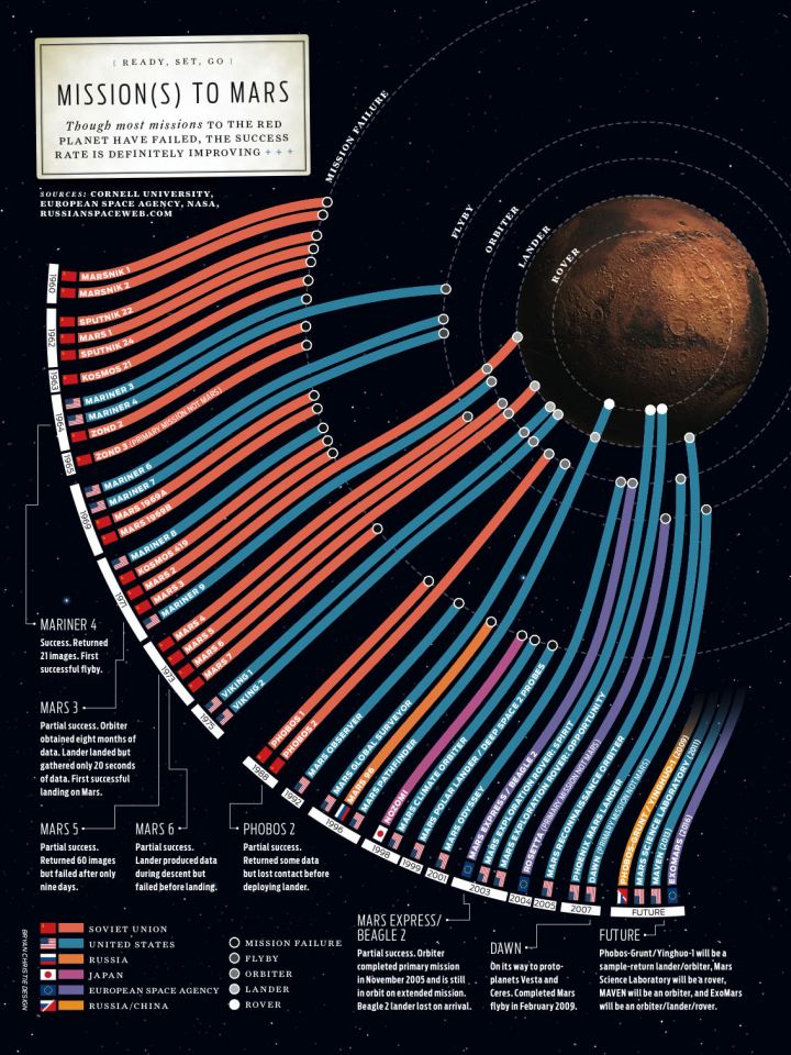
View a larger version of this graphic here
An infographic needs to be able to communicate complex or dull information quickly and efficiently. Extraneous fluff added to a visualization because it’s “cool” typically muddies the information and begins to chip away at our attention. A simple, streamlined, and focused approach can hit its mark beautifully if done well. This graphic, which visualizes the world’s missions to Mars, is the perfect example of how to turn a table of names and dates into a piece of information art.
Let’s start with the visual hierarchy. Your eye shoots directly to the large white box against a black background. In the fewest words necessary, we read what this is about and smooth as milk we flow into the timeline. This is the meat of the graphic, and what we came for. Without even needing to read the dates, you are compelled visually to begin from the top and move down.
Now comes the genius bit. The timeline works both as a measure of time, but also a measure of distance. We move down the timeline and closer to Mars as we go. The viewer is able to gloss over this and still completely grasp where the Mars missions began and how far we’ve come in a matter of seconds. Once we’ve gotten what we need to from the timeline, we are invited to catch a few neat facts before heading down to the business of the color-coded legend. This design satisfies my itch every time I look at it.
It’s interesting to see styled trends come and go in the infographic world, but the one thing that will always rise to the surface is simple, effective information design. If you can hang a piece of art on your wall and learn some facts at the same time, then that’s the real mission.
>> View larger version of Mission(s) to Mars
Subscribe to Visual Capitalist
Our creative team uses the above infographics as inspiration for their own work.
If you want to see their creations, we publish new visuals every day that help to explain the complex world of business and investing.
Join over 40,000 people that get our free daily email blast, or join thousands of others on Facebook, Twitter, LinkedIn, or YouTube who get fresh daily visuals from us.


VC+
VC+: Get Our Key Takeaways From the IMF’s World Economic Outlook
A sneak preview of the exclusive VC+ Special Dispatch—your shortcut to understanding IMF’s World Economic Outlook report.

Have you read IMF’s latest World Economic Outlook yet? At a daunting 202 pages, we don’t blame you if it’s still on your to-do list.
But don’t worry, you don’t need to read the whole April release, because we’ve already done the hard work for you.
To save you time and effort, the Visual Capitalist team has compiled a visual analysis of everything you need to know from the report—and our upcoming VC+ Special Dispatch will be available exclusively to VC+ members on Thursday, April 25th.
If you’re not already subscribed to VC+, make sure you sign up now to receive the full analysis of the IMF report, and more (we release similar deep dives every week).
For now, here’s what VC+ members can expect to receive.
Your Shortcut to Understanding IMF’s World Economic Outlook
With long and short-term growth prospects declining for many countries around the world, this Special Dispatch offers a visual analysis of the key figures and takeaways from the IMF’s report including:
- The global decline in economic growth forecasts
- Real GDP growth and inflation forecasts for major nations in 2024
- When interest rate cuts will happen and interest rate forecasts
- How debt-to-GDP ratios have changed since 2000
- And much more!

Get the Full Breakdown in the Next VC+ Special Dispatch
VC+ members will receive the full Special Dispatch on Thursday, April 25th.
Make sure you join VC+ now to receive exclusive charts and the full analysis of key takeaways from IMF’s World Economic Outlook.
Don’t miss out. Become a VC+ member today.
What You Get When You Become a VC+ Member
VC+ is Visual Capitalist’s premium subscription. As a member, you’ll get the following:
- Special Dispatches: Deep dive visual briefings on crucial reports and global trends
- Markets This Month: A snappy summary of the state of the markets and what to look out for
- The Trendline: Weekly curation of the best visualizations from across the globe
- Global Forecast Series: Our flagship annual report that covers everything you need to know related to the economy, markets, geopolitics, and the latest tech trends
- VC+ Archive: Hundreds of previously released VC+ briefings and reports that you’ve been missing out on, all in one dedicated hub
You can get all of the above, and more, by joining VC+ today.

-

 Green1 week ago
Ranked: The Countries With the Most Air Pollution in 2023
-

 Automotive2 weeks ago
Almost Every EV Stock is Down After Q1 2024
-

 AI2 weeks ago
The Stock Performance of U.S. Chipmakers So Far in 2024
-

 Markets2 weeks ago
Charted: Big Four Market Share by S&P 500 Audits
-

 Real Estate2 weeks ago
Ranked: The Most Valuable Housing Markets in America
-

 Money2 weeks ago
Which States Have the Highest Minimum Wage in America?
-

 AI2 weeks ago
Ranked: Semiconductor Companies by Industry Revenue Share
-

 Travel2 weeks ago
Ranked: The World’s Top Flight Routes, by Revenue