Misc
13 Scientific Reasons Explaining Why You Crave Infographics
Ever wonder why your brain craves visually stimulating content?
It’s not by random chance.
In fact, there’s overwhelming scientific evidence that explains why people are attracted to visuals such as infographics, data visualizations, and charts. In essence? The majority of people are visual learners, and carefully thought-out and well-researched visuals can explain something more effectively than text ever could.
It’s why we, at Visual Capitalist, aim to continue providing insights on business and investing by creating and curating the best data-driven visual media on the web.
13 Scientific Reasons On Why You Crave Infographics
Without further ado, the 13 data-driven reasons behind the power of infographics and visual content.

The above infographic comes to us from NeoMam Studios and it takes a data-driven approach to explaining why people constantly crave infographics.
Here’s a summary of the 13 reasons:
Human beings are visually wired:
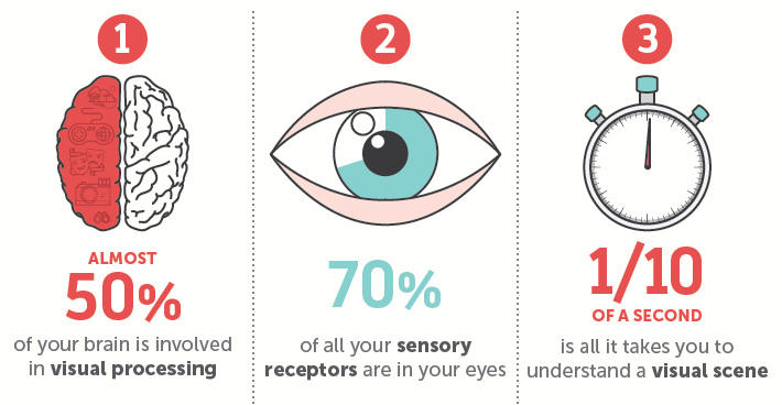
1. Almost 50% of your brain is involved in visual processing.
2. 70% of all your sensory receptors are in your eyes.
3. 1/10 of a second is all it takes you to understand a visual scene.
4. It takes us only 150 milliseconds to process a symbol, and 100 milliseconds to attach a meaning to it.
We need to understand things faster because we suffer from information overload:
5. We receive 5x as much information in 2014 as in 1986.
6. We consume 34 gigabytes of information on an average day, just outside of work.
7. Only 28% of words on a web page are actually read on an average visit.
Infographics help us get information more quickly because:
8. Researchers have found that color visuals increase willingness to read by 80%.
9. For medicine labels, a study found that 70% understand the labels with text only, while 95% understand with text and pictures.
10. People do 323% better following directions with text and illustrations in comparison to just text.
Infographics are more persuasive:
11. A study conducted at the Wharton School of Business found that 50% of the audience was persuaded by purely verbal presentation, while 67% were persuaded by a verbal presentation accompanied by visuals.
12. Adding pictures of brain scans and mentioning cognitive neuroscience make people more inclined to believe what they are reading.
13. People remember 80% of what they see and do, in comparison to 10% of what they hear, or 20% of what they read.


VC+
VC+: Get Our Key Takeaways From the IMF’s World Economic Outlook
A sneak preview of the exclusive VC+ Special Dispatch—your shortcut to understanding IMF’s World Economic Outlook report.

Have you read IMF’s latest World Economic Outlook yet? At a daunting 202 pages, we don’t blame you if it’s still on your to-do list.
But don’t worry, you don’t need to read the whole April release, because we’ve already done the hard work for you.
To save you time and effort, the Visual Capitalist team has compiled a visual analysis of everything you need to know from the report—and our upcoming VC+ Special Dispatch will be available exclusively to VC+ members on Thursday, April 25th.
If you’re not already subscribed to VC+, make sure you sign up now to receive the full analysis of the IMF report, and more (we release similar deep dives every week).
For now, here’s what VC+ members can expect to receive.
Your Shortcut to Understanding IMF’s World Economic Outlook
With long and short-term growth prospects declining for many countries around the world, this Special Dispatch offers a visual analysis of the key figures and takeaways from the IMF’s report including:
- The global decline in economic growth forecasts
- Real GDP growth and inflation forecasts for major nations in 2024
- When interest rate cuts will happen and interest rate forecasts
- How debt-to-GDP ratios have changed since 2000
- And much more!

Get the Full Breakdown in the Next VC+ Special Dispatch
VC+ members will receive the full Special Dispatch on Thursday, April 25th.
Make sure you join VC+ now to receive exclusive charts and the full analysis of key takeaways from IMF’s World Economic Outlook.
Don’t miss out. Become a VC+ member today.
What You Get When You Become a VC+ Member
VC+ is Visual Capitalist’s premium subscription. As a member, you’ll get the following:
- Special Dispatches: Deep dive visual briefings on crucial reports and global trends
- Markets This Month: A snappy summary of the state of the markets and what to look out for
- The Trendline: Weekly curation of the best visualizations from across the globe
- Global Forecast Series: Our flagship annual report that covers everything you need to know related to the economy, markets, geopolitics, and the latest tech trends
- VC+ Archive: Hundreds of previously released VC+ briefings and reports that you’ve been missing out on, all in one dedicated hub
You can get all of the above, and more, by joining VC+ today.

-

 Green1 week ago
Ranked: The Countries With the Most Air Pollution in 2023
-

 Automotive2 weeks ago
Almost Every EV Stock is Down After Q1 2024
-

 AI2 weeks ago
The Stock Performance of U.S. Chipmakers So Far in 2024
-

 Markets2 weeks ago
Charted: Big Four Market Share by S&P 500 Audits
-

 Real Estate2 weeks ago
Ranked: The Most Valuable Housing Markets in America
-

 Money2 weeks ago
Which States Have the Highest Minimum Wage in America?
-

 AI2 weeks ago
Ranked: Semiconductor Companies by Industry Revenue Share
-

 Travel2 weeks ago
Ranked: The World’s Top Flight Routes, by Revenue